Portfolio

3D Rendering
- 2024
- Art Direction
- Project Management
- Human Resources
Challenge
During the planning for KBIS (Kitchen & Bath Industry Show) 2024 in Q4 2023, we faced a significant challenge: many new product prototypes would not arrive in time for real-life photography. We needed imagery for upcoming trade show booth graphics, printed materials, PR releases and social media.
Approach
To address this, I hired a freelance 3D rendering artist with expertise in photo-realism and a strong understanding of lighting, texturing and product styling. I personally crafted the job post, vetted and reviewed portfolios and tested each promising candidate to ensure they met our high standards.Throughout the process, I was deeply involved, showcasing our quality benchmarks to the artist and providing detailed art direction for each piece.
Benchmarking
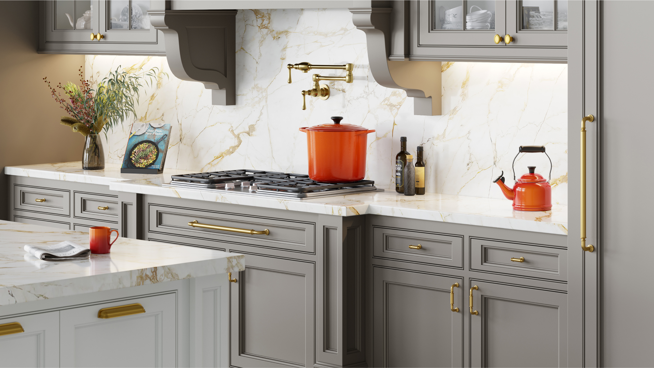
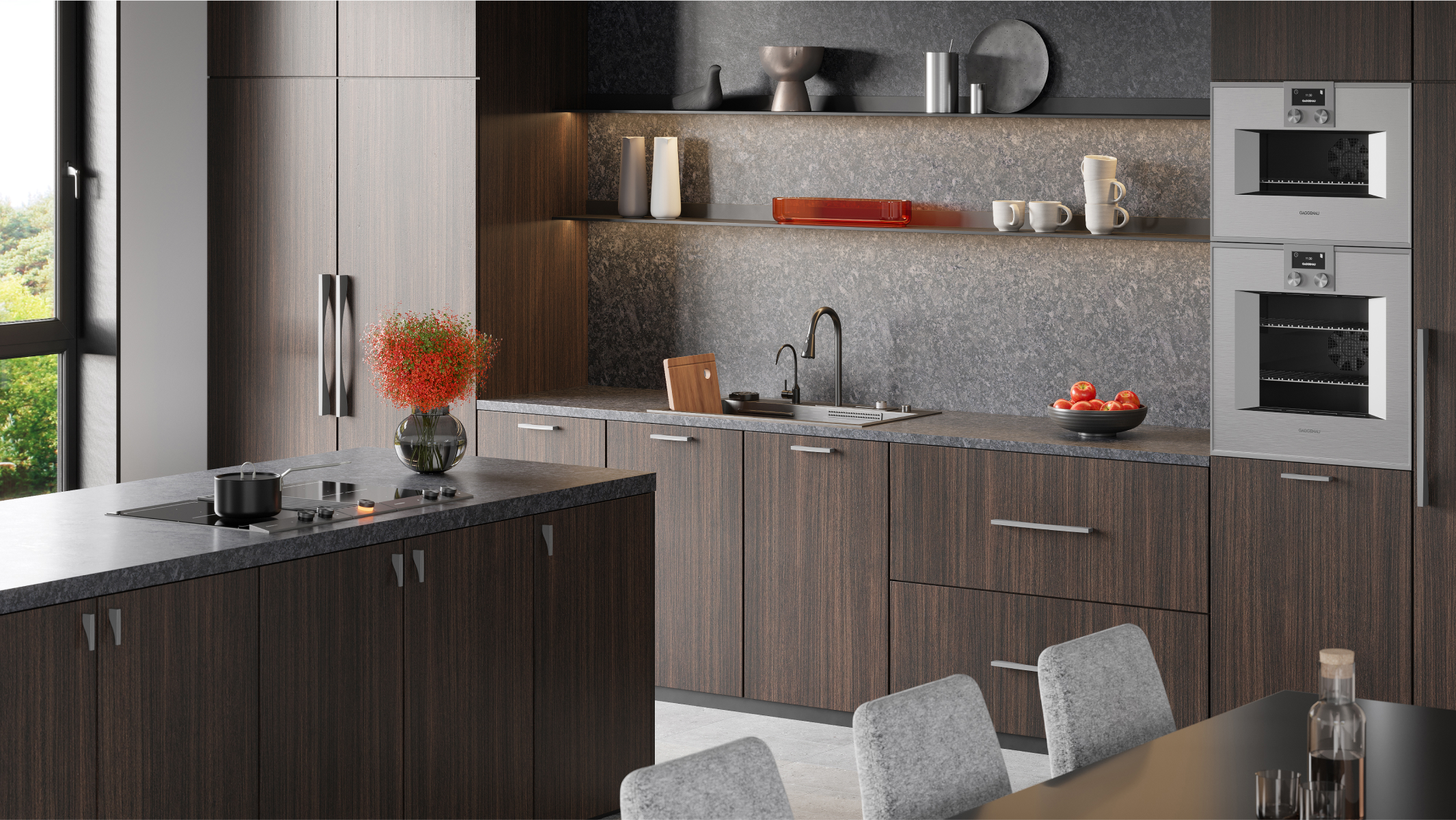
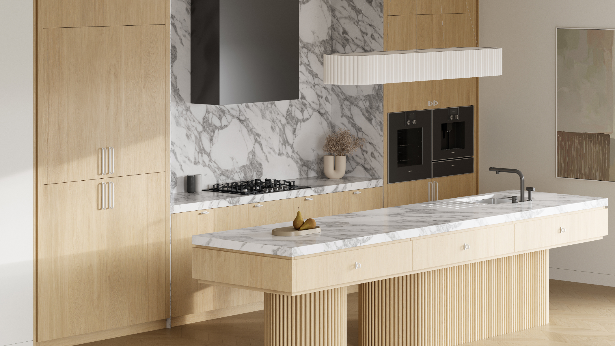
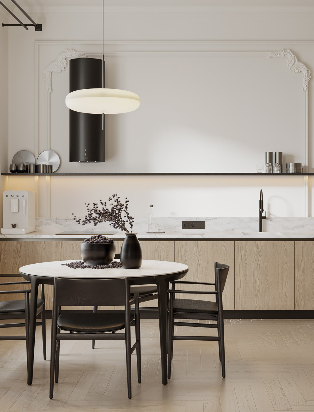
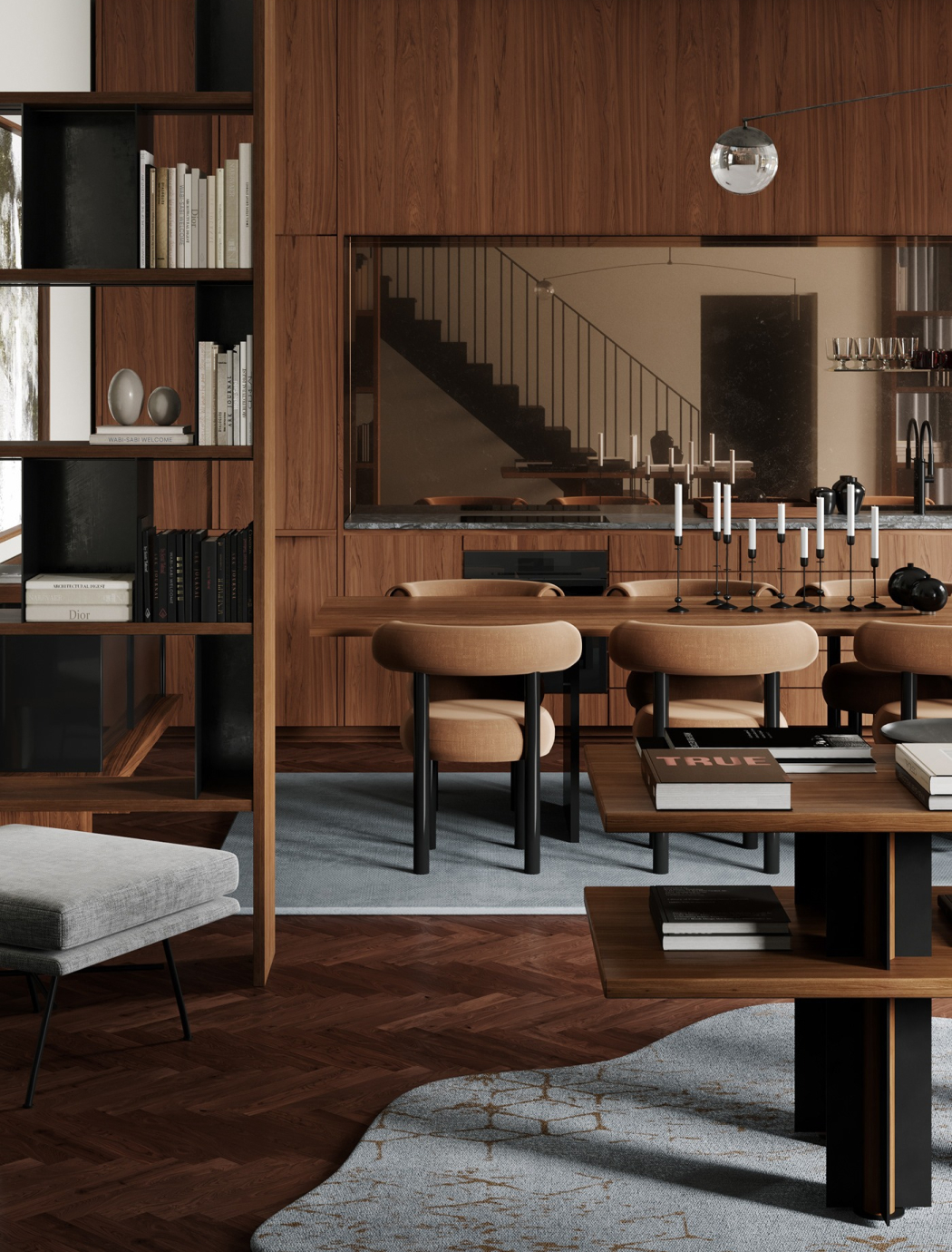
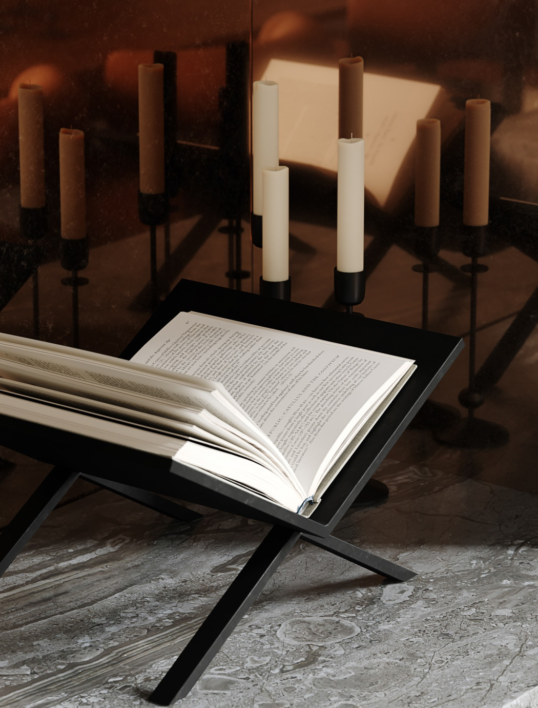
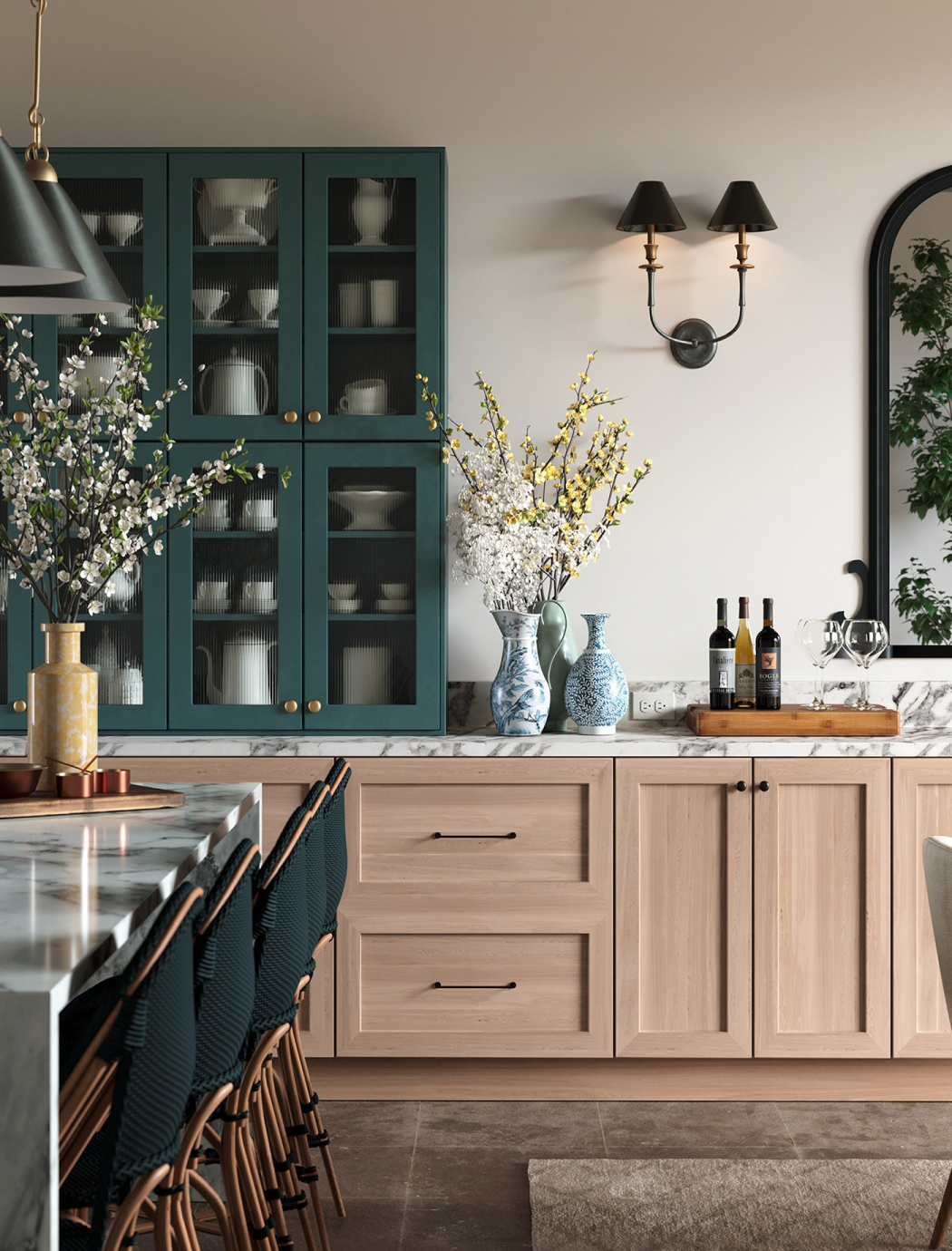
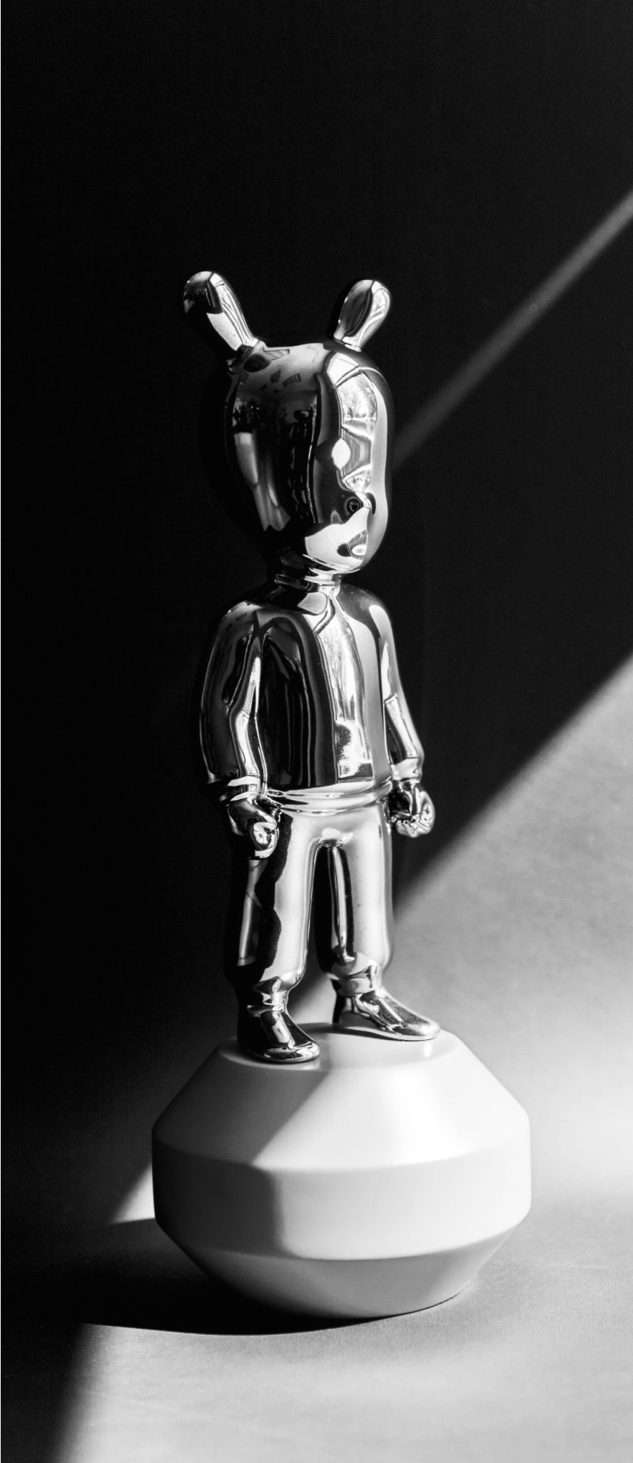
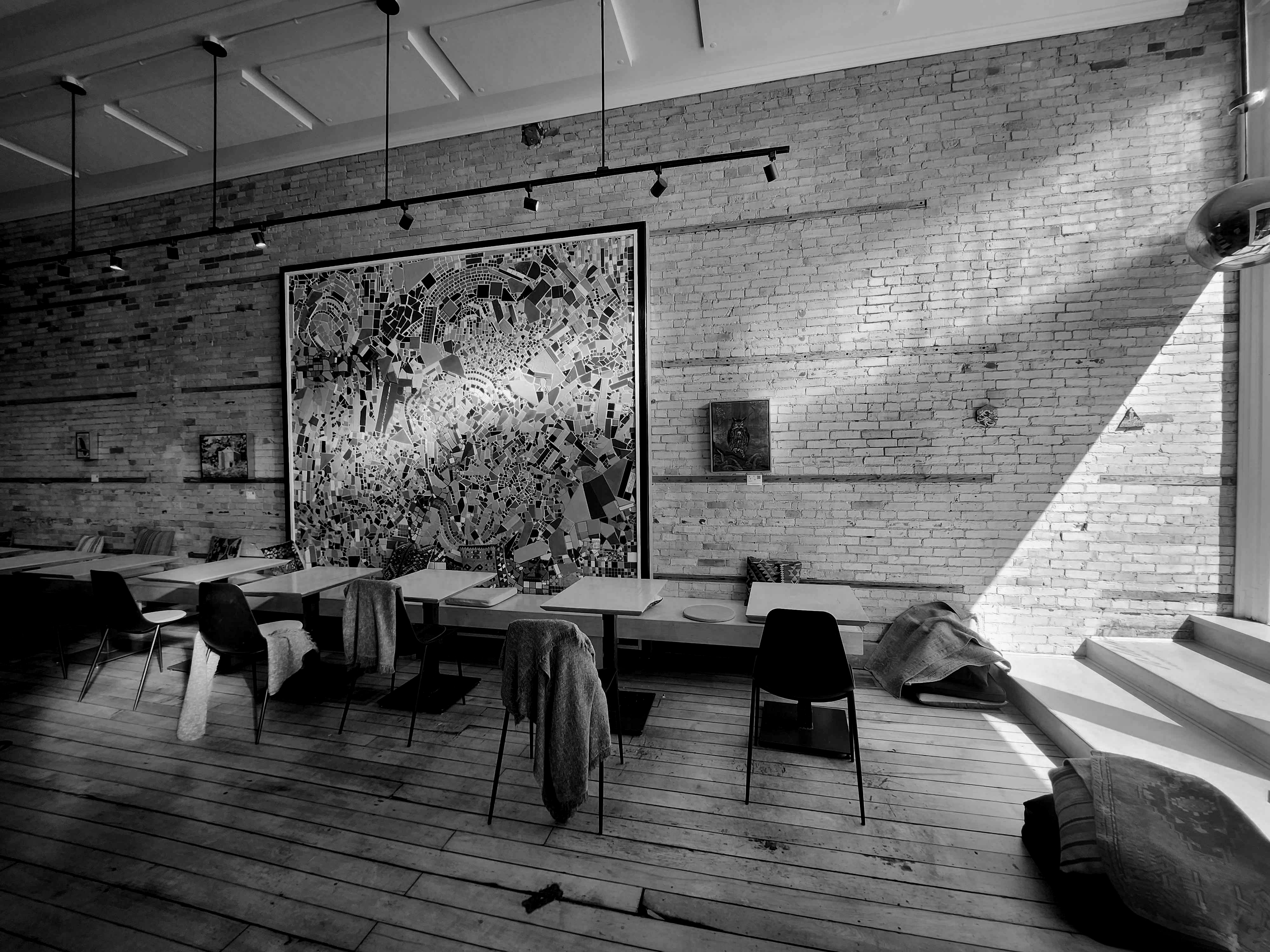
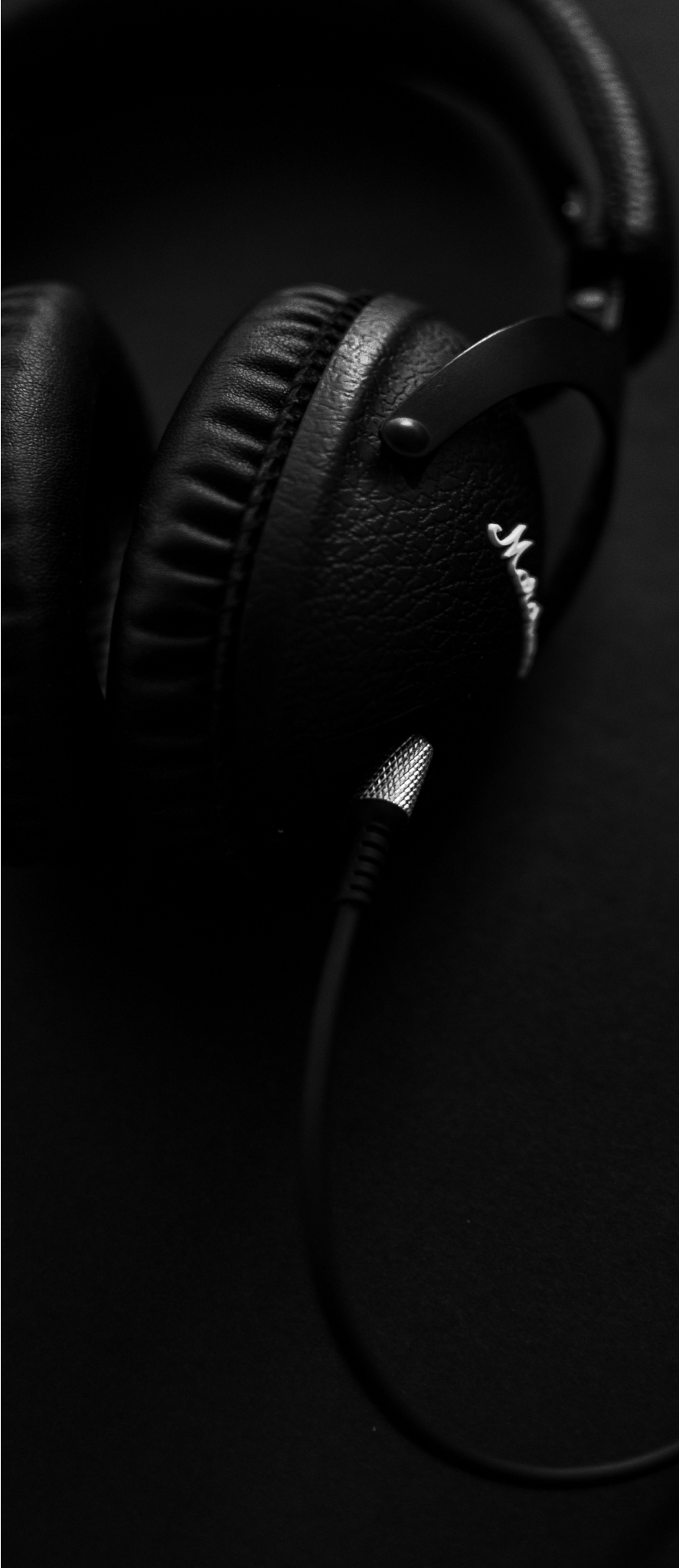
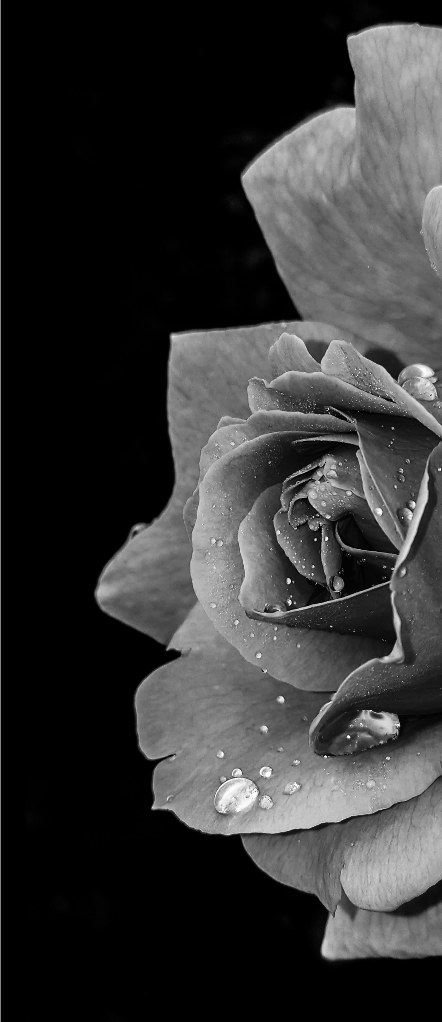
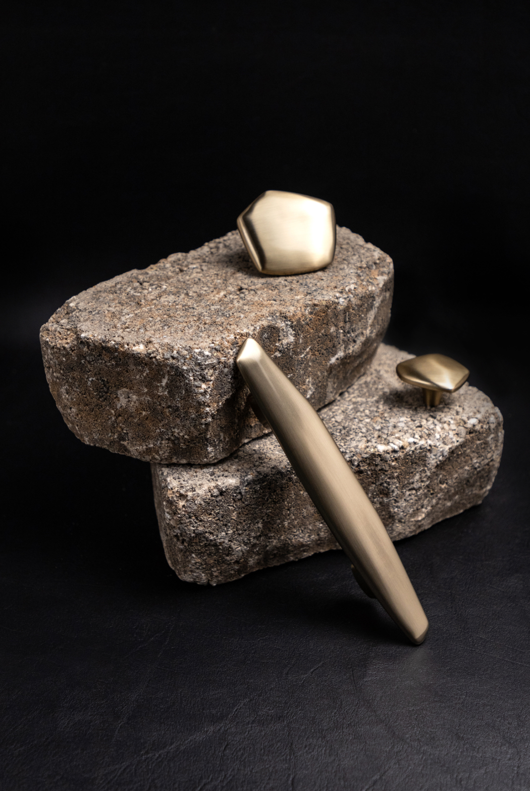
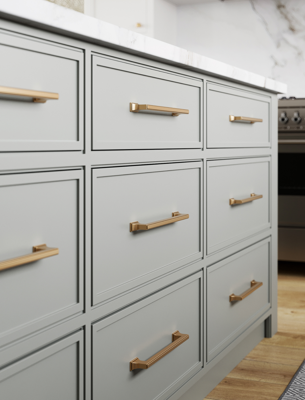
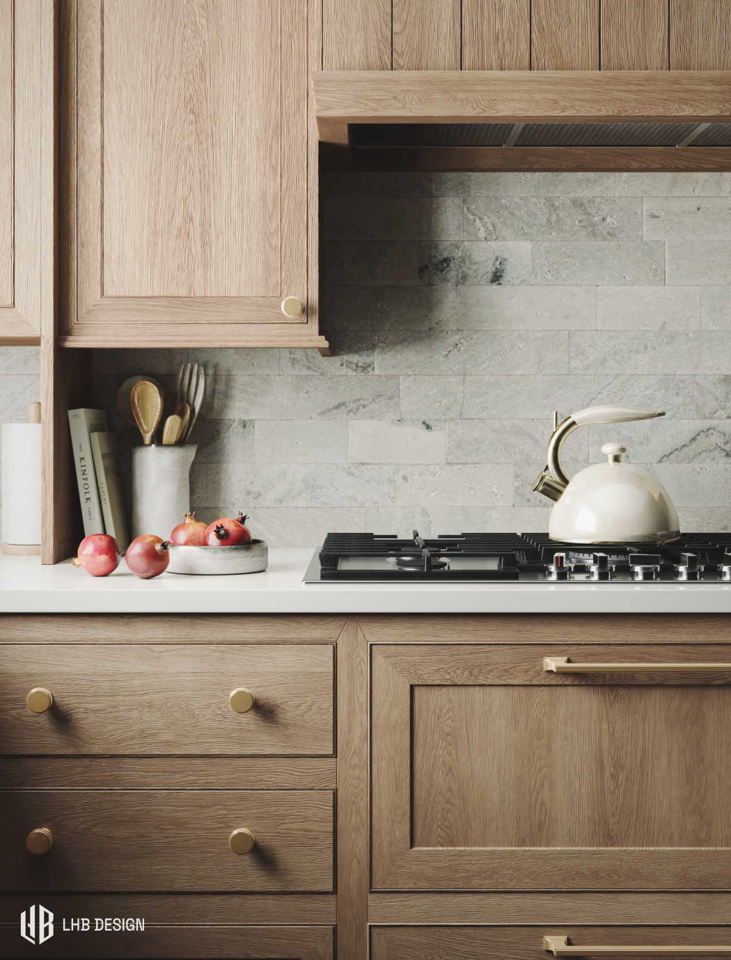
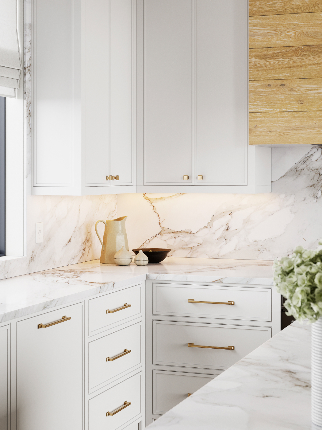
With limited 3D rendering experience myself, I conducted thorough research to establish our quality standards. Before creating the job post, I identified examples (like the ones below) that exemplified the photorealism we aimed to achieve. These examples were included in the job listing to ensure candidates understood the level of rendering quality expected. All featured renders demonstrated artists' mastery of Autodesk 3ds Max and Corona Renderer.
The Shortlist
Dozens of 3D artists applied, but few met the qualifications. I meticulously reviewed each candidate’s portfolio and ultimately shortlisted four artists. I then administered a rendering test to determine the best fit.
The test required each artist to produce an interior render showcasing our hardware. They could choose between transitional or modern style hardware, with .step files provided. The hardware was to be mounted on a cabinet in a specified finish, Champagne Bronze. I supplied multiple high-resolution photos of the finish in real life for reference. To save time, I allowed candidates to reuse a pre-existing scene. The renders were evaluated based on the following key metrics:
- Photorealism: Was the rendering overall convincing in terms of lighting and texturing?
- Styling: Did the artist demonstrate good taste in styling the scene with props?
- Hardware Detailing: Was the texturing and lighting on the hardware realistic, showing proper brushing and texture?
Moving Forward
I chose to work with Anastasiya, as she exceeded expectations with her test renders, providing multiple angle views and nearly perfecting the texturing and color of the Champagne Bronze finish on the first attempt.
Furthermore, she demonstrated a strong commitment to understanding our project needs, worked tirelessly alongside us for the next few months, and handled feedback and changes with grace.
Art Direction
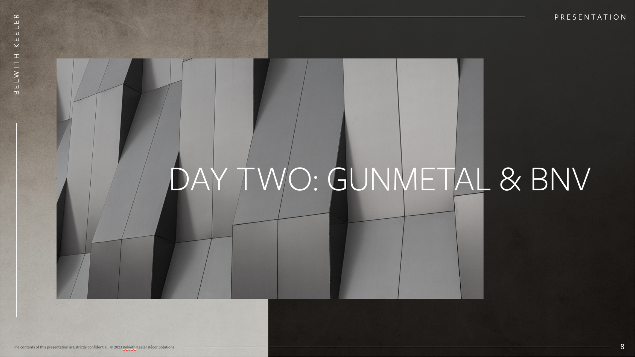
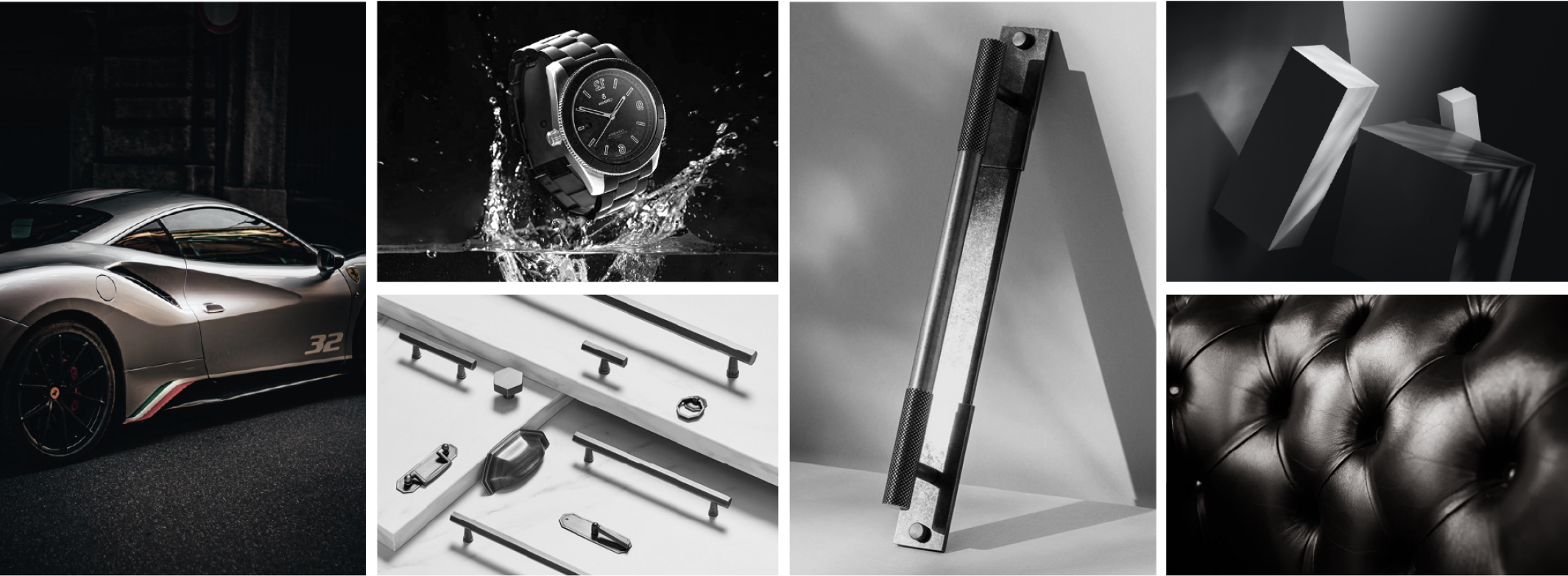
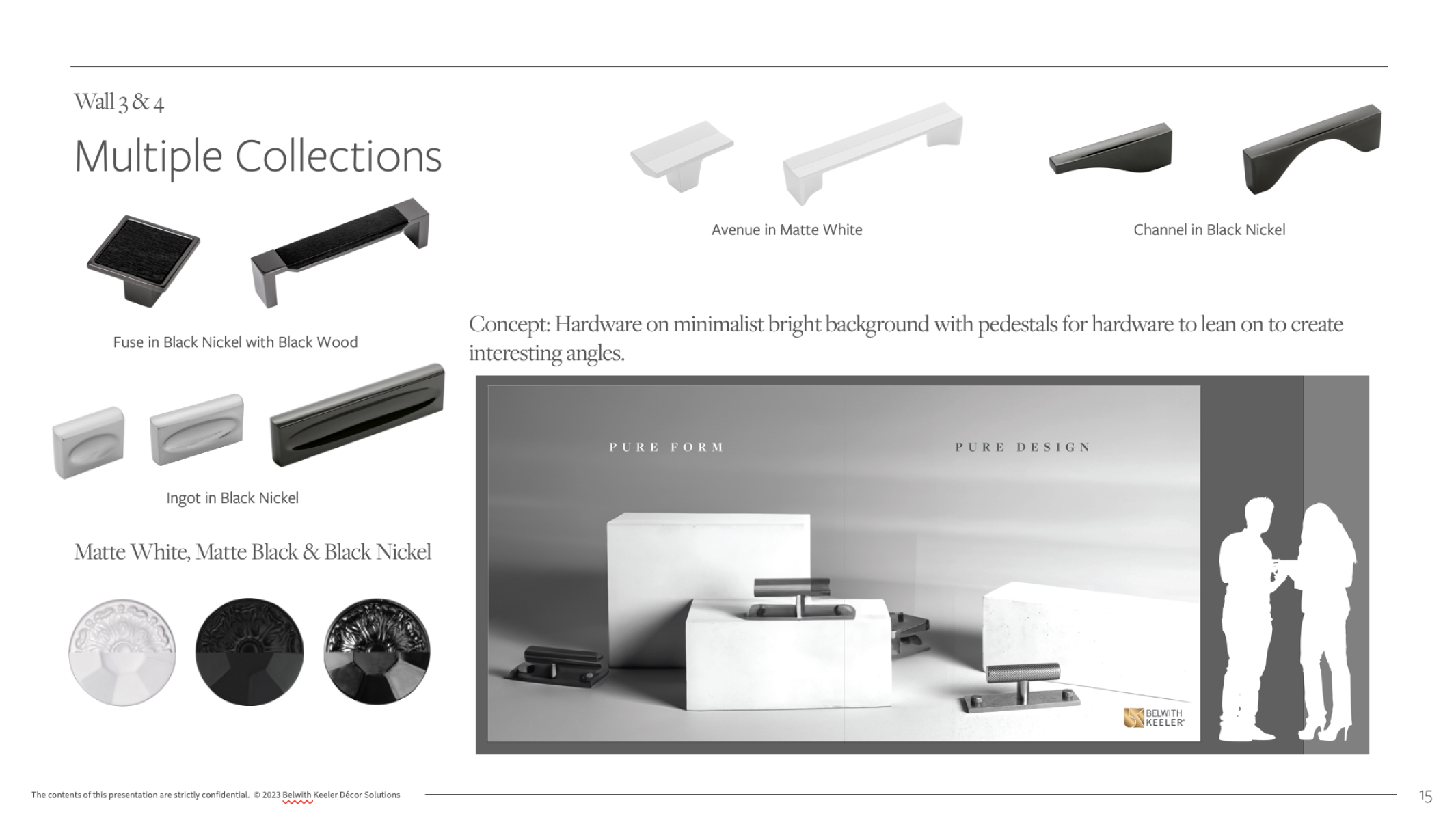
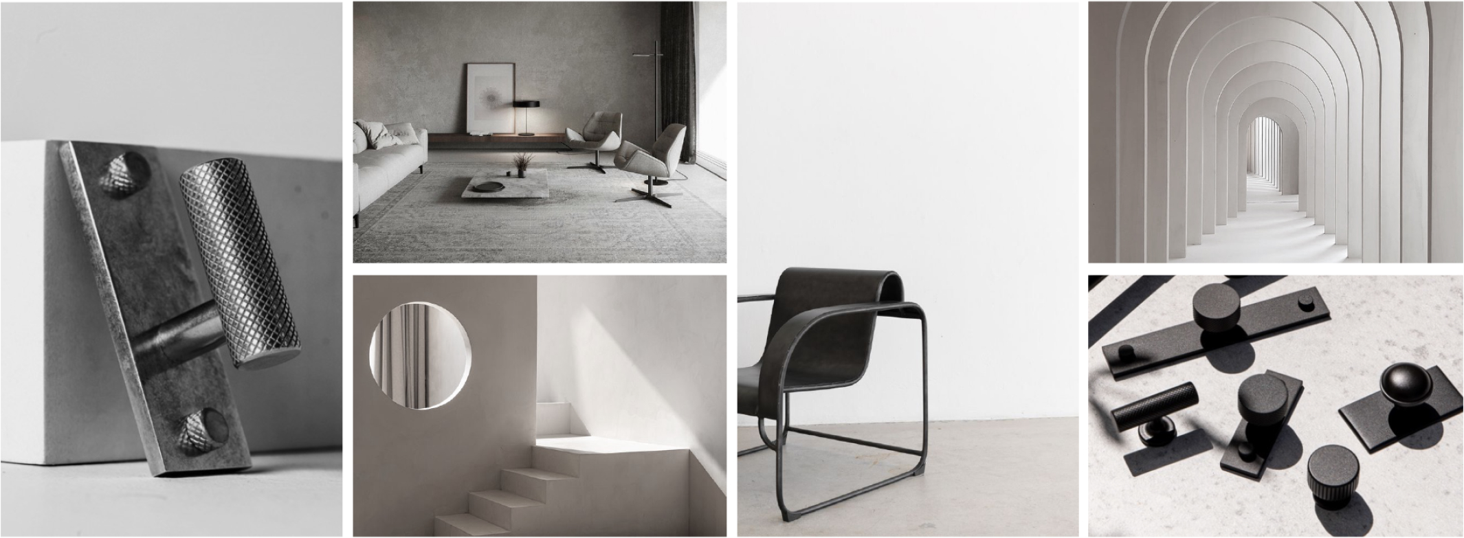
To effectively communicate with Anastasiya, despite mild language barriers, I opted to compile a detailed deck outlining our trade show ideas. Recognizing the importance of clear documentation, I aimed to minimize meetings by fostering a culture of high documentation.
Within the deck, I presented mood boards for each day along with the desired collections and finishes to be featured. Additionally, I utilized Photoshop's Generative Fill AI to create rough sketches of concepts and stage compositions. The main trade show graphics were sized at approximately 16 feet wide by 8 feet tall, with human silhouettes added for scale reference.
Project Management
A significant portion of the booth's success hinged on the timely completion of the renders, which would set the tone for the two outer walls of the structure, changing daily. With the KBIS event spanning three days, we required six graphics in total, plus additional interior renders for three printed brochures.
Given the interdependence of several projects on the successful completion of these renders, I took the lead in scoping the feasibility of the project. I established timelines and set up milestones with Anastasiya to ensure all related projects would be completed and delivered on time for the show.
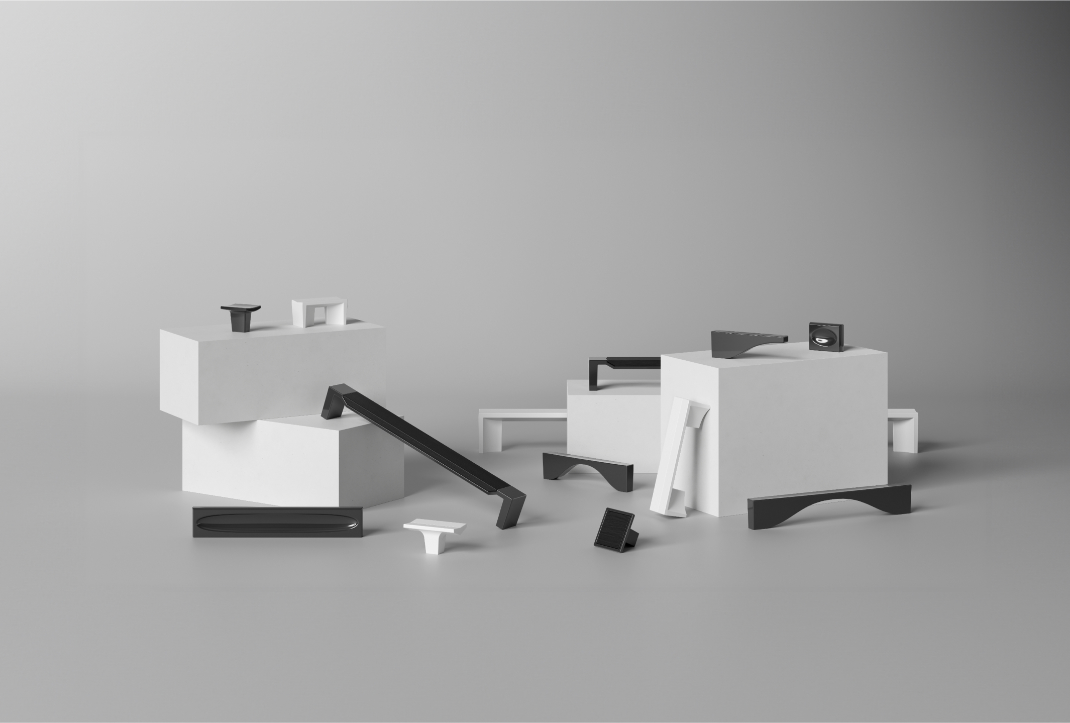
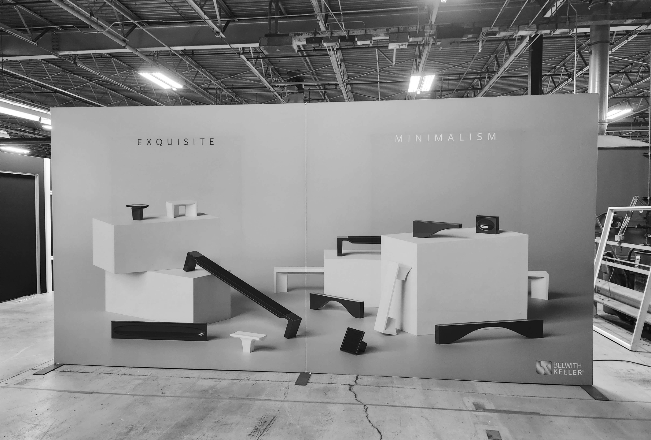
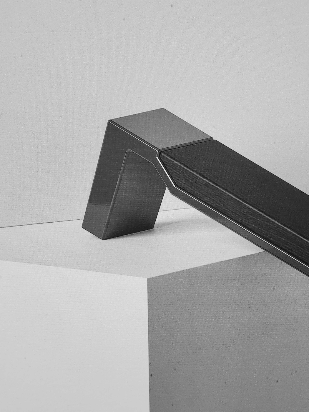
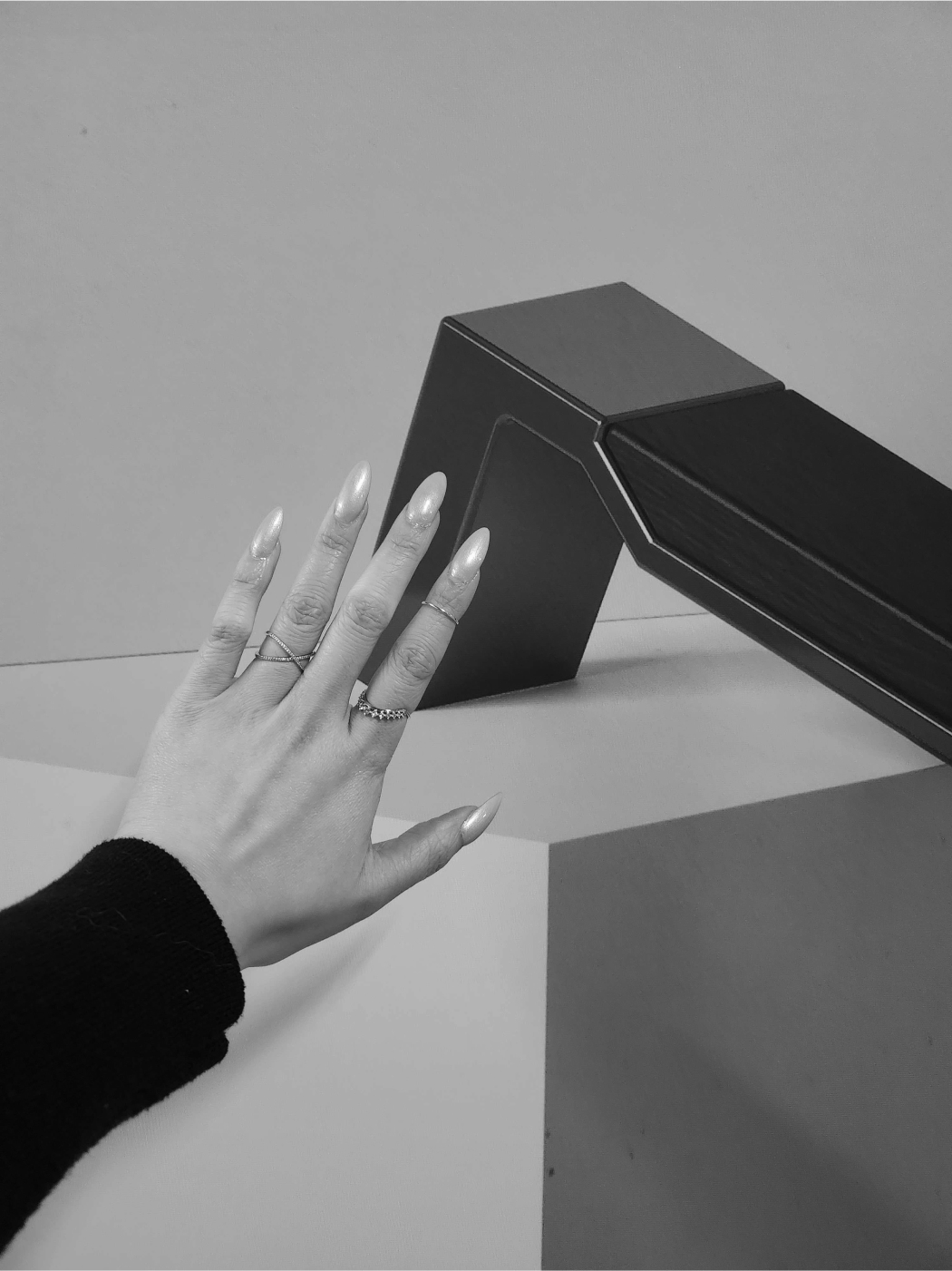
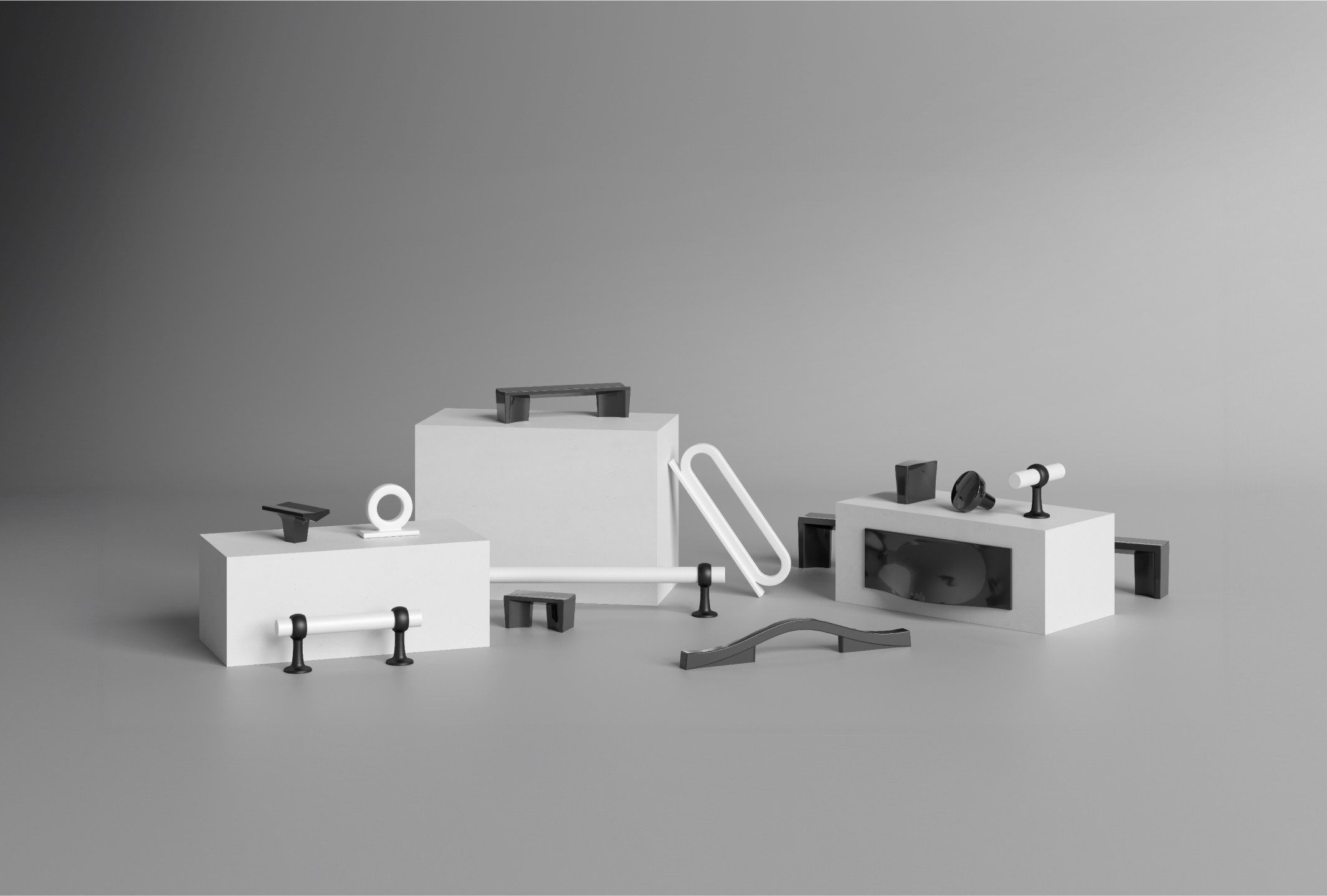
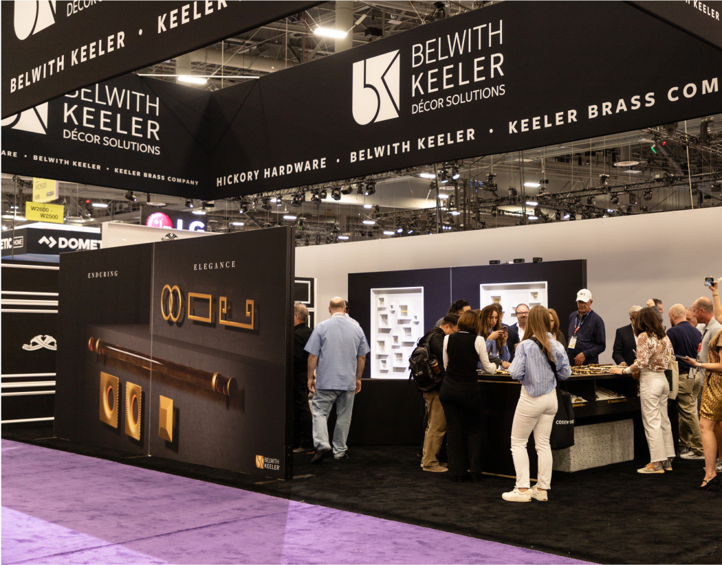
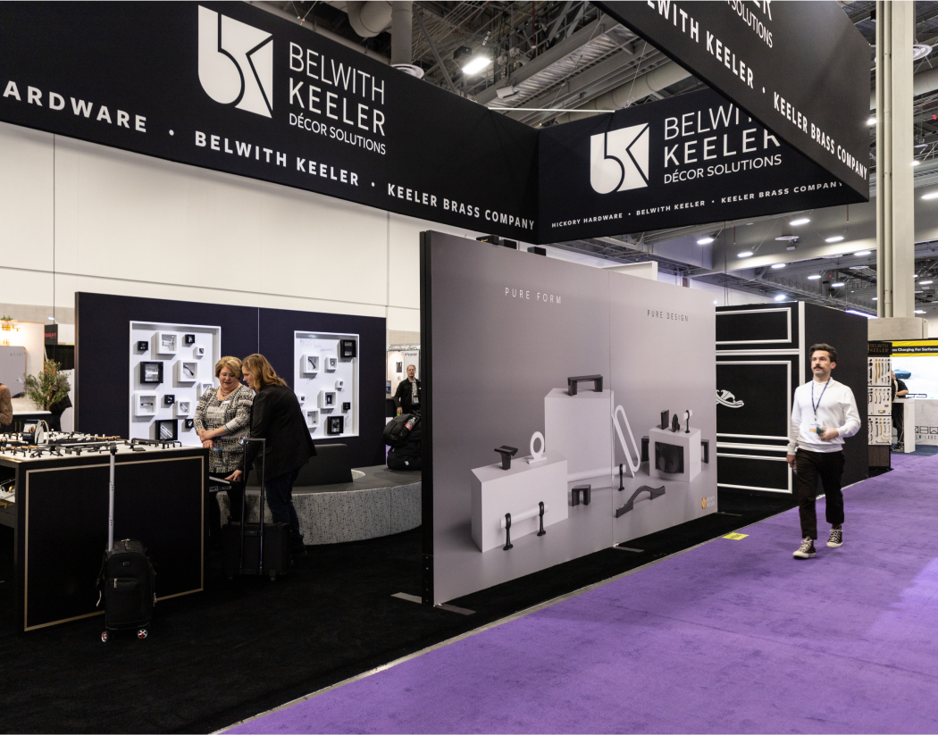
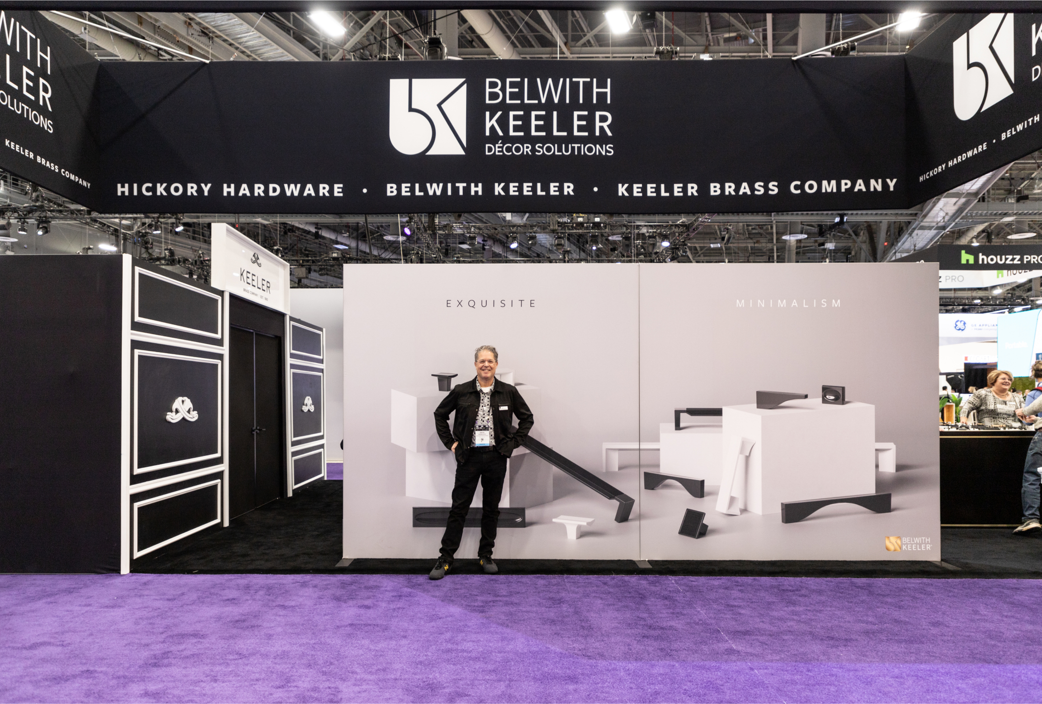
Interior Renderings
In addition to the booth wall graphics, we needed interior renderings to stand in for physical products that wouldn't arrive in time for a photoshoot.
Using the same approach as with the wall graphics, I collaborated with Anastasiya to establish visual benchmarks and moodboards. This guided the creation of interior renderings that accurately reflected the style of each collection. Below are the outstanding results of our collaboration.
