

Portfolio
Terra Alchemists
- 2024
- Packaging Design
- Logo Design
- Brand Identity
Challenge
Showcasing certain types of work in your portfolio may not always be feasible due to client confidentiality agreements. Encountering this challenge with packaging design for a specific client, I proactively addressed the gap by conceptualizing and developing a brand of my own. Inspired by renowned companies under the DECIEM umbrella, I created Terra Alchemists—a brand with a distinct focus on science-backed skincare and fragrances.
Approach
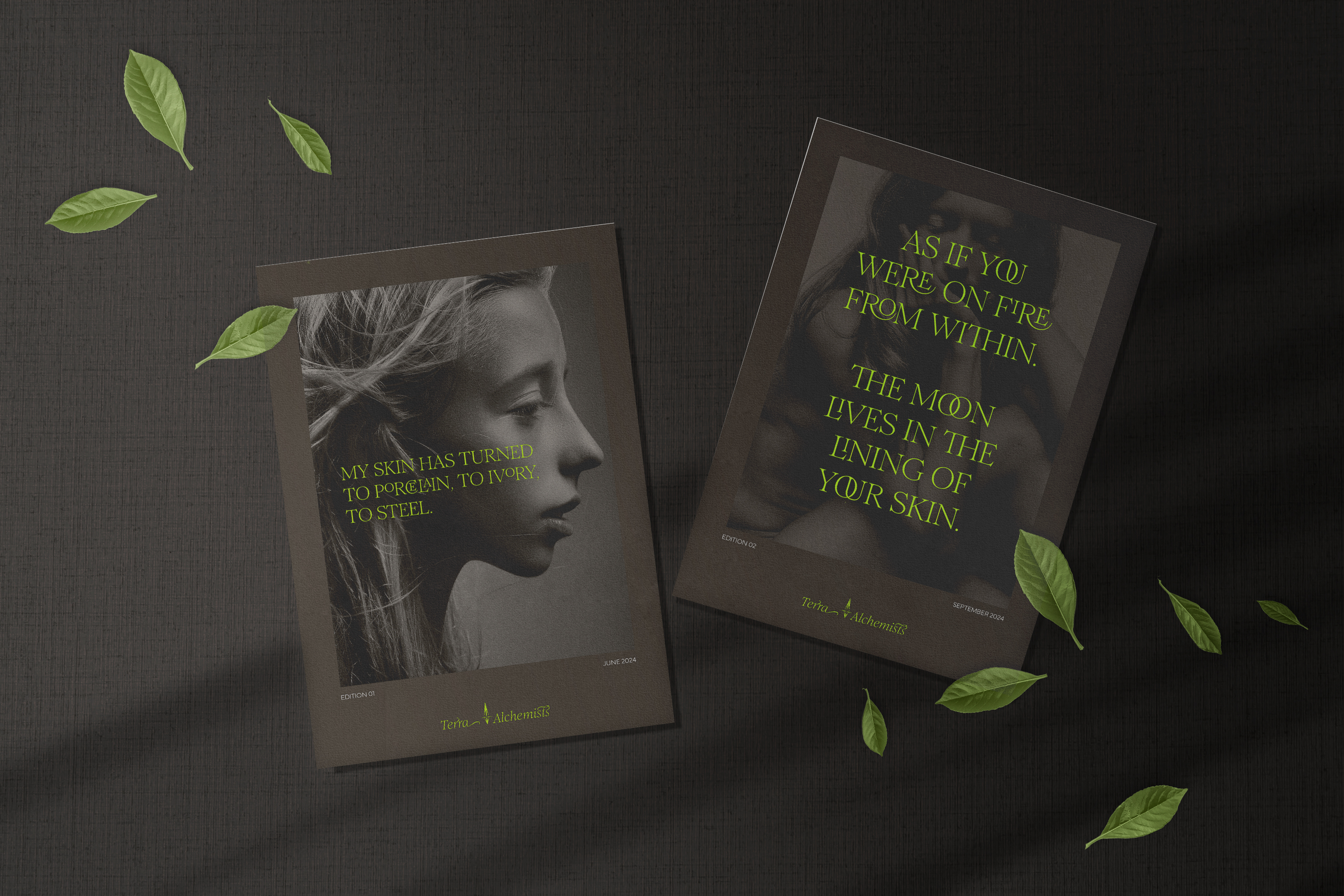
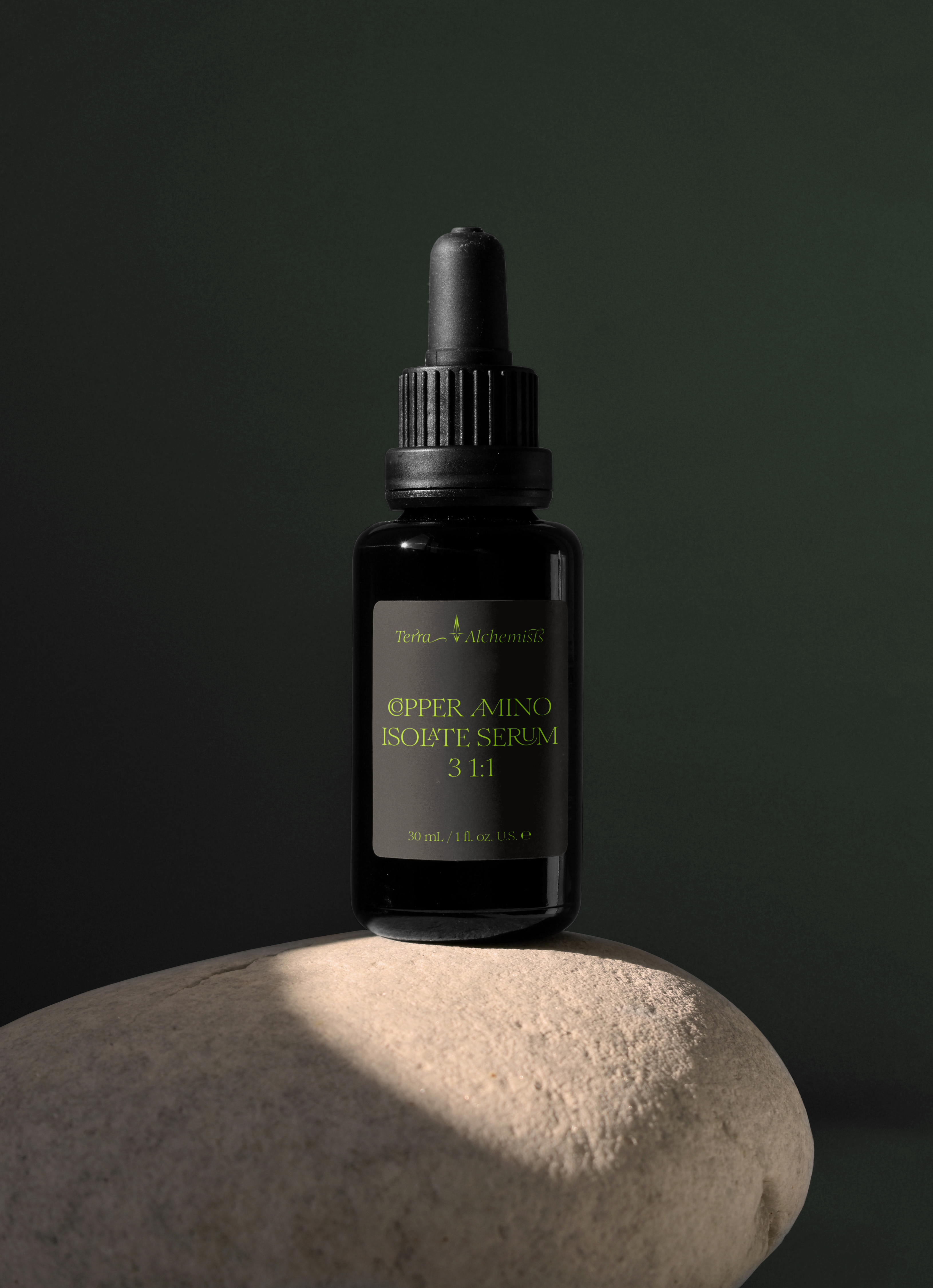
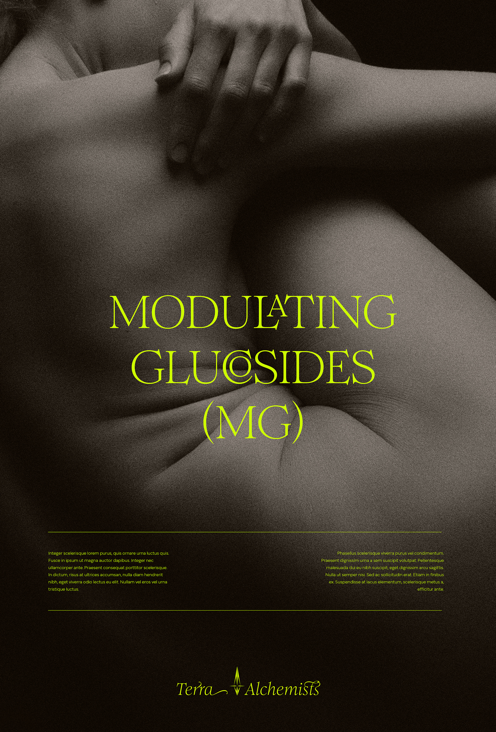
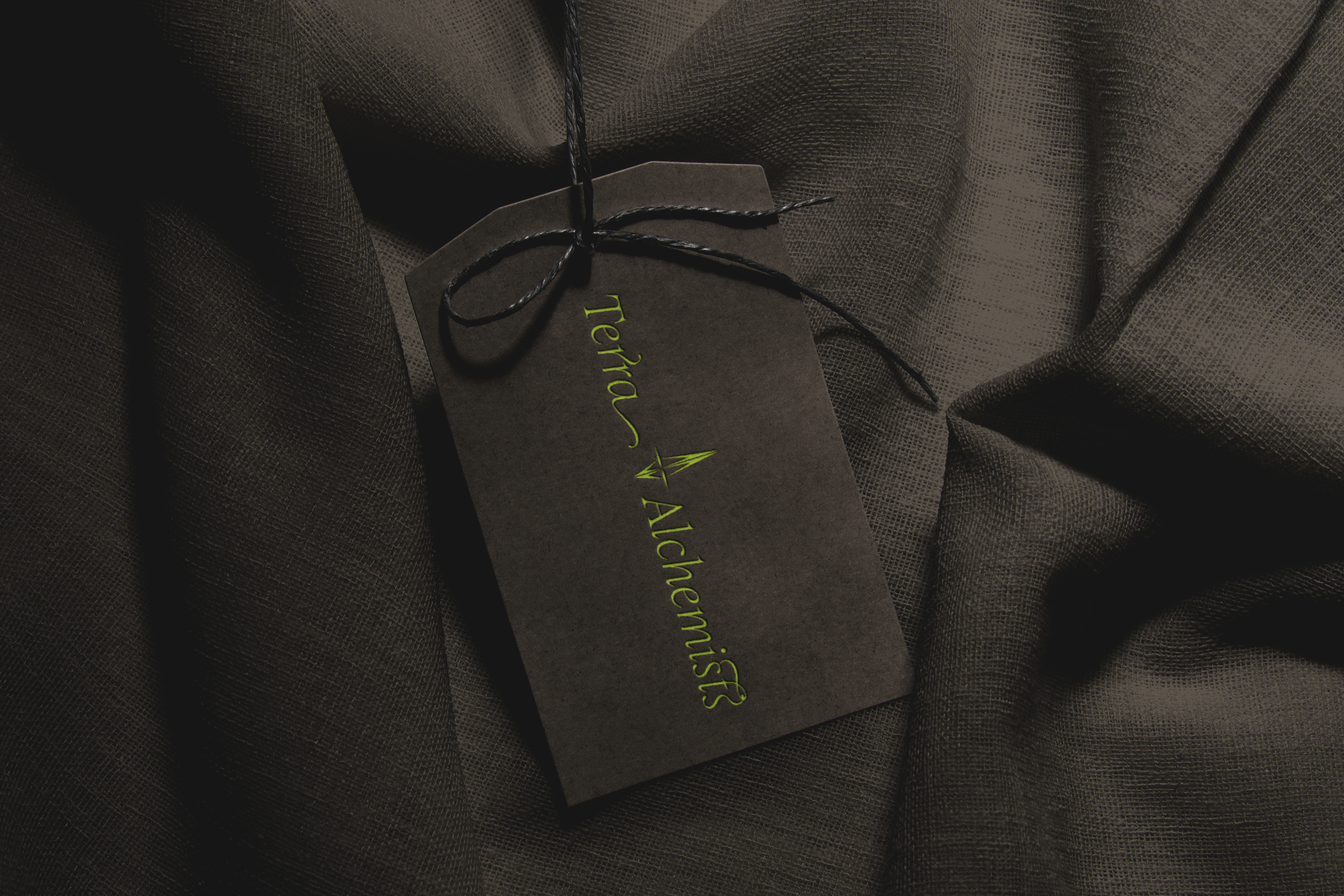
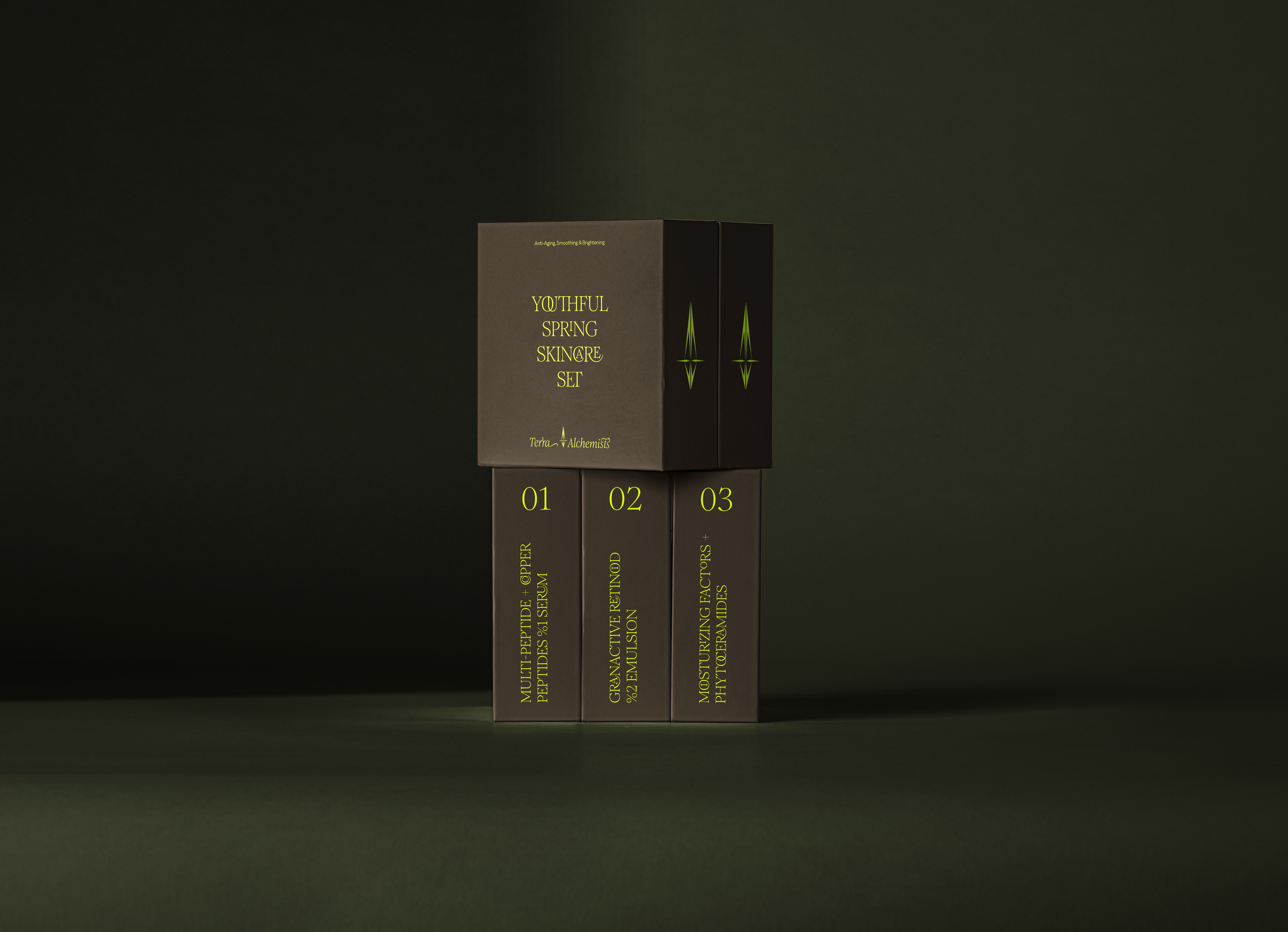
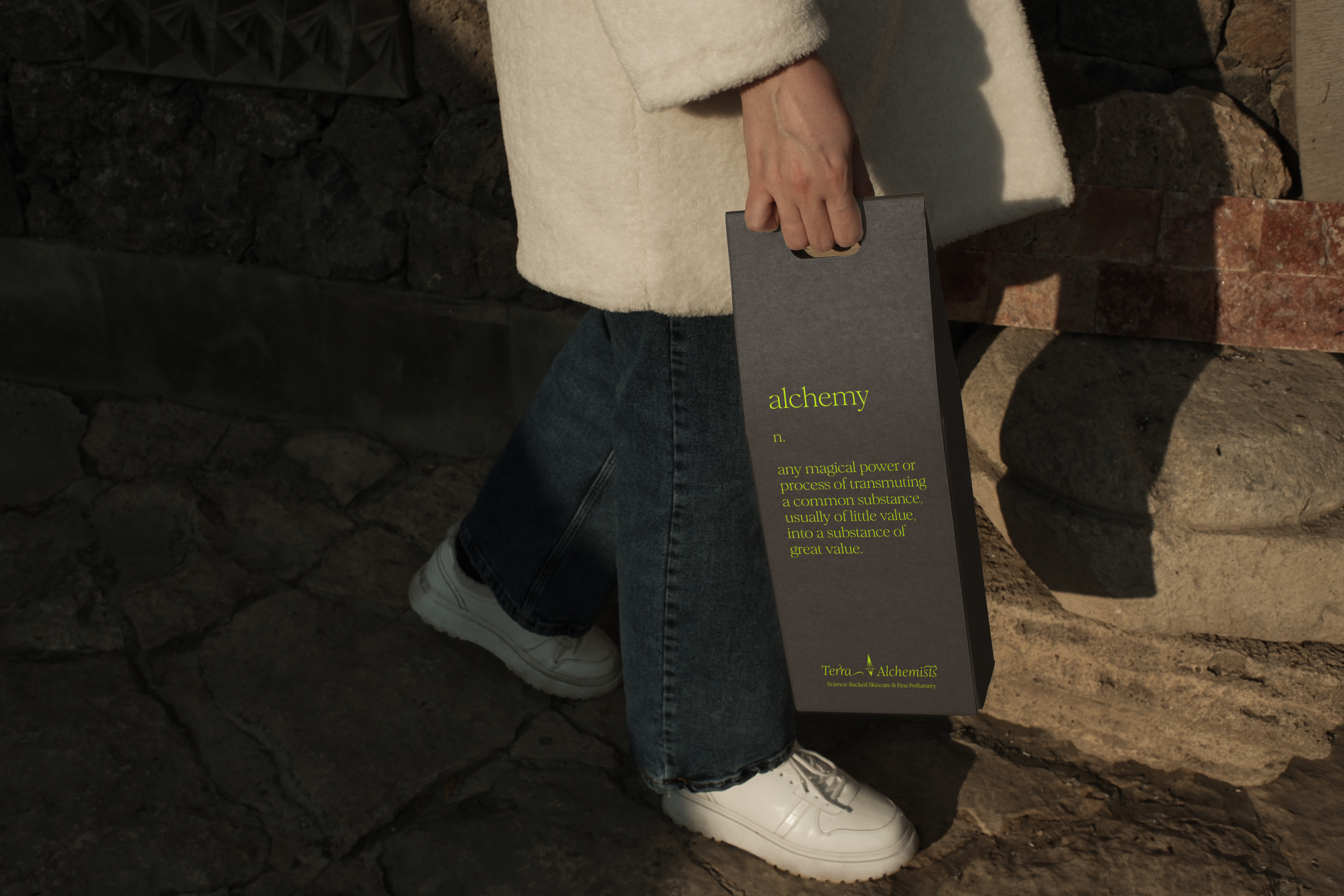
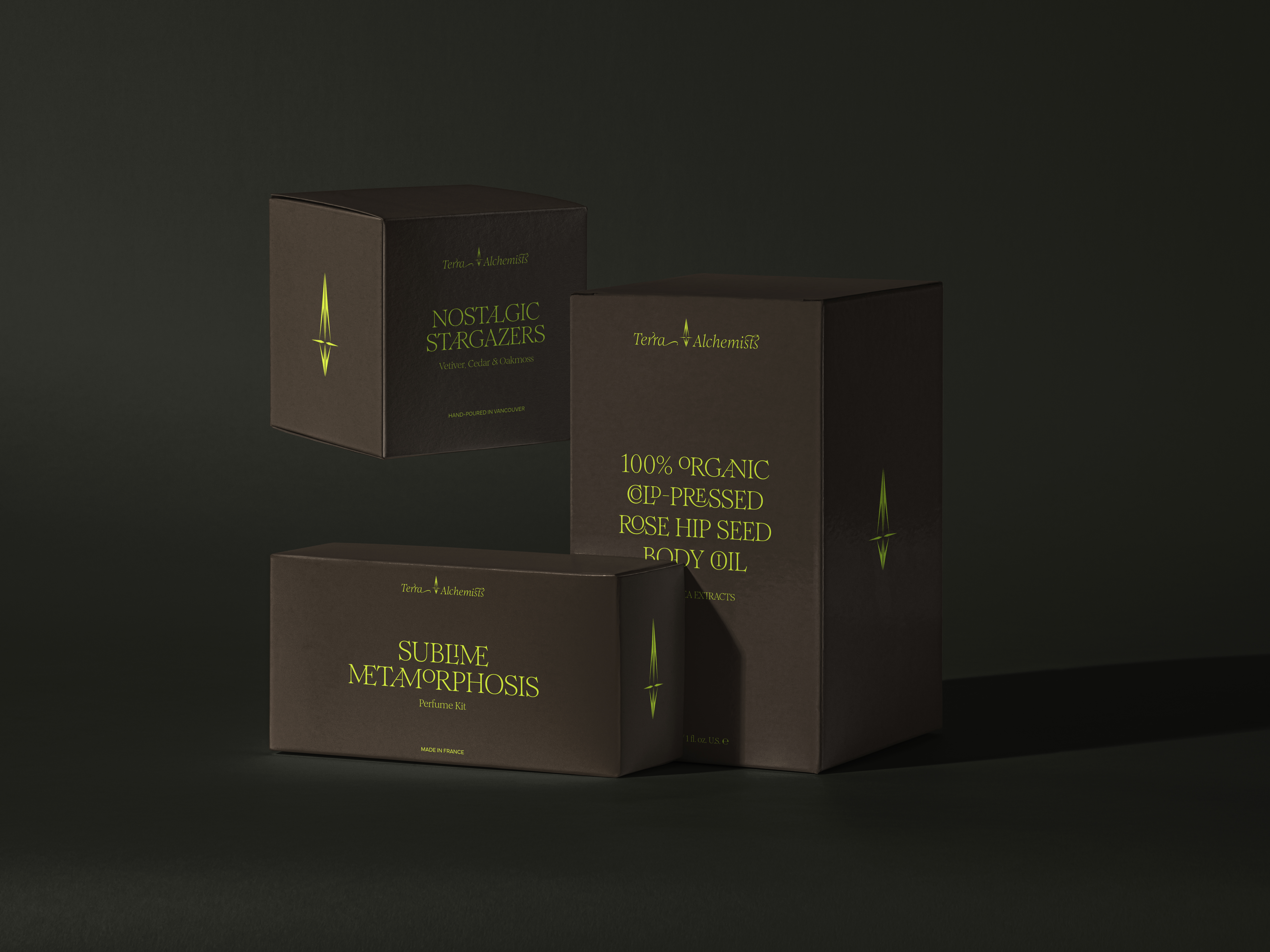
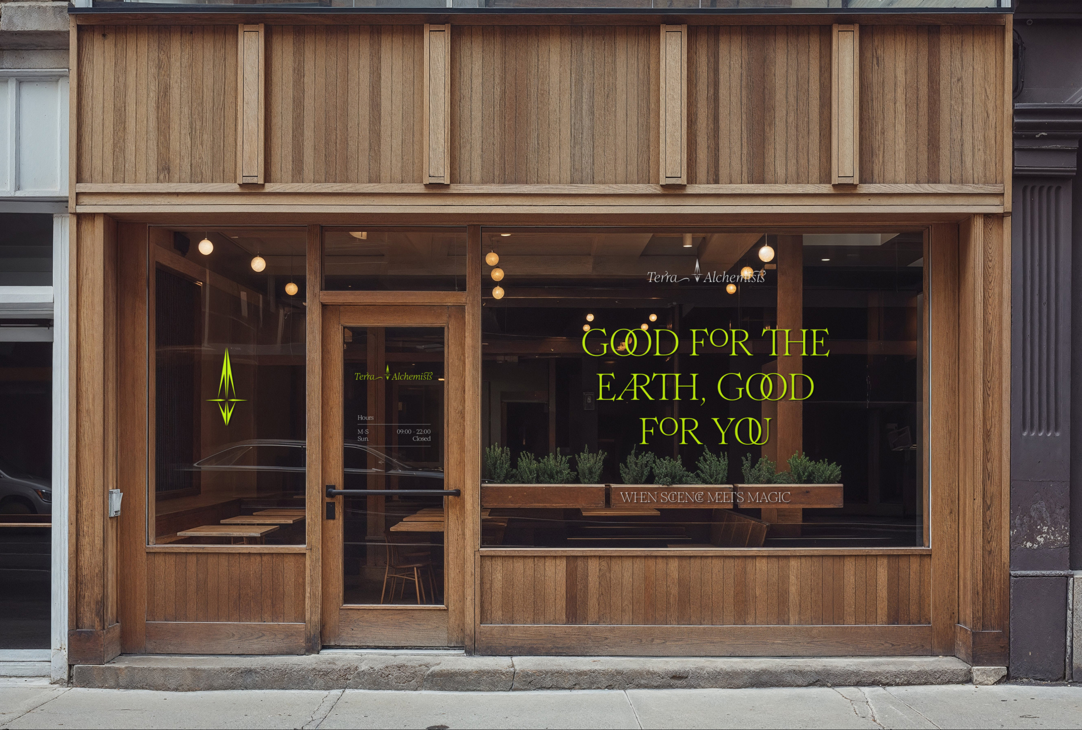
My close friend and I indulged in a touch of nostalgia, revisiting a once-prominent hue from my past work and wardrobe: Hex #CCFF00, a vivid lime green with a dominant yellow undertone. To balance and enrich this vibrant color, I juxtaposed it with deep, earthy hues like anthracite and brown, complemented by colors like mossy sage and olive green. Additionally, I stumbled upon a captivating font boasting an array of intricate ligatures, which I integrated into the project.
The Font that Started it All
Romie is a stunning font designed by Margot Lévêque. When I first encountered it in application through a website, I knew I had to have it and find an excuse to use it. Terra Alchemists was the perfect project to start playing with a typeface that had such a wide array of fun ligatures and weights to explore.


The Litmus Test
While Romie is a great font, to make it practical of packaging application, a true sans-serif would be needed to define small type items such as disclaimers or product make and sizing. For this, I selected Mundial, a complementary but clean font that would take on the supporting role of complementing the star.
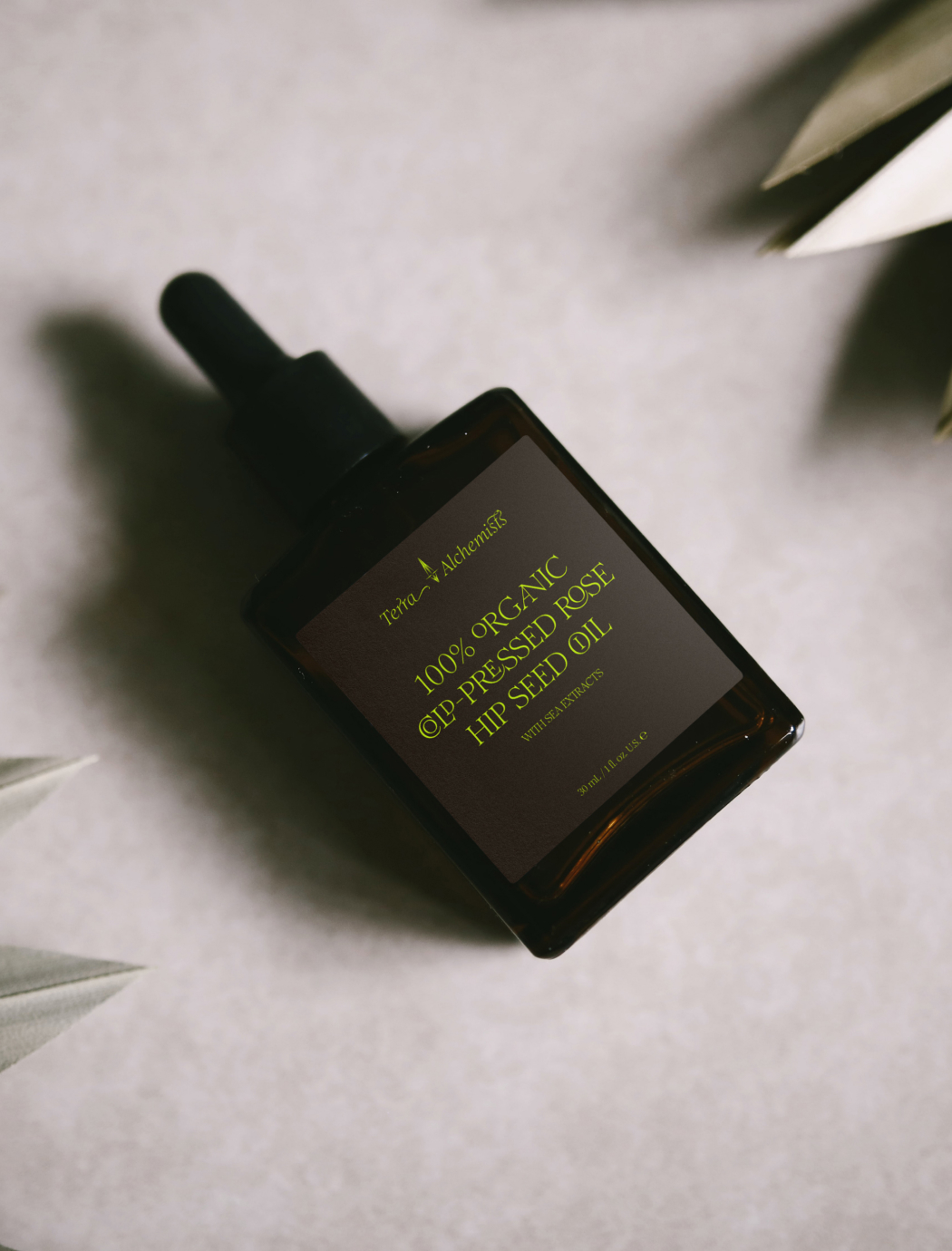

Eco-Friendly Packaging
In keeping with the name, but also for brand ethos reasons, for which “Terra” means earth, it made complete sense for the packaging to be primarily paper-based, biodegradable and recyclable.
The Brand Aesthetic
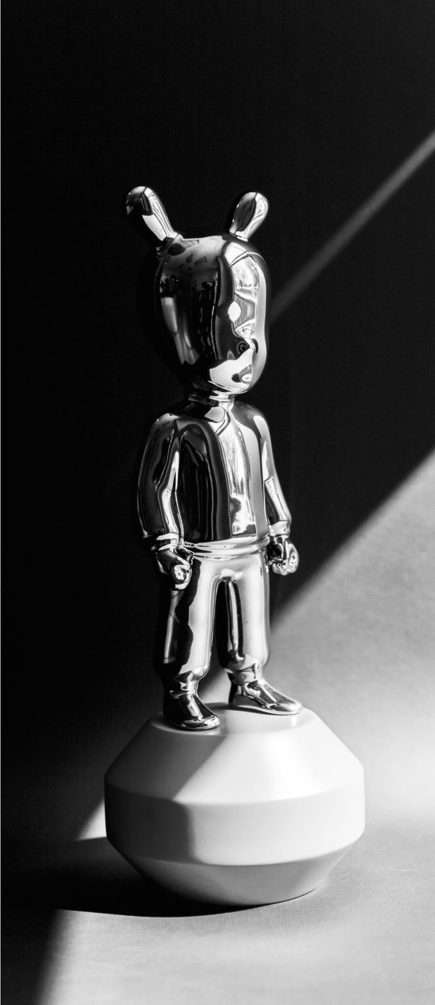
The earthy color palette for the brand lent itself well to sepia, a timeless photography style that veers away from conventional black and white tones, instead accentuating rich brown hues.
The look lends a softness and warmth to the imagery that feels both cozy and nostalgic.
The original photography was done in black and white and was adjusted to have the sepia appearance.


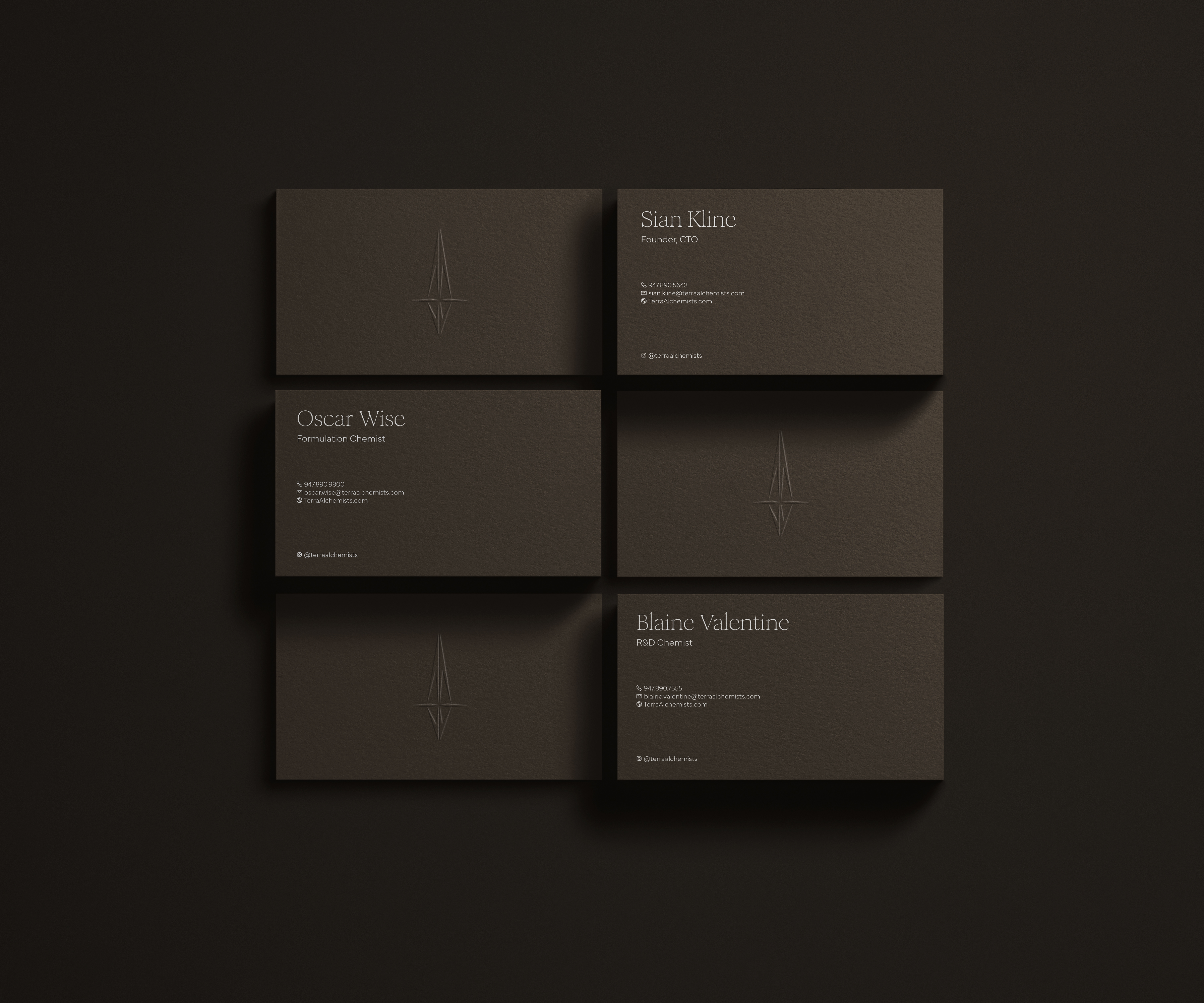
Business Cards
For clients that desire a minimalist card, every other detail must make an impression. A thick cardstock was selected, followed by a slightly off-white foil to complement the warm color palette and finished with a delicious heavy emboss on the Terra Alchemists’ logomark.


01
About
An area describing what this site is all about, who I am and how I came to be.

02
Portfolio
The most important aspect of the site, a select catalog of works spanning over a decade.


03
Blog
An amalgam of my creative explorations, activities, musings and discoveries.


04
Music
Music is one of the most vital ingredients to my creativity and inspiration. Visit this page to listen to some tunes.


05
Contact
I am always looking to connect with other talented individuals. Reach out for collabs,freelance, or other opportunities.