Portfolio

Brew Press
- 2024 - 2025
- Logo Design
- Brand Identity
- Packaging Design
Challenge
This project involved creating a logo, developing a cohesive brand identity, and designing packaging for a boutique print company in Grand Rapids, Michigan. The business caters to small, local enterprises by offering custom, handcrafted printing and bookbinding services. The company's name, coined by its founder, reflects his passion for tea and coffee, emphasizing the precise, thoughtful process of brewing a perfect cup—qualities mirrored in the meticulous attention to detail found in handmade printing.
Approach
I was given creative freedom in designing the logo and selecting the color palette, with the only guideline being the founder’s desire for a fun, playful, and lighthearted aesthetic. Drawing on my knowledge of the founder’s preferences, I chose colors that would resonate with them while also encouraging them to step outside their comfort zone. To bring the brand’s personality to life, I introduced a character mascot as the centerpiece of the design. Complementing the logo, I selected unique fonts with distinctive letterforms, ensuring individuality and versatility across applications—from eye-catching large-format advertisements to finely crafted business cards.
The Mascot
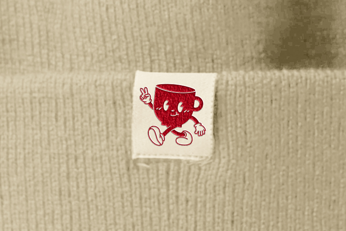
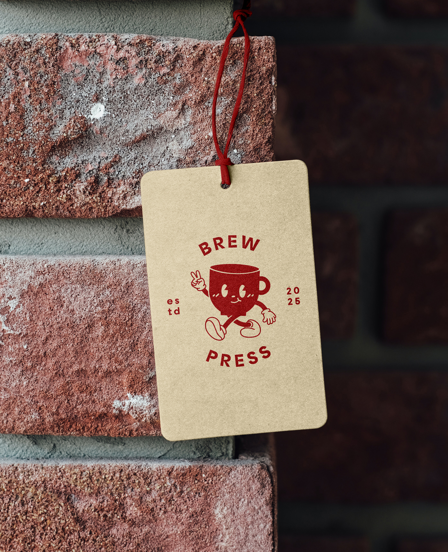
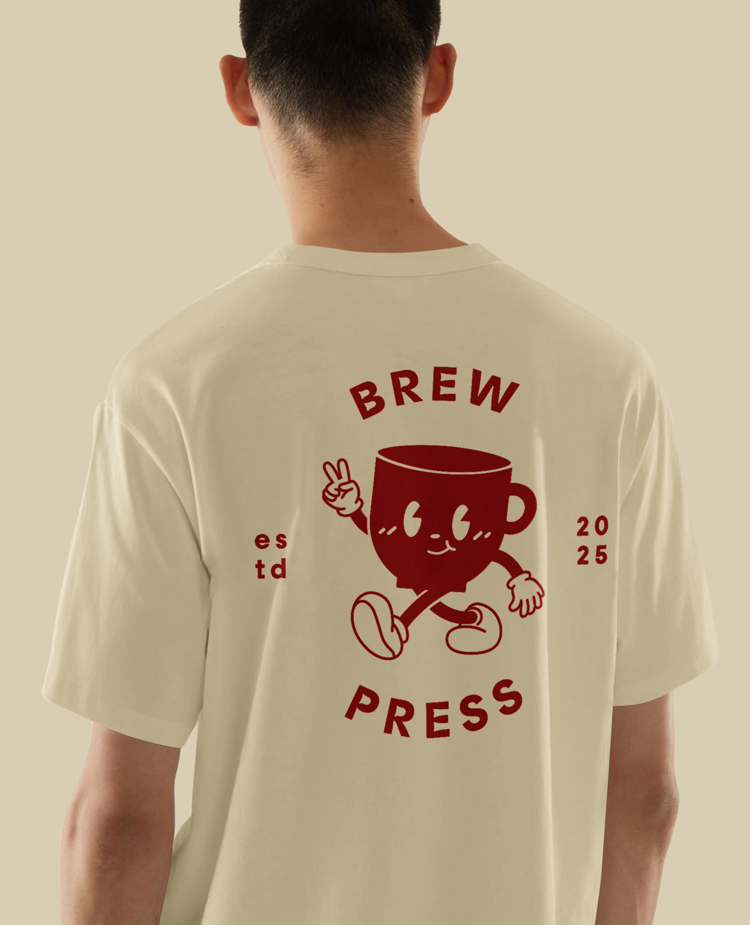
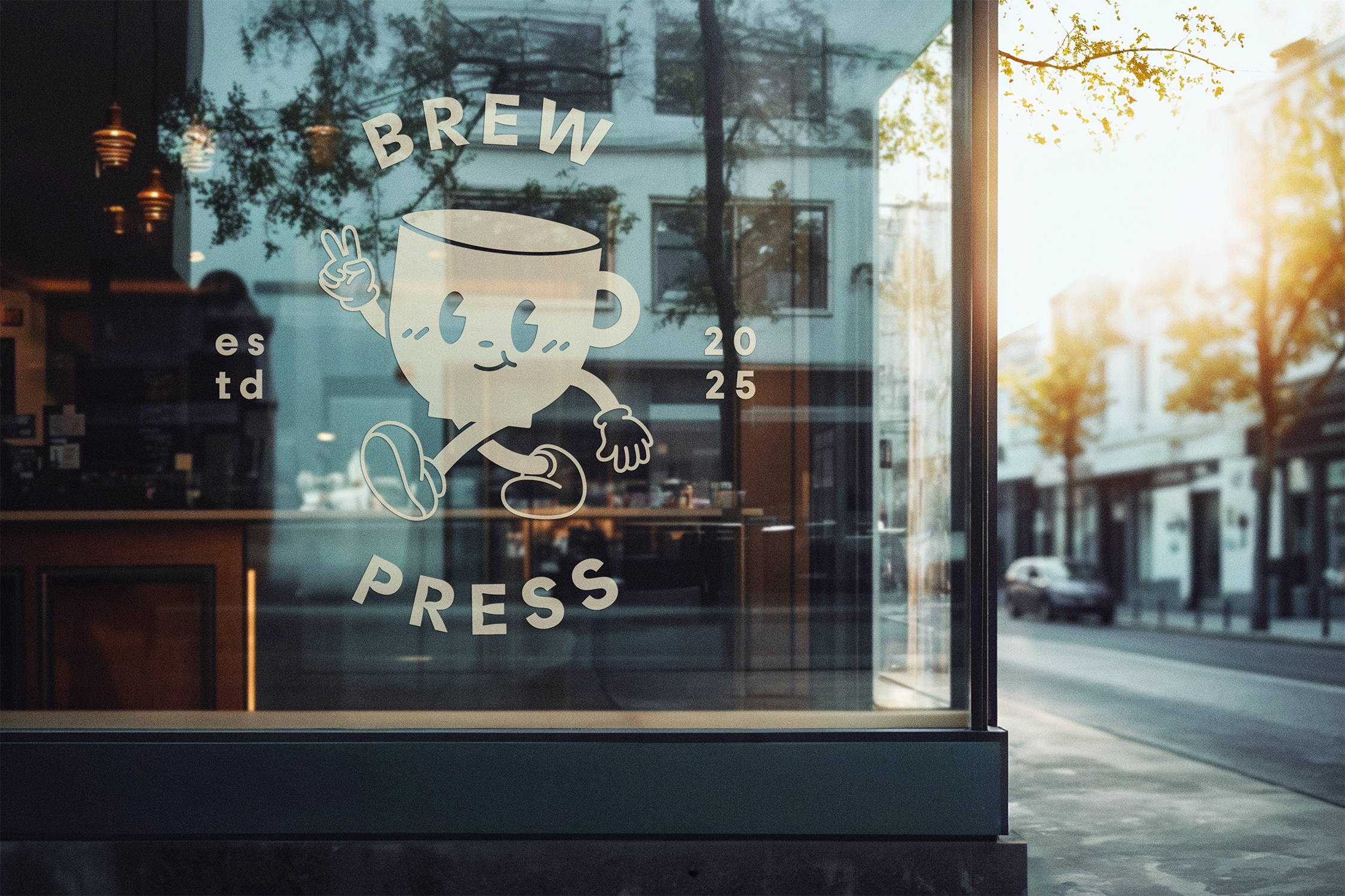
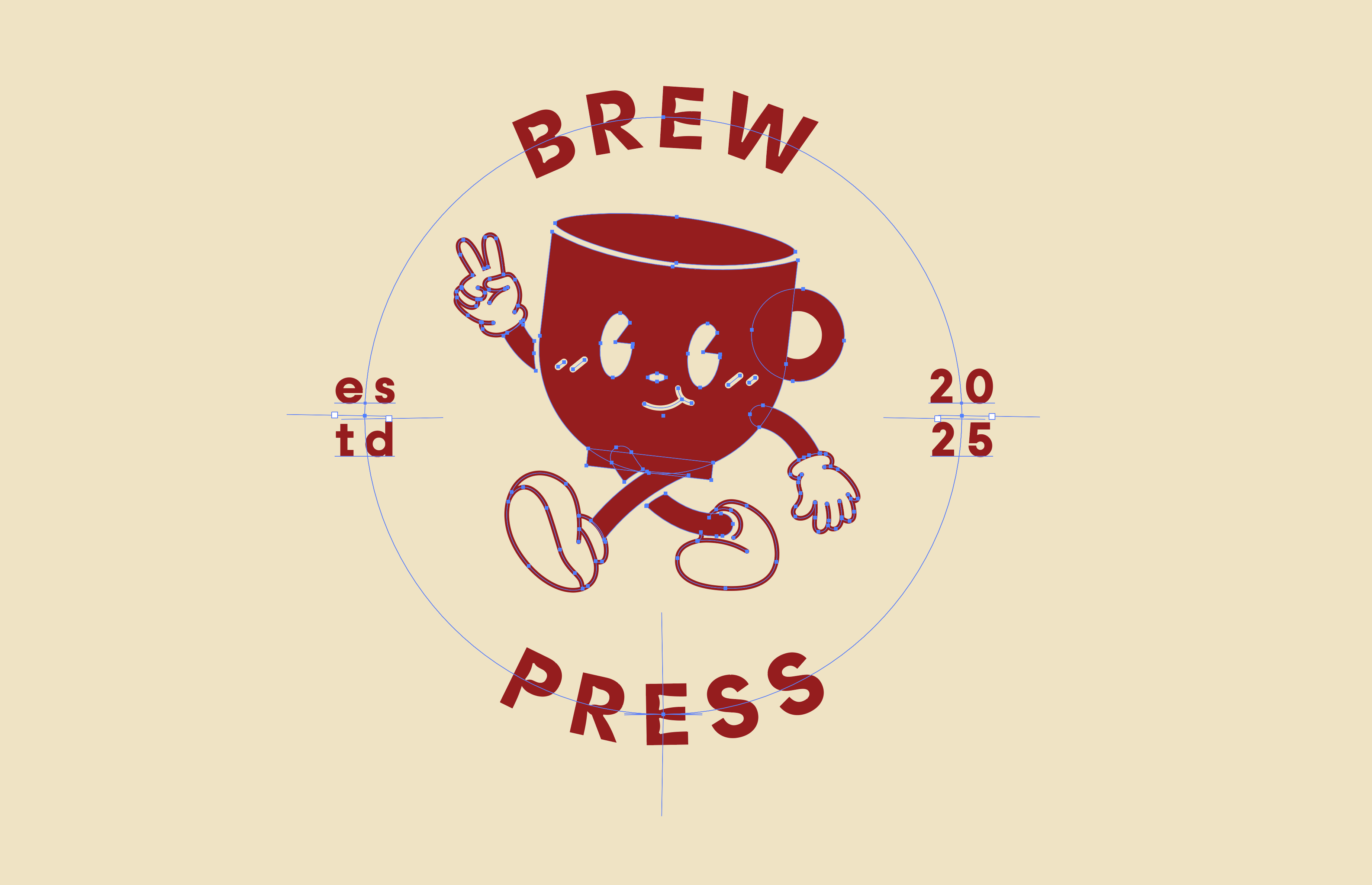
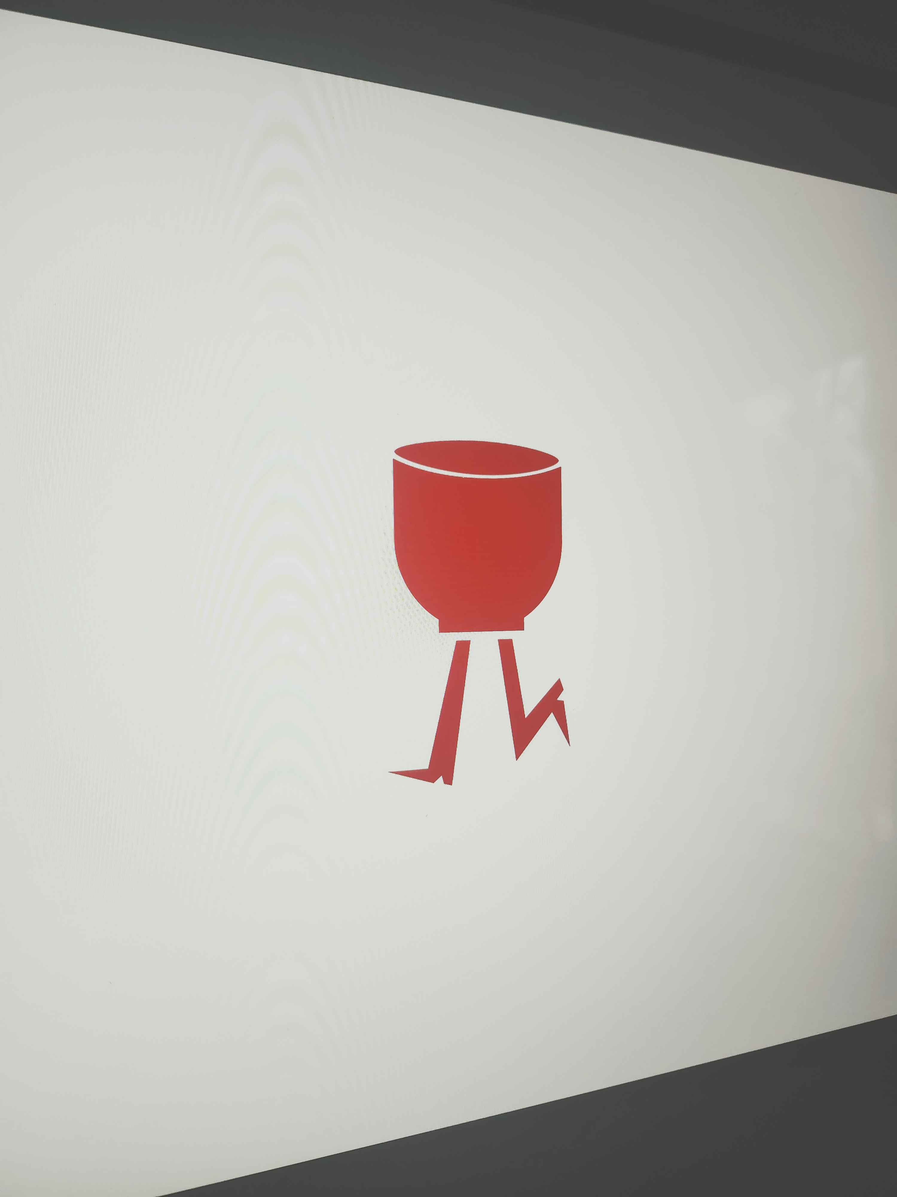
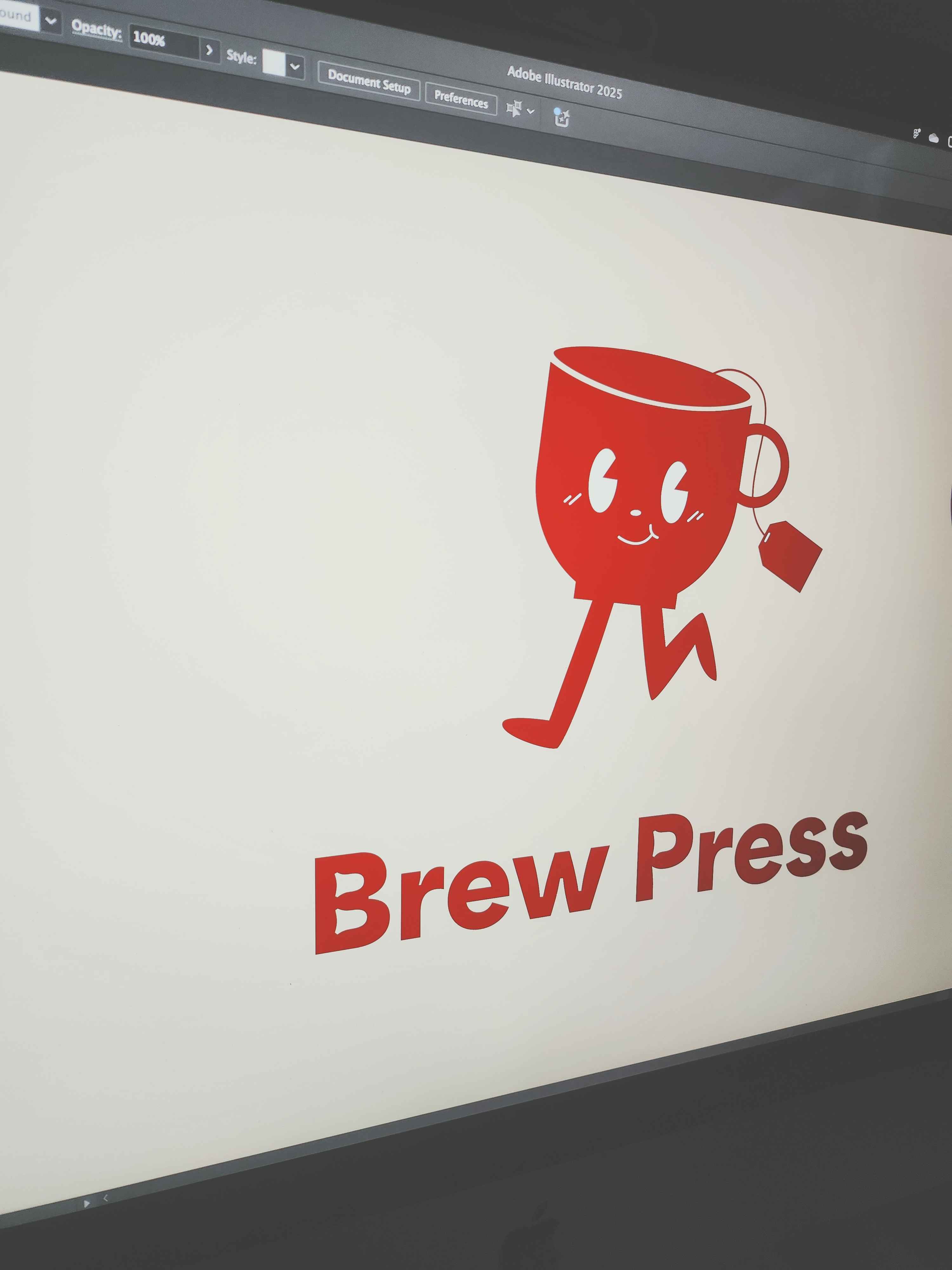
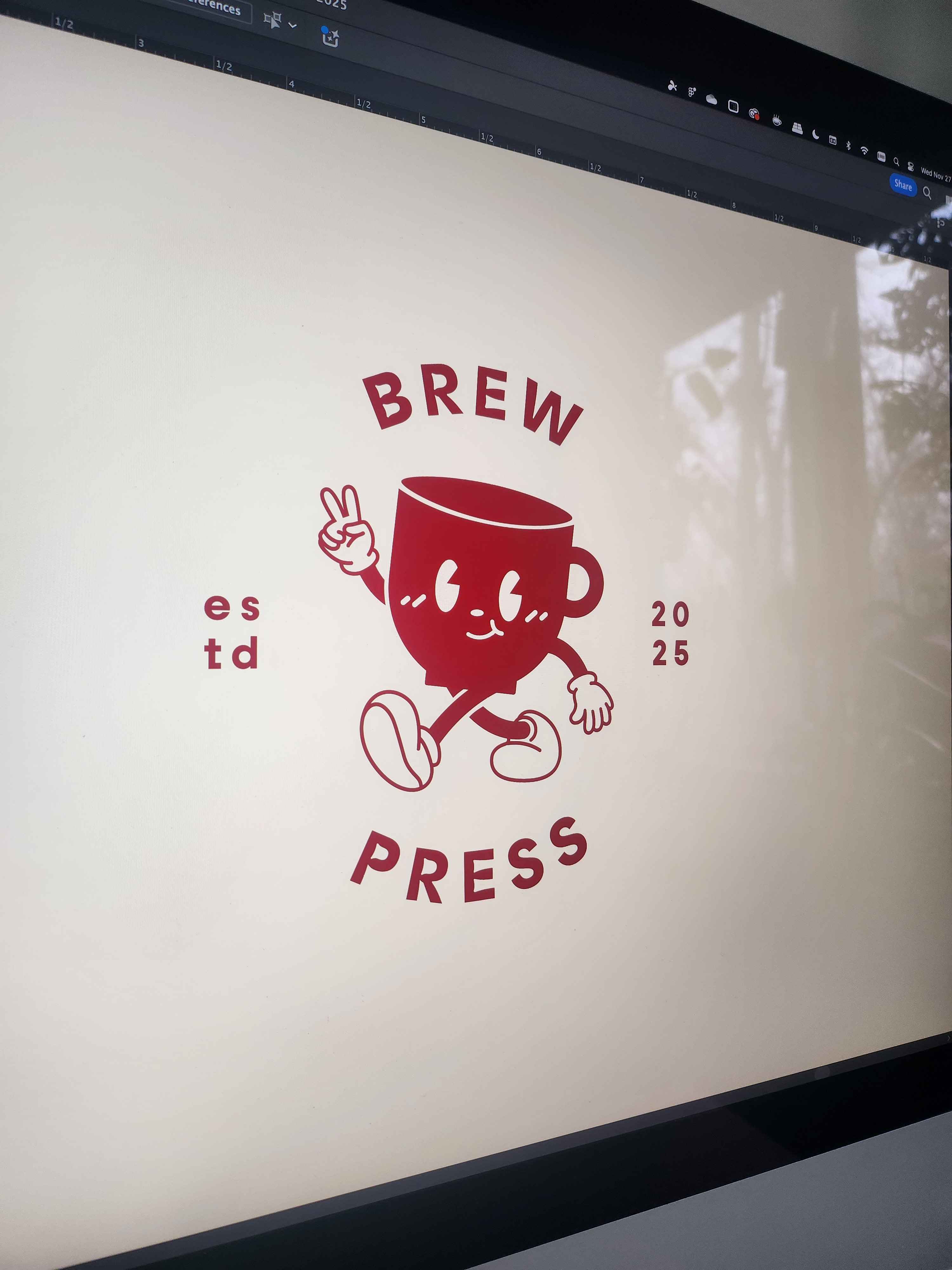
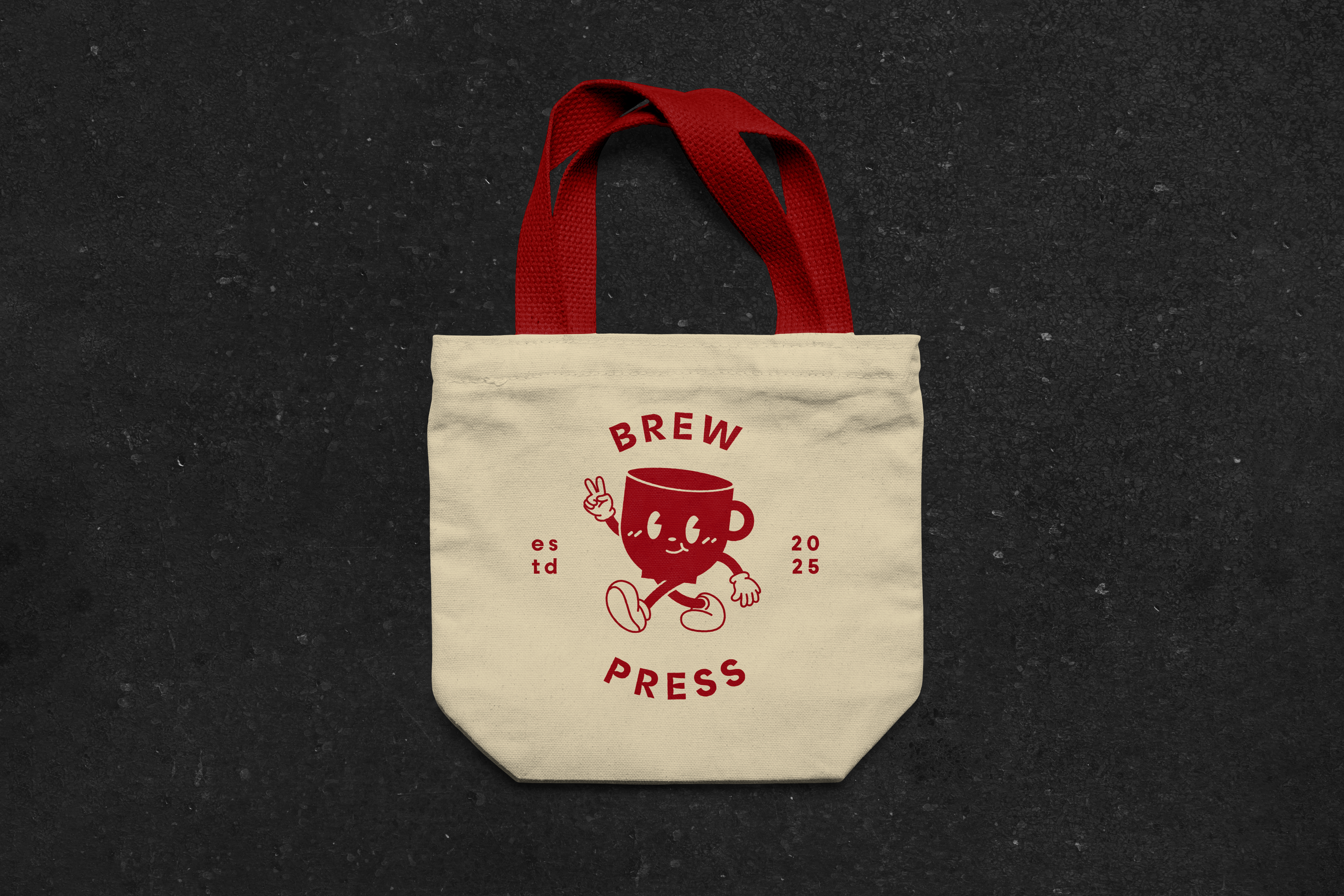
The character evolved through numerous iterations during the design process. What began as a simple, static silhouette of a teacup or coffee mug gradually transformed into a lively and engaging mascot. Adding legs was the first step in bringing the design to life, followed by expressive arms, hands, and a cheerful face. The design was meticulously refined—scaling elements, adjusting details, and thickening facial features to ensure clarity at smaller sizes. The legs and shoes were reworked to harmonize with the arms, creating a cohesive and balanced style. Inspirations included Cuphead, retro Western cartoons, and the minimalist mascots often found in cafés and snack brand logos across Korea, Japan, and Singapore. The final character design, affectionately named "Brew," blends retro Western cartoon charm with subtle Eastern kawaii aesthetics, resulting in a mascot that feels both nostalgic and contemporary, and above all, friendly and approachable.

Stylescapes
To establish a clear visual direction for the brand, several stylescapes were developed. These served as a quick and effective way to explore and showcase the potential variations of the logo mascot, color palette, typography, and overall aesthetic. This exercise facilitated a creative sprint, generating ideas for the brand’s tone and visual hierarchy while laying the groundwork for initial advertising strategies and copywriting. The stylescapes also provided a framework for experimenting with font usage and hierarchy.

Packaging Suite
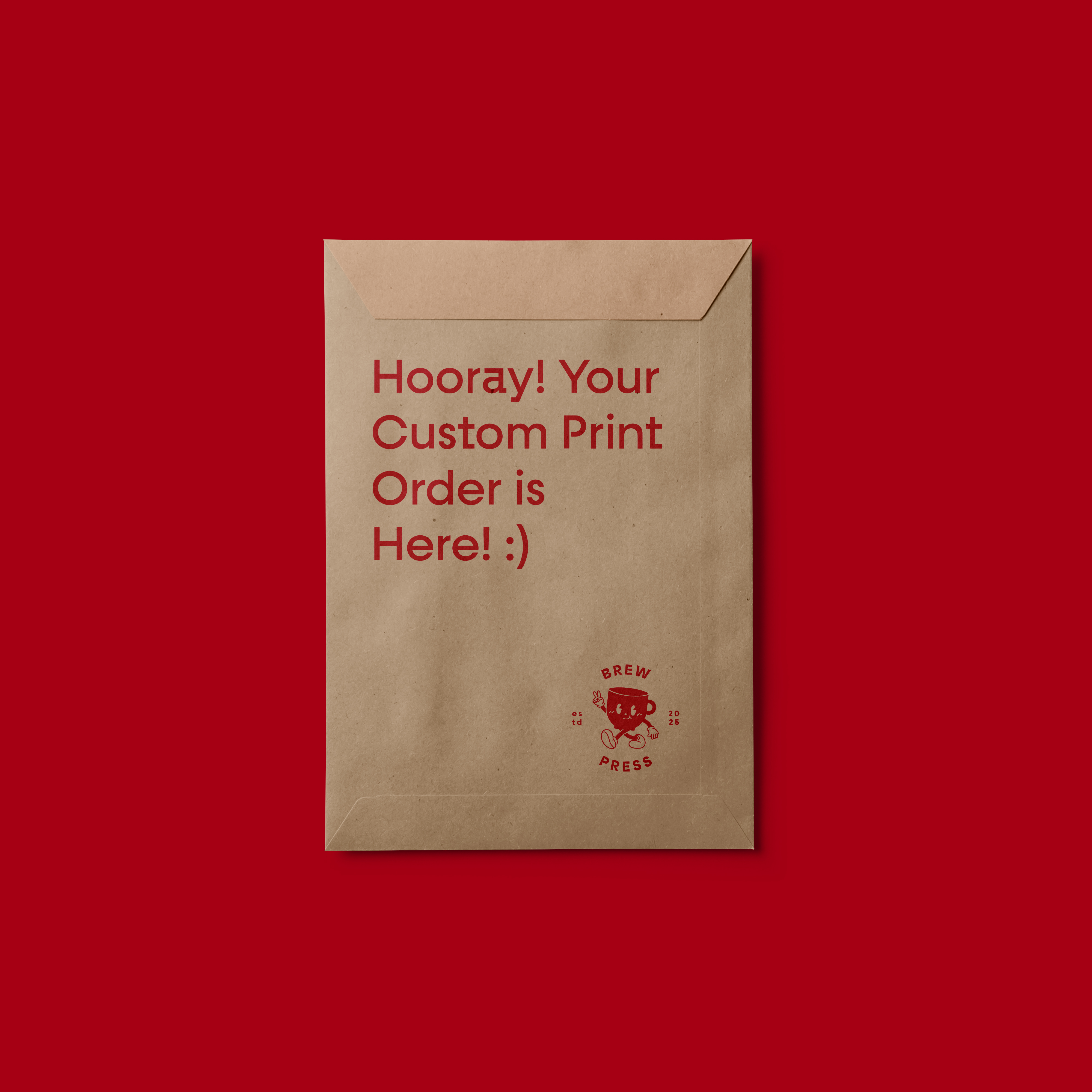
To accommodate the diverse range of deliverables Brew Press provides to its clients, a unified suite of branded packaging was developed. This included custom-branded packaging tape, mailers, stickers, and paper bags, all designed to reflect the brand's playful yet professional identity. The packaging prominently features the signature red and cream color palette, paired with the mascot logo to ensure immediate brand recognition. Each element was designed with versatility and practicality in mind, balancing functionality with aesthetic appeal. From the bold, eye-catching tape used to seal shipments to the detailed sticker designs that add a personalized touch, every piece reinforces the thoughtful, handcrafted ethos of Brew Press while creating a memorable unboxing experience for its customers.




Apparel & Merch
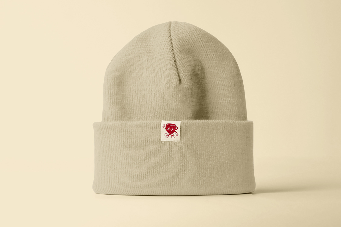
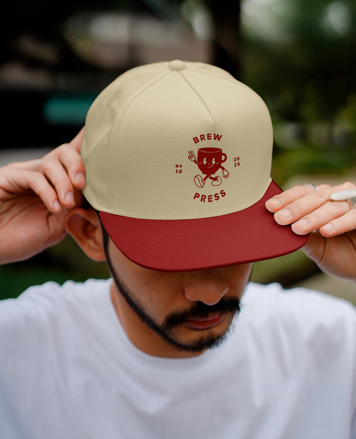
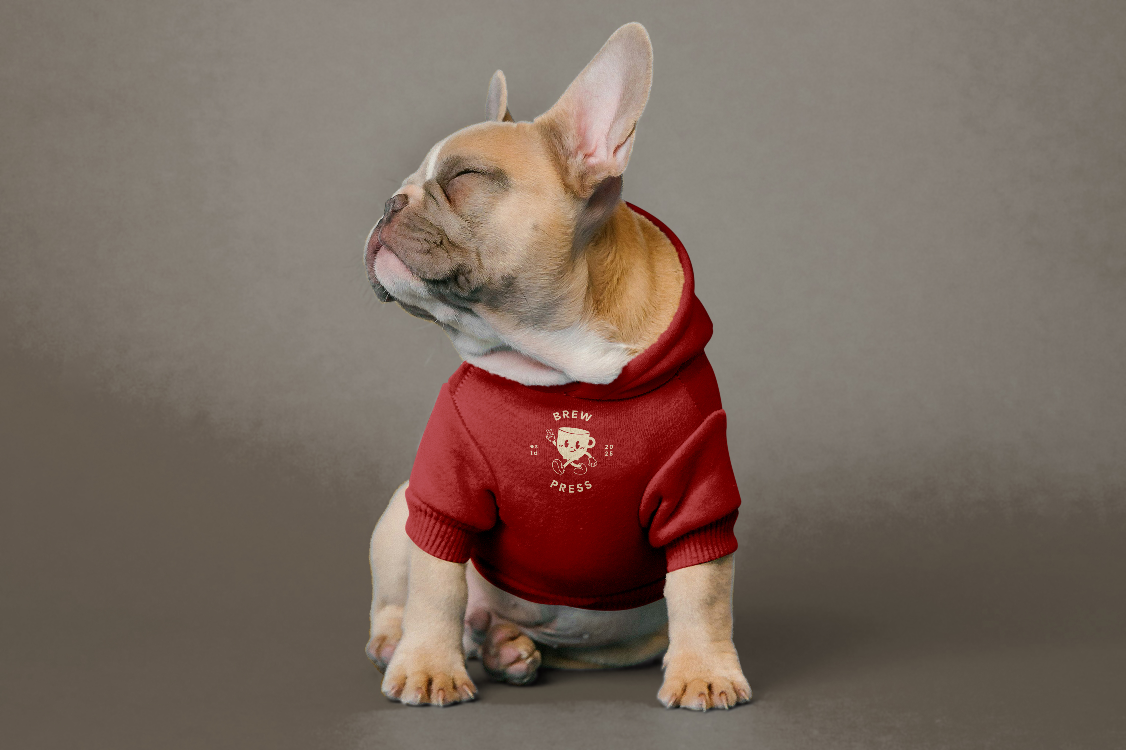
To further extend the brand’s reach and incorporate the founder's background in graffiti culture, a range of apparel and merchandise was designed with a focus on streetwear aesthetics. This collection includes beanies, snapback caps, and t-shirts, each thoughtfully designed to align with the brand’s fun and playful identity while maintaining a bold, urban edge.
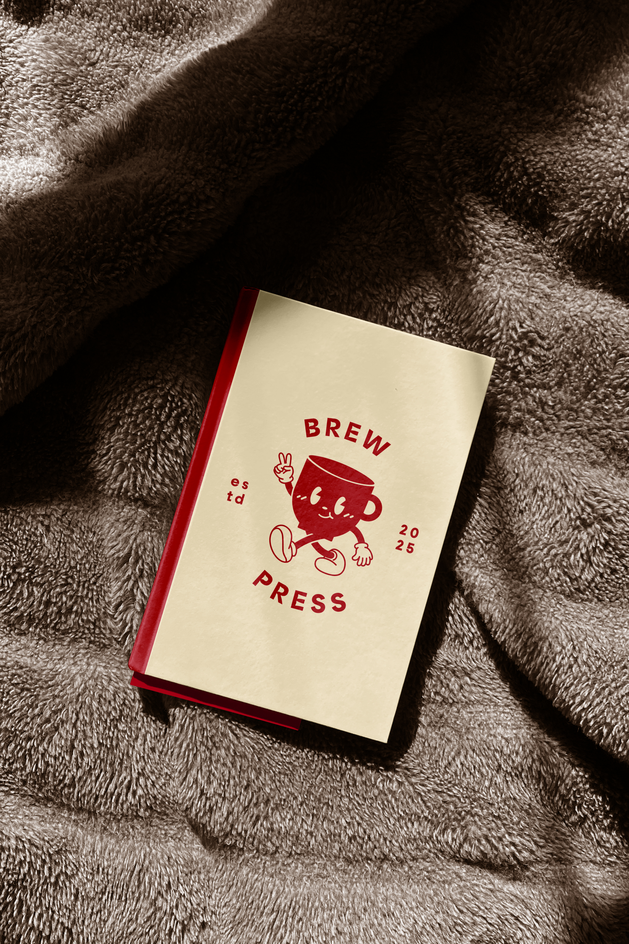
Additionally, hand-bound and stitched sketchbooks were introduced as a nod to the brand’s dedication to handmade craftsmanship. These sketchbooks were designed to complement the apparel line, complete with custom-branded retail tags that tie the collection together. The collective blend of streetwear and artisanal details positions the merch as both functional and stylish. The project is ongoing, slated to launch in 2025.
