

Portfolio
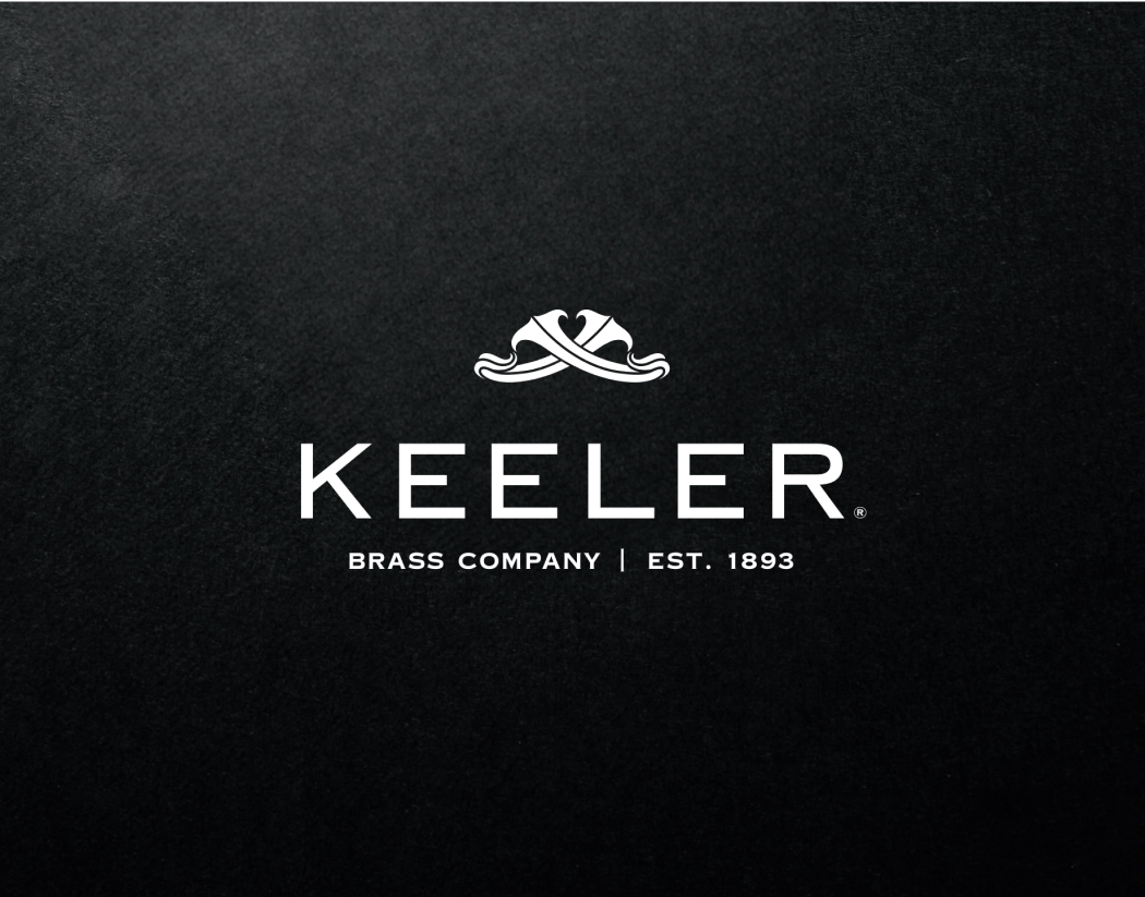
Keeler Brass Company
- 2022 - 2024
- Brand Identity
- Art Direction
- Content Development
Challenge
Commencing in late August 2022 and slated for completion by year-end, the branding identity project demanded meticulous attention to detail. It necessitated the cultivation of a unique aesthetic distinct from our existing brand offerings. Tasks included crafting a logo, developing a visual brand guide for cohesive execution across PR and social media platforms, designing packaging, orchestrating photoshoots and post-production and concurrently producing a 40+ page printed lookbook alongside website development.
Approach
Amidst this compressed timeline, my focus was on cultivating a deep understanding of the future trajectory of the Keeler Brass Company brand. Securing alignment from key stakeholders and ensuring accountability to the envisioned brand essence were paramount at every stage.
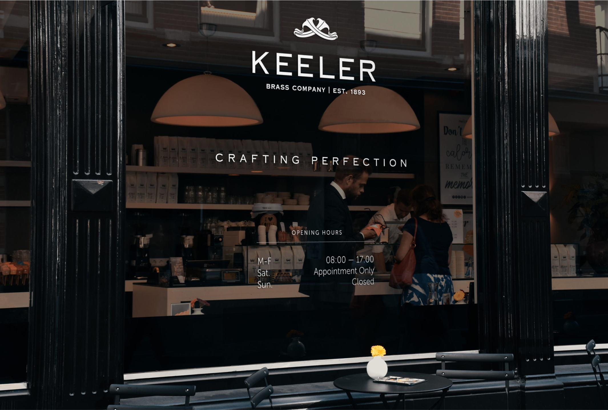
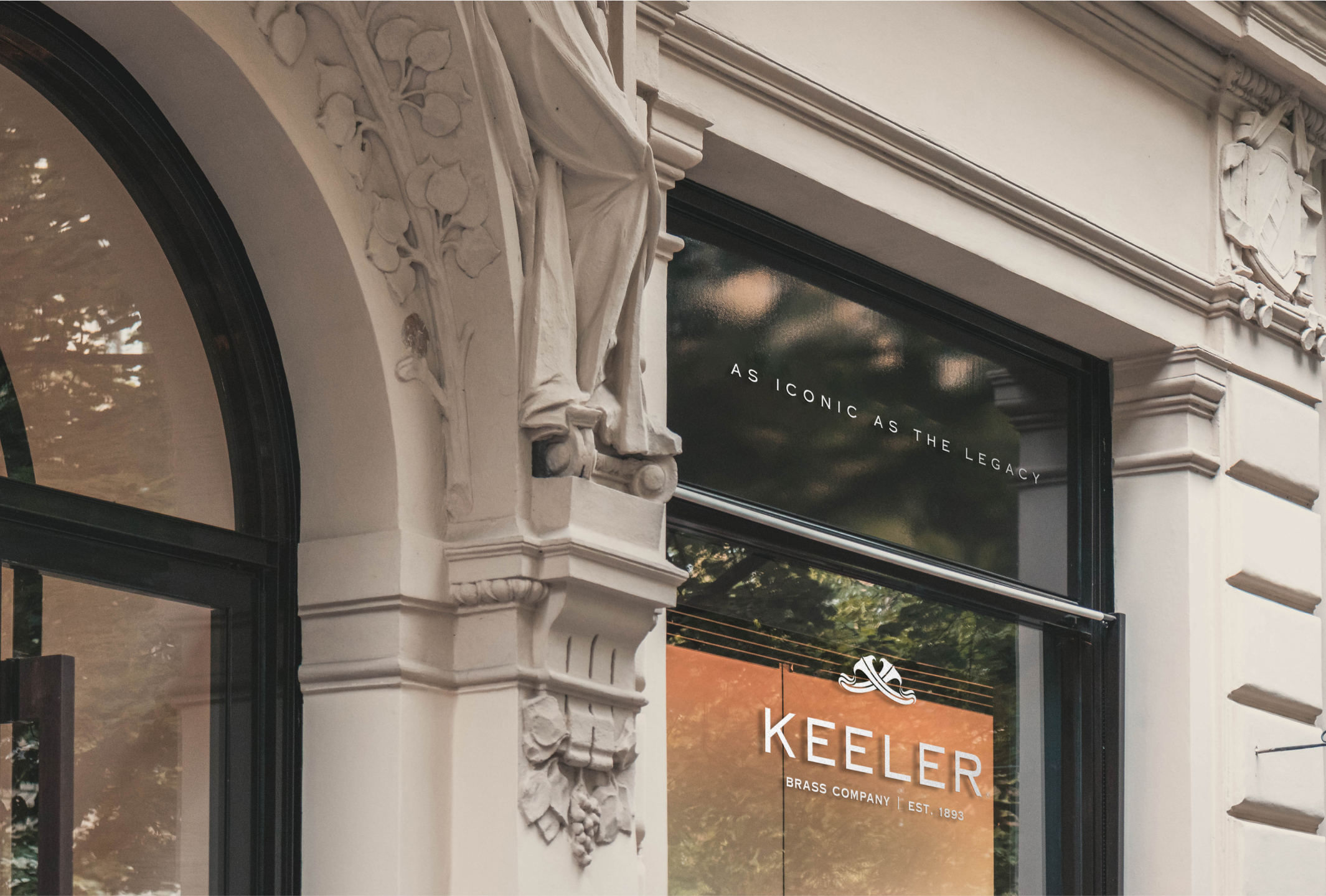
Forging a Brand Identity
Established in 1893, Keeler Brass Company (KBC) has a rich history spanning over 130 years. The impetus for our rebranding journey was sparked by a unique co-branding opportunity with a luxury appliance company.
As the principal designer, I spearheaded the research, development, and realization of KBC’s brand identity, overseeing art direction, photography, and logo design. Collaborating closely with key stakeholders, I navigated an expedited timeline to breathe life into our brand’s creative vision.
Prep & Learning Journey
In the absence of a creative director and marketing director, I turned to a selection of invaluable resources for guidance. Essential reads included David Airey’s “Identity Designed,” Radim Malinic’s “Book of Branding,” Mark Miller and Ted Vaughn’s “Culture Built My Brand,” and Michael Evamy’s “Logo,” supplemented by a plethora of online articles and resources that informed my research journey.

Brand Alignment Sessions
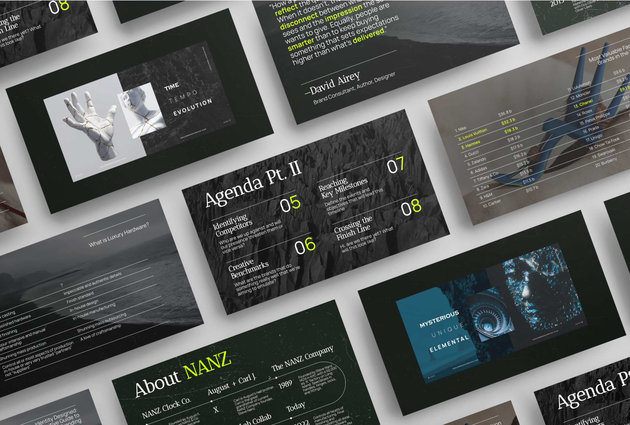
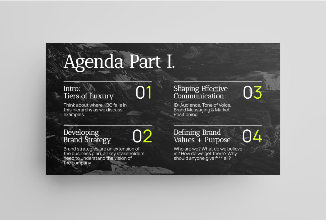
Given the size of our key stakeholder group, we conducted only a few comprehensive sessions to collectively discuss Keeler’s brand direction. To ensure efficiency, I meticulously crafted an extensive brand workshop and presentation, aiming for swift yet impactful progress. Securing democratic buy-in from all stakeholders was paramount, fostering a collaborative environment and preventing decisions from being made in isolation.
Brands to Watch
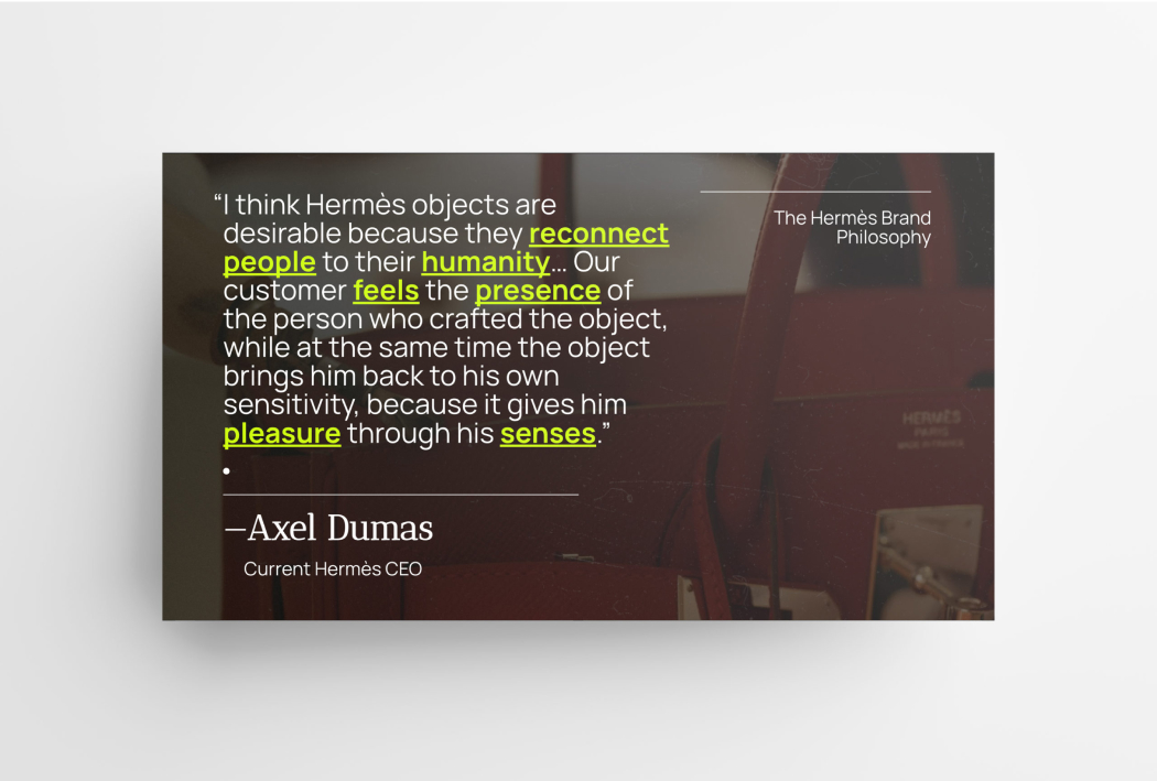
The brand workshop presentation delved into an analysis of our competitors’ histories and growth trajectories, offering valuable insights into emerging brands to watch. Notably, we examined fashion powerhouses like Ganni, Bottega Veneta, Louis Vuitton, Chanel and Hermès, leveraging them as peripheral benchmarks to comprehend audience segmentation and tailored branding strategies.
While our aspiration is to elevate luxury hardware to an art form, we recognized the importance of strategic foresight. My objective was to prompt stakeholders to engage deeply in envisioning our brand’s trajectory, fostering thoughtful discussions about our future aspirations and positioning within the industry.
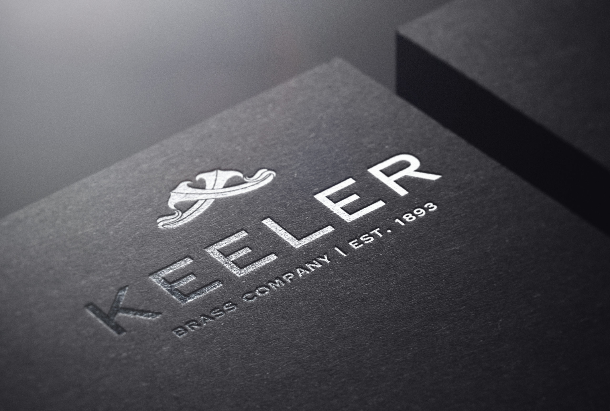
Logo Evolution
In just a couple of intense days, I generated numerous logo designs and meticulously explored countless font options. Achieving unanimous agreement among all key stakeholders proved to be a challenging task.
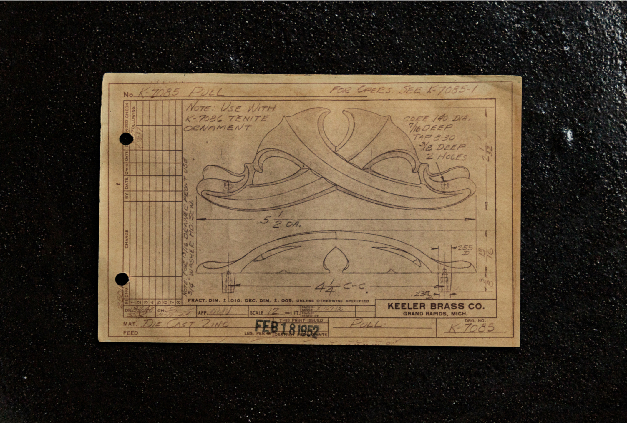
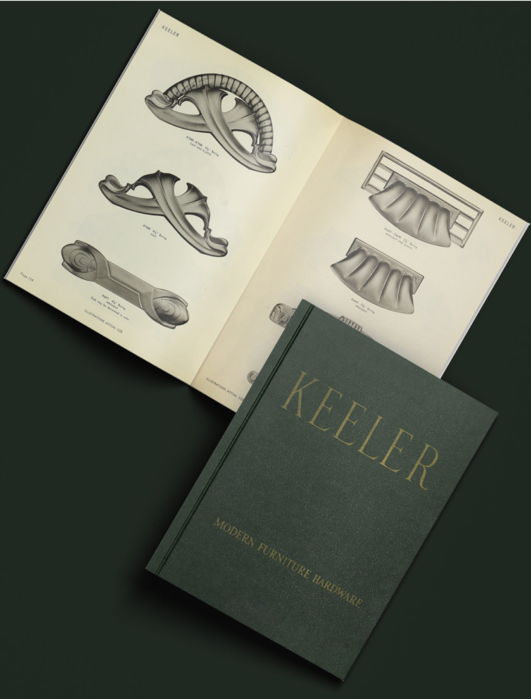
However, I am pleased to affirm that the final iteration of the KBC logo has garnered satisfaction from all parties involved, ranging from the CEO to departmental directors and the designer. Rooted in heritage, the design draws inspiration from K7085, a part found on page 124 of Keeler’s 1953 edition of Modern Furniture Hardware. Further historical exploration unearthed an even earlier rendition dated February 18th, 1952, suggesting its original inception.

Inspirational Origins
A significant source of inspiration for the logo design stemmed from Creed, the esteemed French perfumer established in 1760 during the reign of King George III. Their sharp, modern logo evokes a sense of historical grandeur, akin to two crossed swords without literal representation.

Historical Roots
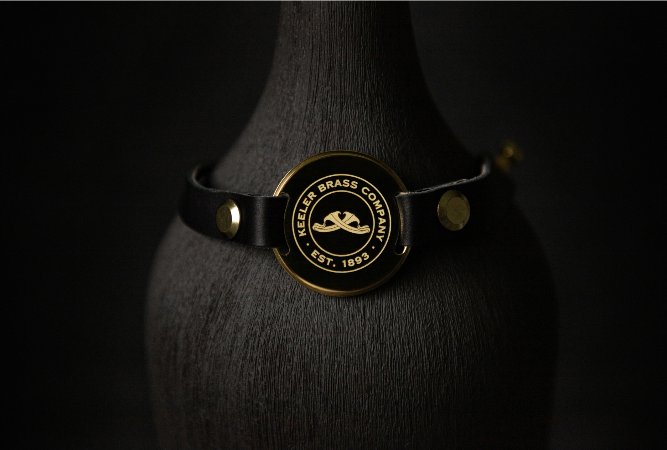
For the Keeler logo, the mandate was to strike a balance between tradition and modernity, as one stakeholder aptly put it, “one foot in the old, one in the new.” This served as the essence of the creative brief. The final iteration achieves this delicate equilibrium through two key elements:
Firstly, the acanthus logomark draws from a historical design found within the Keeler archives, offering a blend of familiarity and novelty. It presents a simplified yet distinctive representation of an iconic motif historically associated with Greek columns and Byzantine architecture.
Secondly, the font choice possesses historical roots but underwent modernization by shedding its serifs for the primary “KEELER” typeface. Each component of the logo bears a rich historical lineage, yet has been contemporized through a process of simplification.

The Font
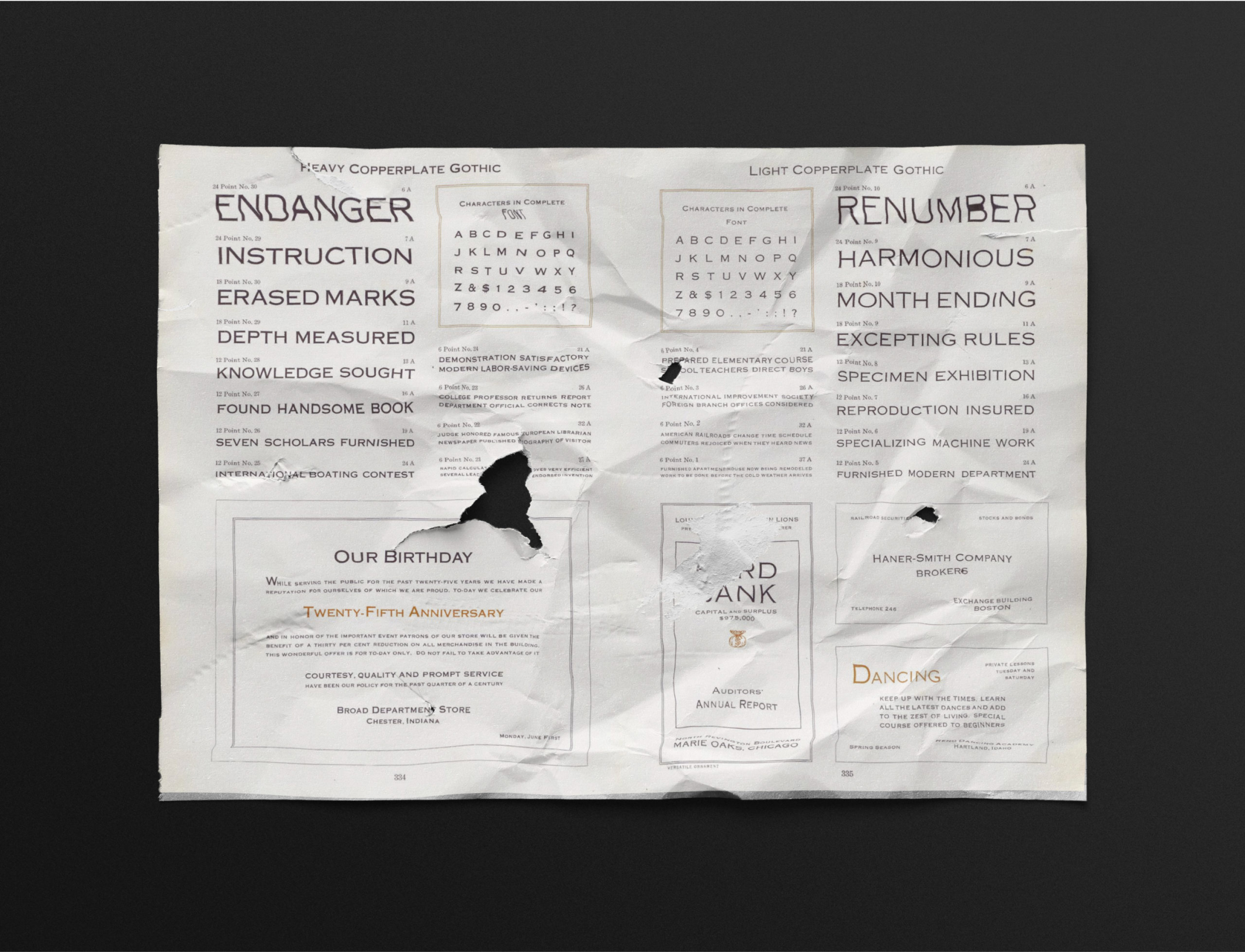
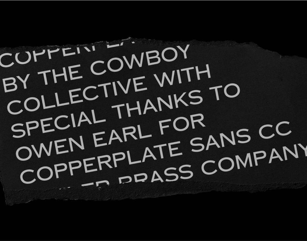
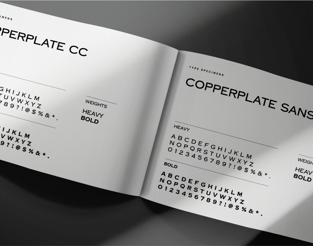
The chosen typeface for our logo and brand is Copperplate CC, crafted by Owen Earl of Cowboy Collective. Inspired by the original plates found in the 1923 American Type Founders Specimen Book & Catalogue, Copperplate CC embodies a timeless elegance. While each type designer imbues their interpretation with unique nuances during digitization, Owen’s rendition stands out for its meticulous attention to detail, particularly in punctuation marks and numerals—a level of care often lacking in pre-installed versions of Copperplate.
Originating in 1901, the original Copperplate font was conceived by the legendary American type designer, Frederic William Goudy, specifically for engraved metal use. This historical connection deeply resonated with the heritage of the Keeler brand, which has recently relaunched its focus on crafting exquisite decorative hardware. In collaboration with Owen, whose expertise in typography is formidable, we embarked on discussions that ultimately led to the development of a serif-free Copperplate CC variant tailored specifically for the Keeler logo—an endeavor for which I am immensely grateful.

Typeface History
The selection of our font aligns closely with our brand ethos, as all our products are developed and manufactured domestically in the USA. Thus, opting for a font with both historical significance and American origin felt especially fitting. If you’re intrigued by the nuances of Copperplate, here are some insights shared by Owen during our discussions:
To get into more obscure trivia I want to talk about sans serif versions of Copperplate Gothic. Most of us today would agree that Copperplate Gothic has serifs, what else are the sharp corners at the ends of the lines? However, at the time of its creation in 1902, Copperplate Gothic was not considered a serifed font.
The word ‘Gothic’ to typographers, especially at the time, meant sans-serif. Copperplate Gothic is a strange edge case because the design of its letters belong very much to the tradition of sans-serif fonts, it is unusual, for instance, for the line width to remain uniform in serifed fonts, as it does in Copperplate. The tiny serifs also appear in places that are not typical for a serifed font, such as the bottom right side of the letter ‘N.’ Imagine you were carving letters into stone, and because of the physical process of doing so little ‘serifs’ appeared on the beginning and end of every line you drew. This is what the design of Copperplate suggests, not literally that it was designed by carving things into stone, but that the serifs are less part of the letter design and more part of their construction.

The Brand Feel
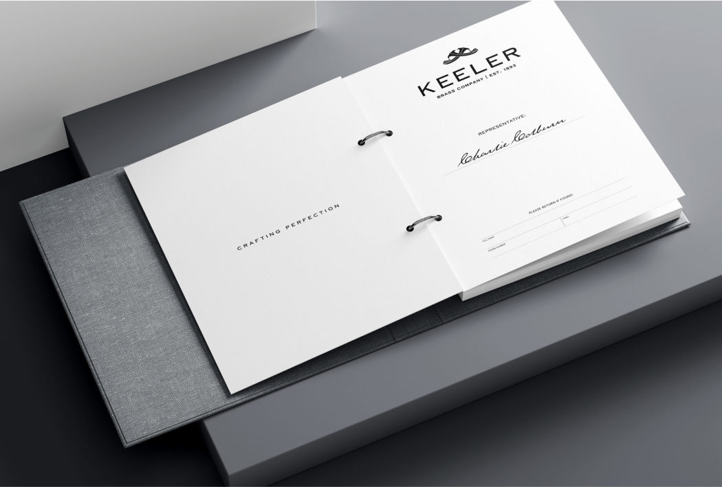
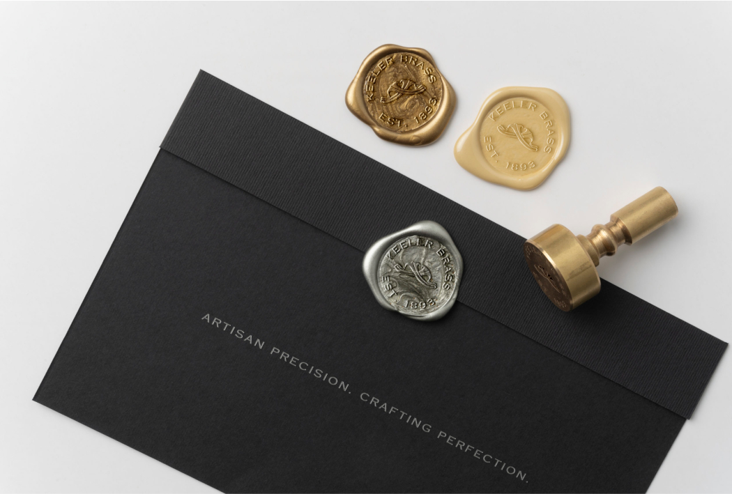
A paramount goal for any brand is to establish a lasting presence in the minds and hearts of its audience, extending even beyond its immediate industry. At Keeler Brass Company, our aspiration is unequivocal: to emerge as the ultimate authority in luxury hardware.
To achieve this vision, we recognize the significance of brand touchpoints. Leading up to KBIS 2023, for example, we meticulously crafted custom greeting cards, personally signed by our Director of Sales, to extend exclusive invitations to select showrooms. Each card was sealed with a bespoke wax seal bearing our distinctive logomark, adding a touch of sophistication to the outreach experience.
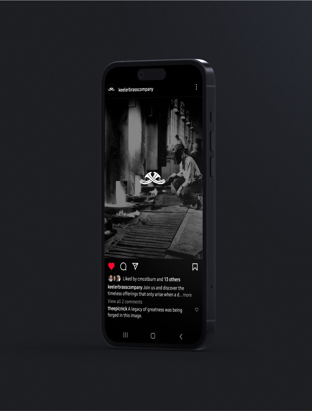
Social Media
As we prepared to launch the Keeler Brass Company social media accounts, I aimed to ensure a strong debut. I developed a content calendar, crafting and organizing visuals and copy to establish the brand’s presence and build excitement leading up to the official launch at KBIS 2023.

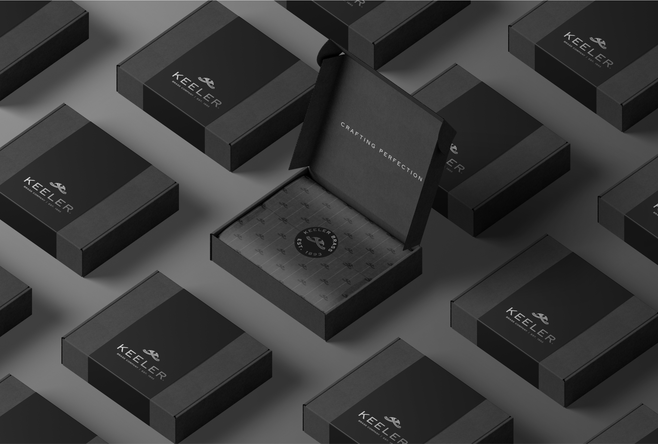
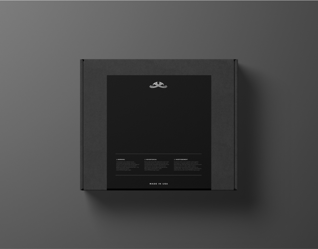
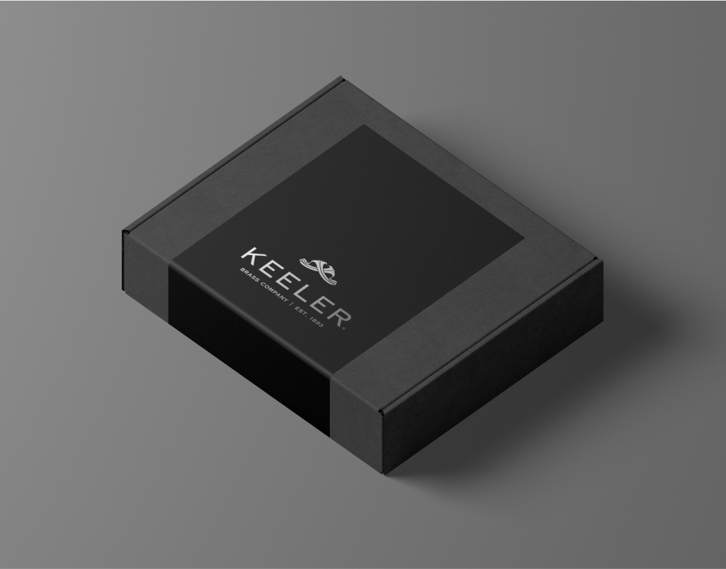
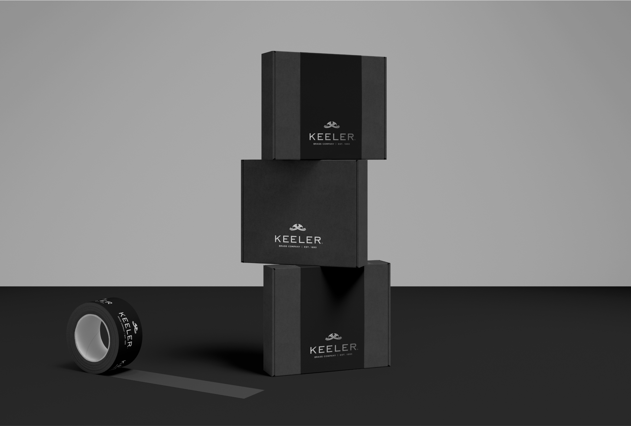
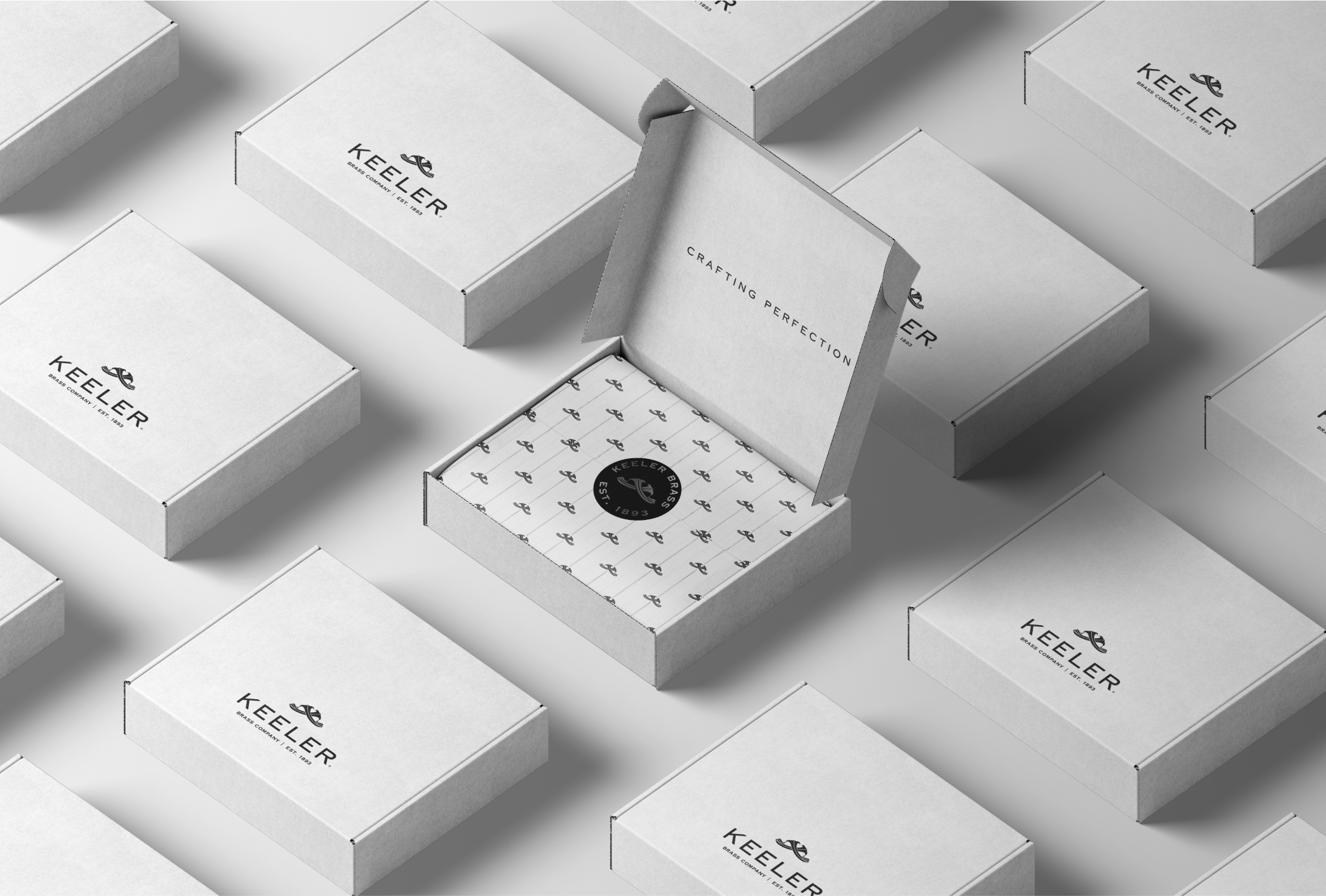
Packaging Design
Below are a series of ambitious packaging concepts developed for Keeler Brass Company, encompassing various price points and iterations. These designs include labels, wrappers, custom tissue paper patterns, tape and stickers.
My goal was to reinforce our branding through meticulous attention to detail and thoughtful presentation. While maintaining elegance, I ensured all necessary standards were met, including the inclusion of Prop 65 verbiage in three languages.
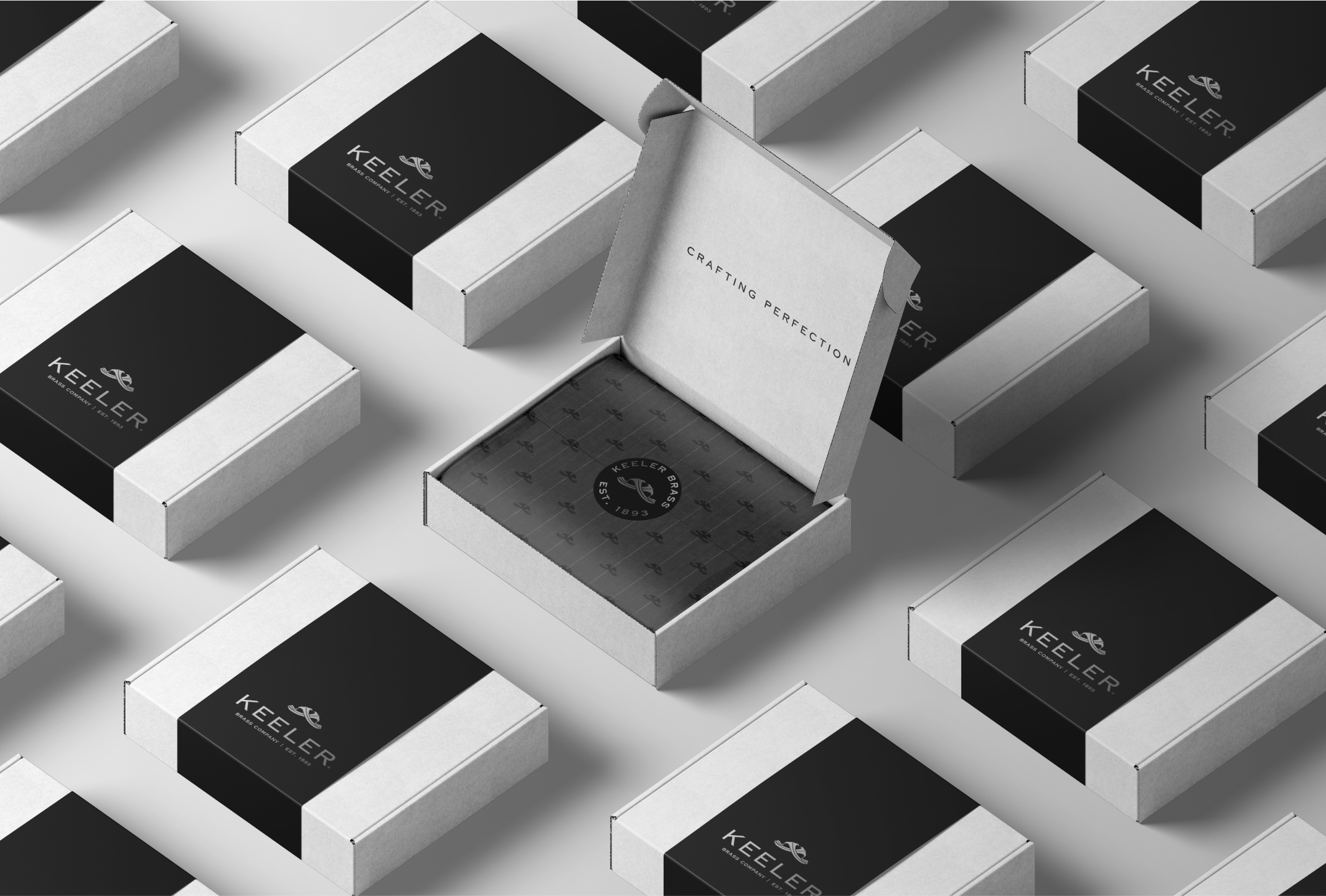
Custom Pattern
To reflect the personalized and made-to-order nature of the Anthology Series, I developed a pattern for Keeler Brass Company inspired by the detailing on pinstripe suits. This timeless and classic design echoes the brand's values while tastefully incorporating the logomark.


Photography & Lookbook Design
Explore my Photography and Lookbooks & Catalogs pages to see more of my work for Keeler Brass Company.


01
About
An area describing what this site is all about, who I am and how I came to be.


02
Portfolio
The most important aspect of the site, a select catalog of works spanning over a decade.


03
Blog
An amalgam of my creative explorations, activities, musings and discoveries.


04
Music
Music is one of the most vital ingredients to my creativity and inspiration. Visit this page to listen to some tunes.


05
Contact
I am always looking to connect with other talented individuals. Reach out for collabs,freelance, or other opportunities.