Portfolio

E-Commerce & Web
- 2020 - 2025
- Branding
- Copywriting
- Web Design
Challenge
Before 2020, our e-commerce presence faced significant challenges. Websites and partner site listings in the home improvement sector were fragmented, visually inconsistent, and lacked cohesive content and branding standards. Outdated graphics failed to reflect the true potential of our brands, limiting their appeal and effectiveness in reaching target audiences.
Approach
Collaborating with E-commerce directors and their teams, I streamlined the approach to visual and content creation, ensuring alignment with revitalized brand standards. By elevating the overall visual and content quality, we effectively communicated our messaging, unique benefits, and value to target audiences. As both a creative leader and hands-on contributor, I bridged the gap between Marketing and E-commerce, critiquing, refining, and creating materials to achieve cohesive, impactful results. This collaborative effort, supported by the Operations team, drove record-breaking e-commerce growth, with sales increasing 49% year-over-year in 2024. Regular annual refreshes continue to sustain this momentum.
Record-Breaking Sales
Hickory Hardware, the flagship revenue driver for our parent company, had long been underserved in terms of branding and content development. A misguided belief that its affordability and accessibility negated the need for strategic branding left its potential and market perception underutilized.
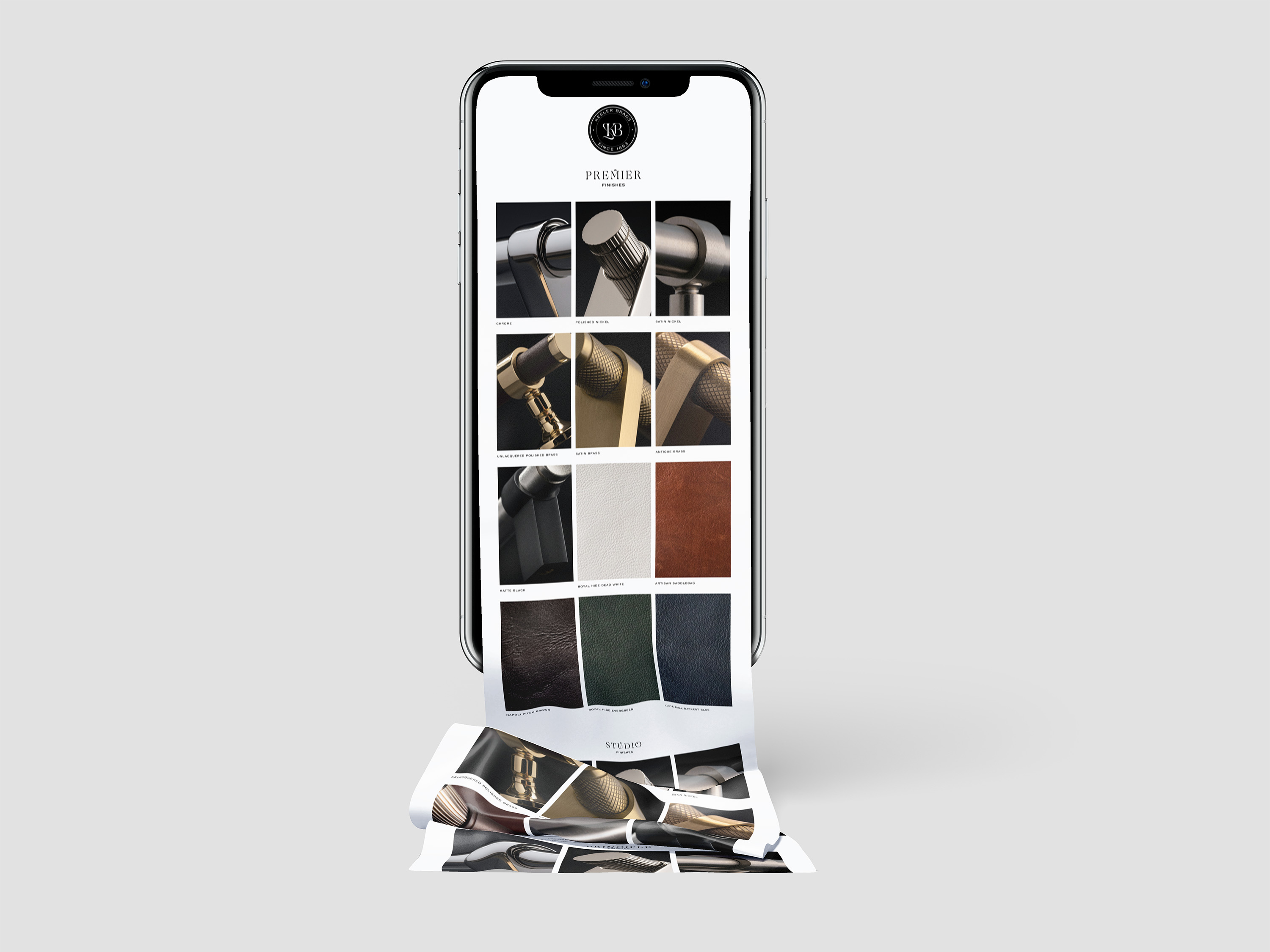
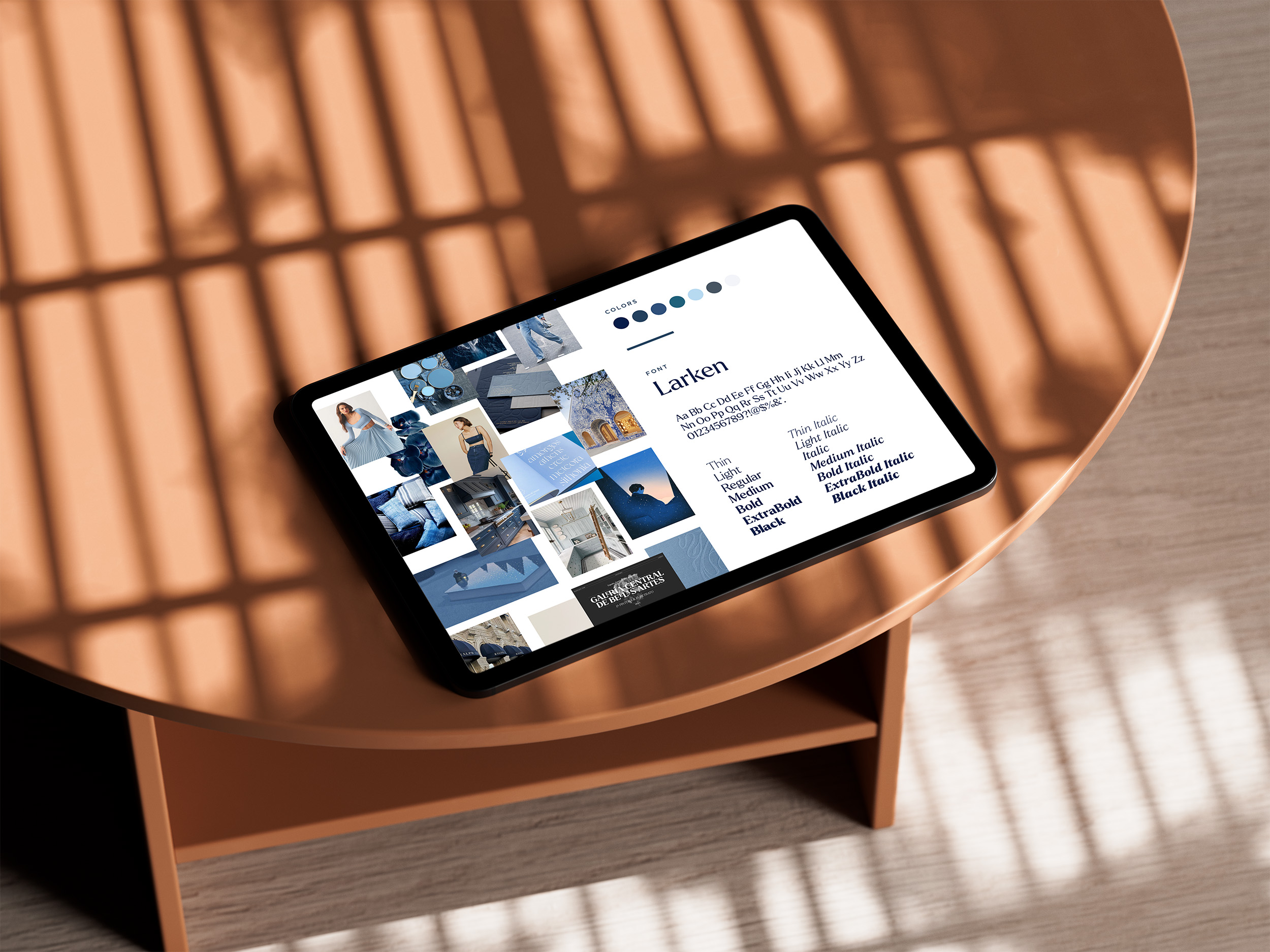
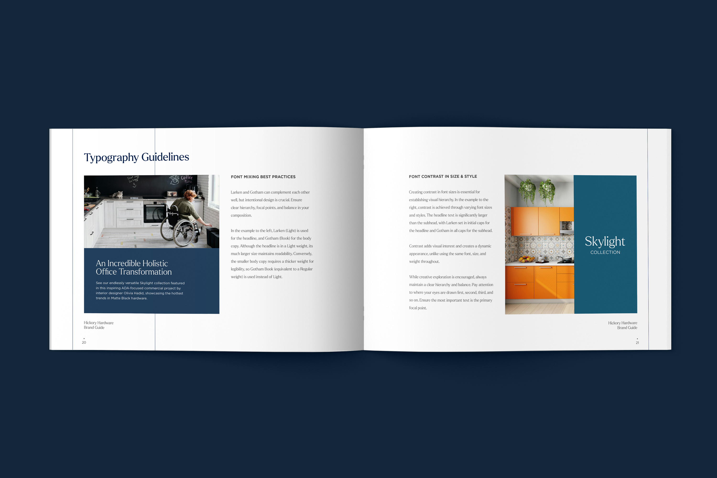
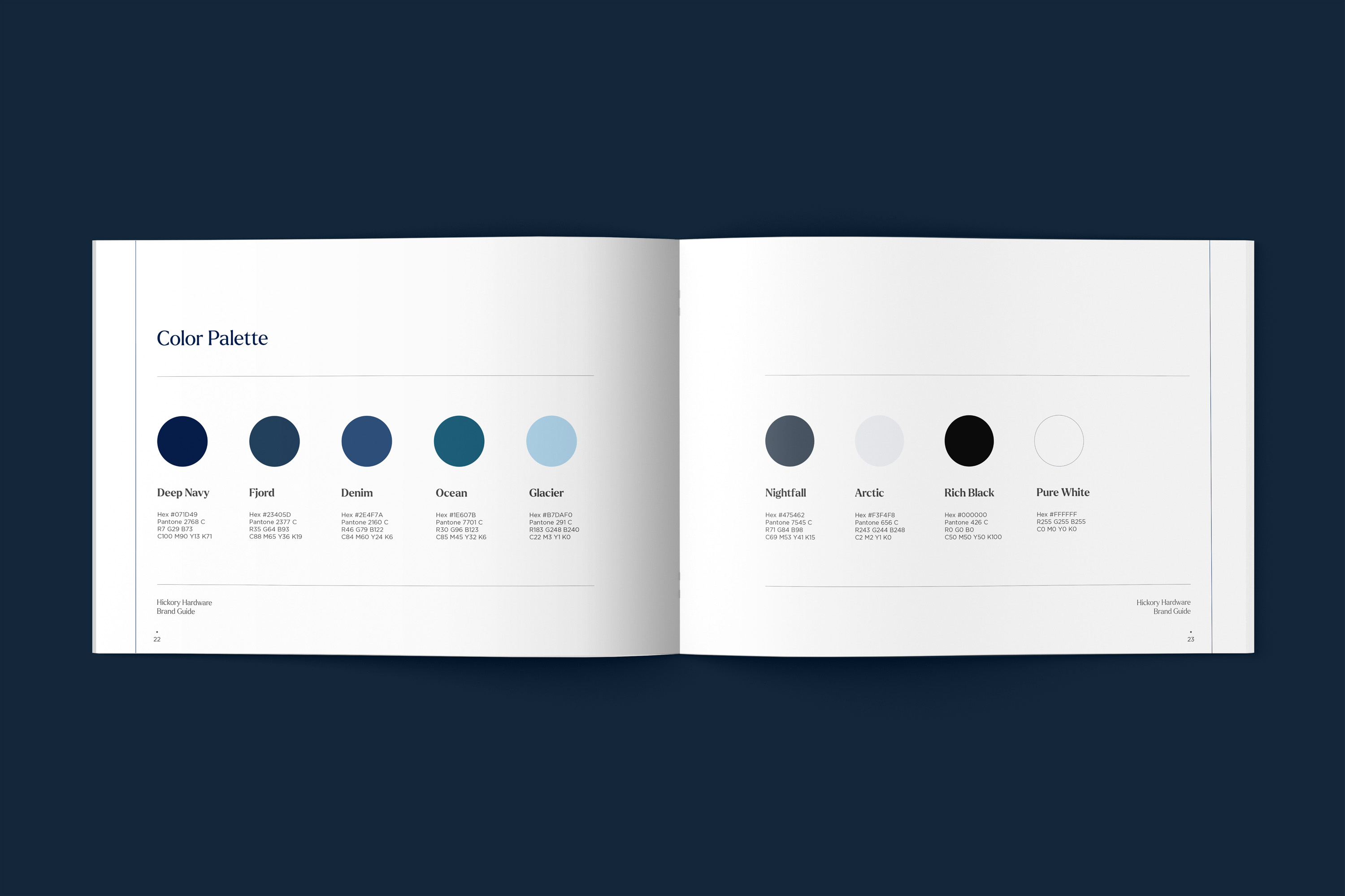
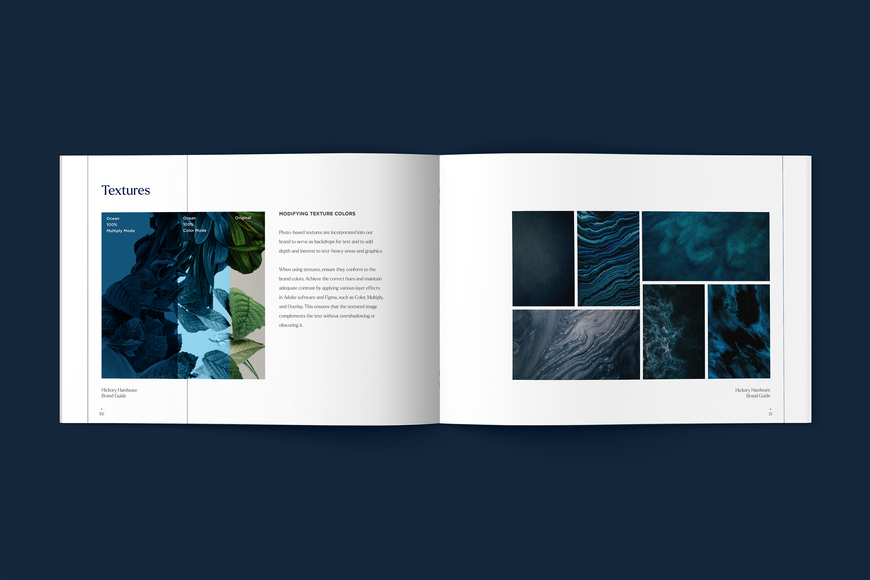
In the summer of 2024, I led a comprehensive brand refresh to change this narrative. This included an updated color palette, refined typography, and new visual guidelines incorporating textures and curated imagery for more impactful storytelling. I also championed the value of strategic branding across all price points, working collaboratively to shift internal mindsets.
This initiative not only redefined Hickory Hardware’s visual identity but also played a key role in driving record-breaking e-commerce sales, contributing to a 49% year-over-year growth in 2024.
Strategic Positioning
The Hickory Hardware brand guide I developed provided a clear foundation for creating visuals that are cohesive, dynamic, and engaging. Previously, the brand's red, white, and blue color palette felt overly political and outdated. While Hickory Hardware is proudly American, I aimed to design a modern color scheme that resonated with its target audience—primarily women.
I carefully selected a range of complementary blue hues, balancing them with sophisticated accent colors like gray with subtle blue undertones. This palette exudes a contemporary feel while remaining versatile across applications. I also addressed technical challenges, such as correcting the brand’s navy blue, which often rendered purple on trade show fabric. By reducing the magenta values and choosing a more accurate Pantone, I ensured consistency and quality across all materials.
Refreshed Storefronts
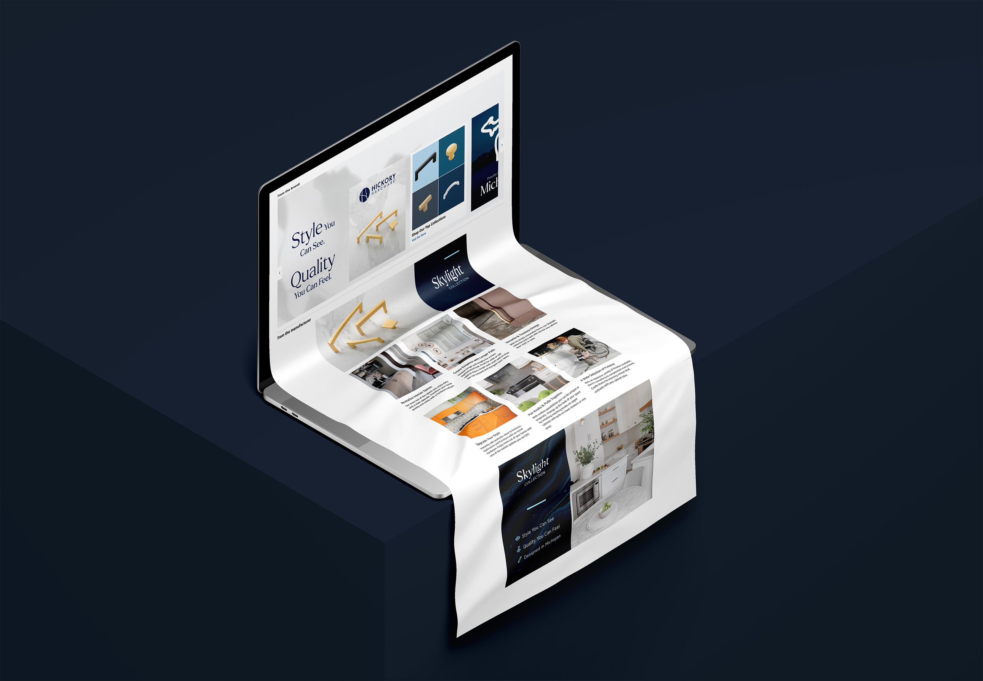
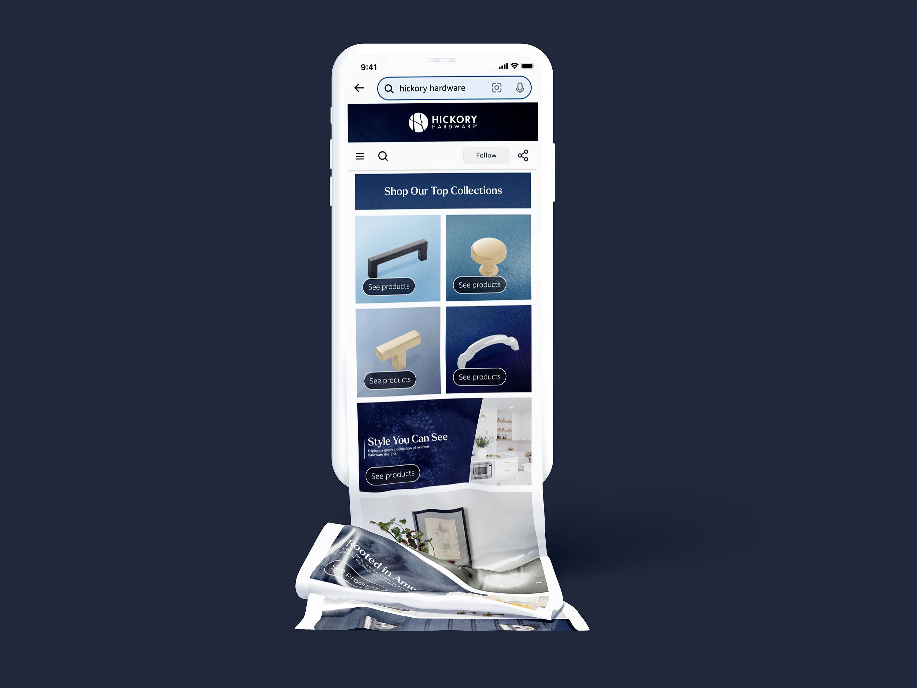
Beyond visual updates, I enhanced the branded storefronts and product pages on Amazon to better communicate Hickory Hardware’s values, design ethos, and craftsmanship. After interviewing team members and learning more about the product development process, I recognized a key narrative: the same meticulous attention to detail applied to our luxury lines is also present in the accessible Hickory Hardware products. I highlighted this in our messaging, emphasizing that great design is attainable without a luxury price tag. This story not only reinforced trust but also elevated the brand’s appeal to our audience.
Transition to Headless E-Commerce
In late 2024, company leadership prioritized streamlining our web presence, moving away from platforms like WordPress and Shopify, which no longer met our growing customization needs. We began migrating to a headless CMS solution using Sanity, paired with Swell for product, order, and customer data management. This shift offers greater flexibility and scalability, aligning with our long-term goals.
Additionally, we initiated the transition from outdated Excel spreadsheets to Salsify, a modern platform designed to optimize product content and ensure consistency across online retail channels. These upgrades position us for enhanced efficiency and a more cohesive e-commerce experience for the future.
Prioritizing the Customer Experience
During our website revamp, it became clear that our teams lacked experience in developing websites and understanding the roadmap and resources required for such an undertaking. I took the initiative to define these pathways, starting with in-depth user research into the buying habits of our diverse customer base.
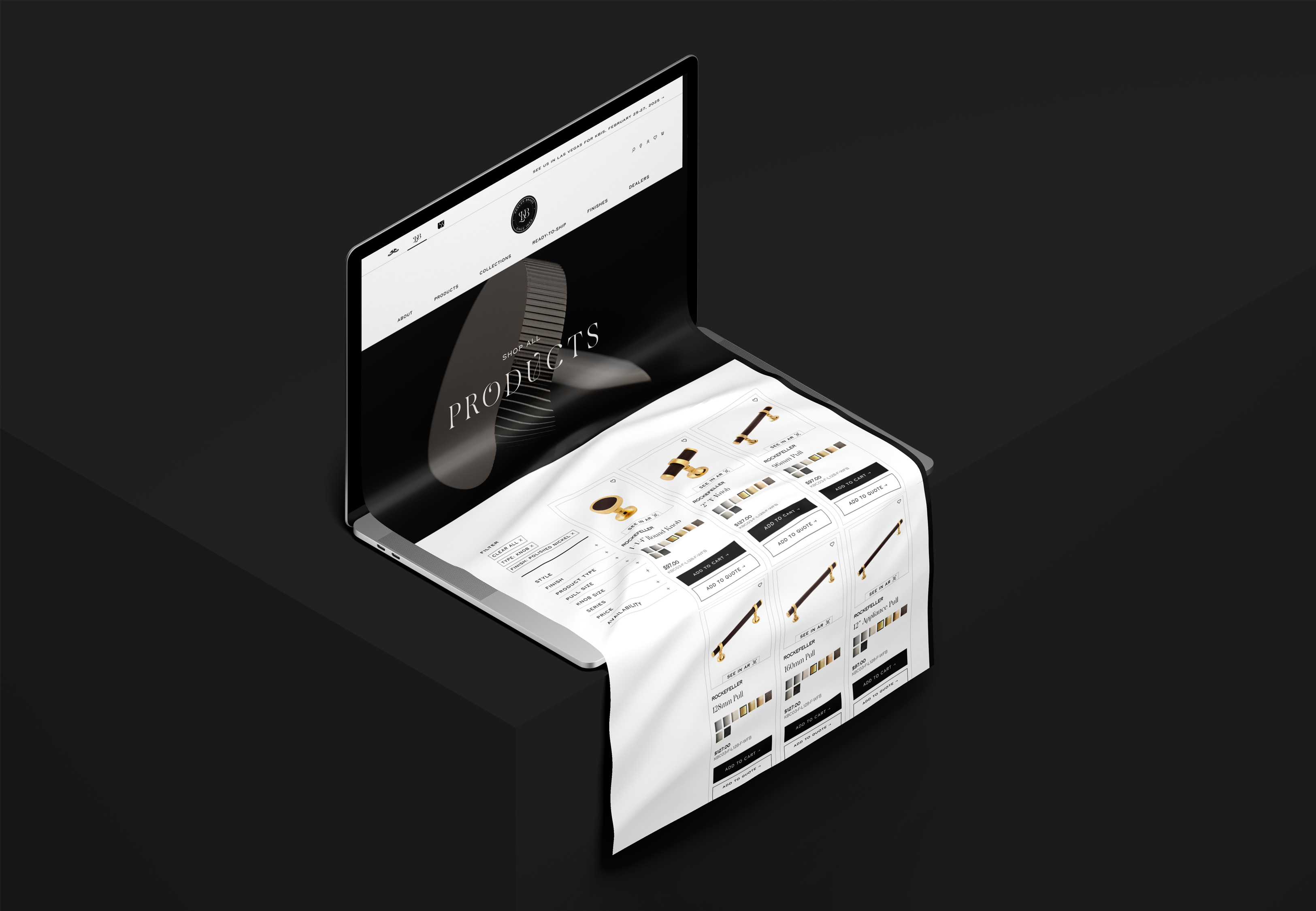
Since our products focus on decorative hardware for kitchens and baths, I explored how different customers—homeowners, DIYers, and designers—approached their shopping journeys. Did they prioritize style, size, finish, or color? These insights shaped our product filtering system, helping us determine the order of attributes and ensuring products were accurately tagged in the backend.
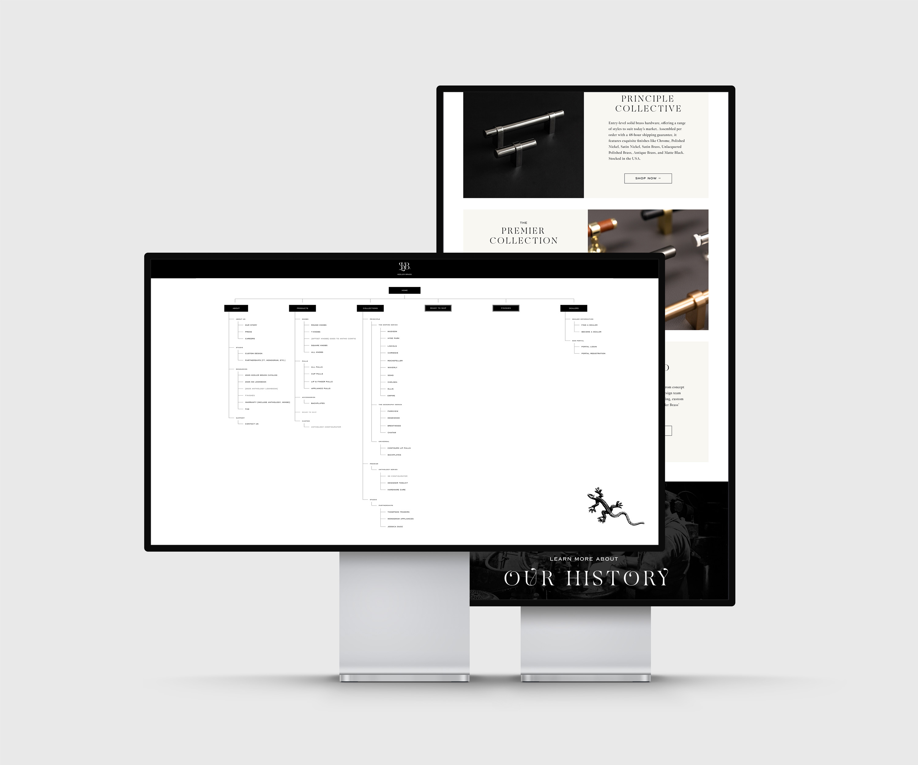
In addition to leading the creation of sitemaps and site designs in Figma, I implemented a major overhaul of our navigation menus. The new structure prioritized intuitive organization, making it easier for customers to explore and find products. This customer-centric approach ensured a seamless shopping experience tailored to their needs.
Tailored Navigation for Different Users
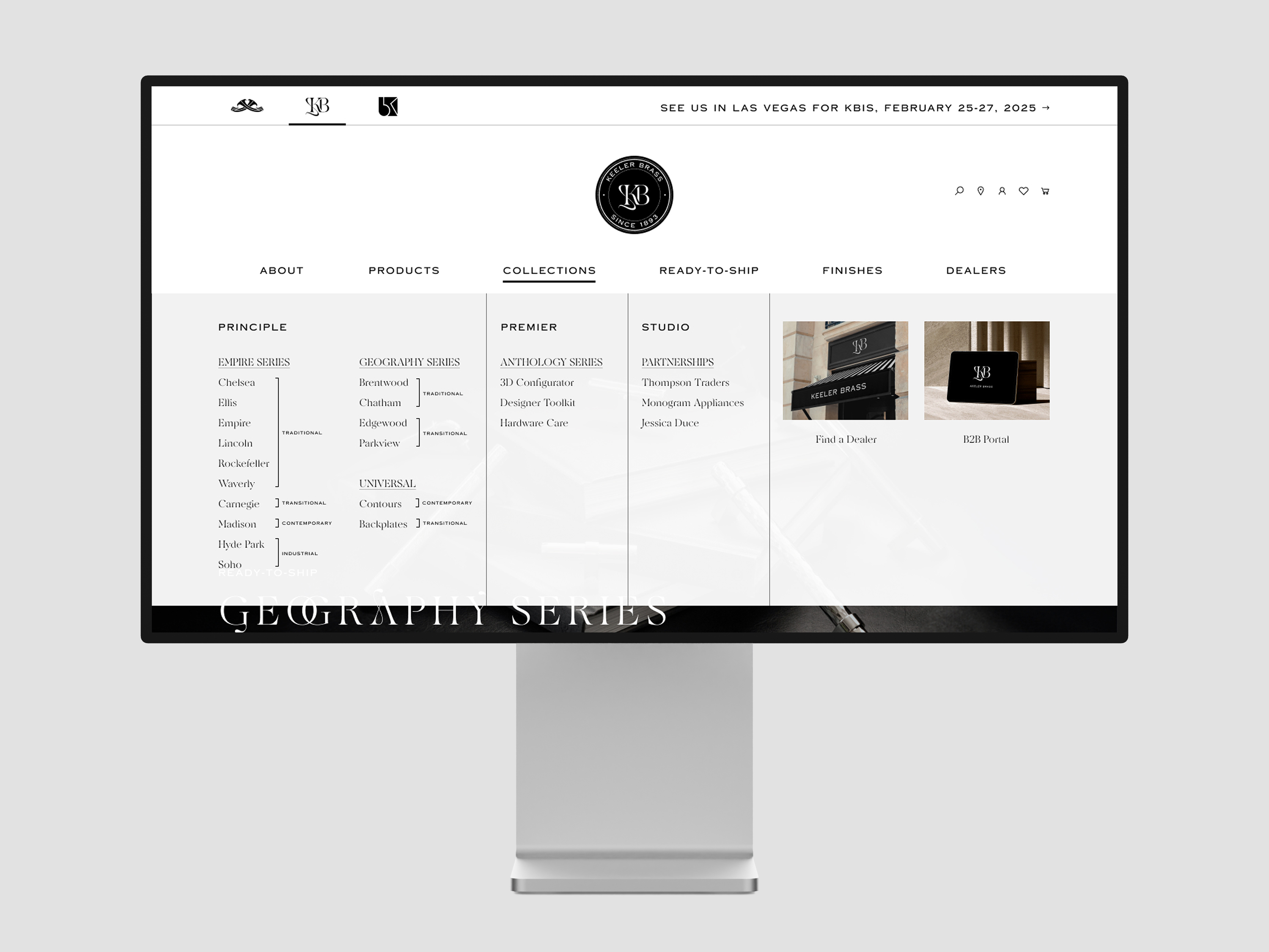
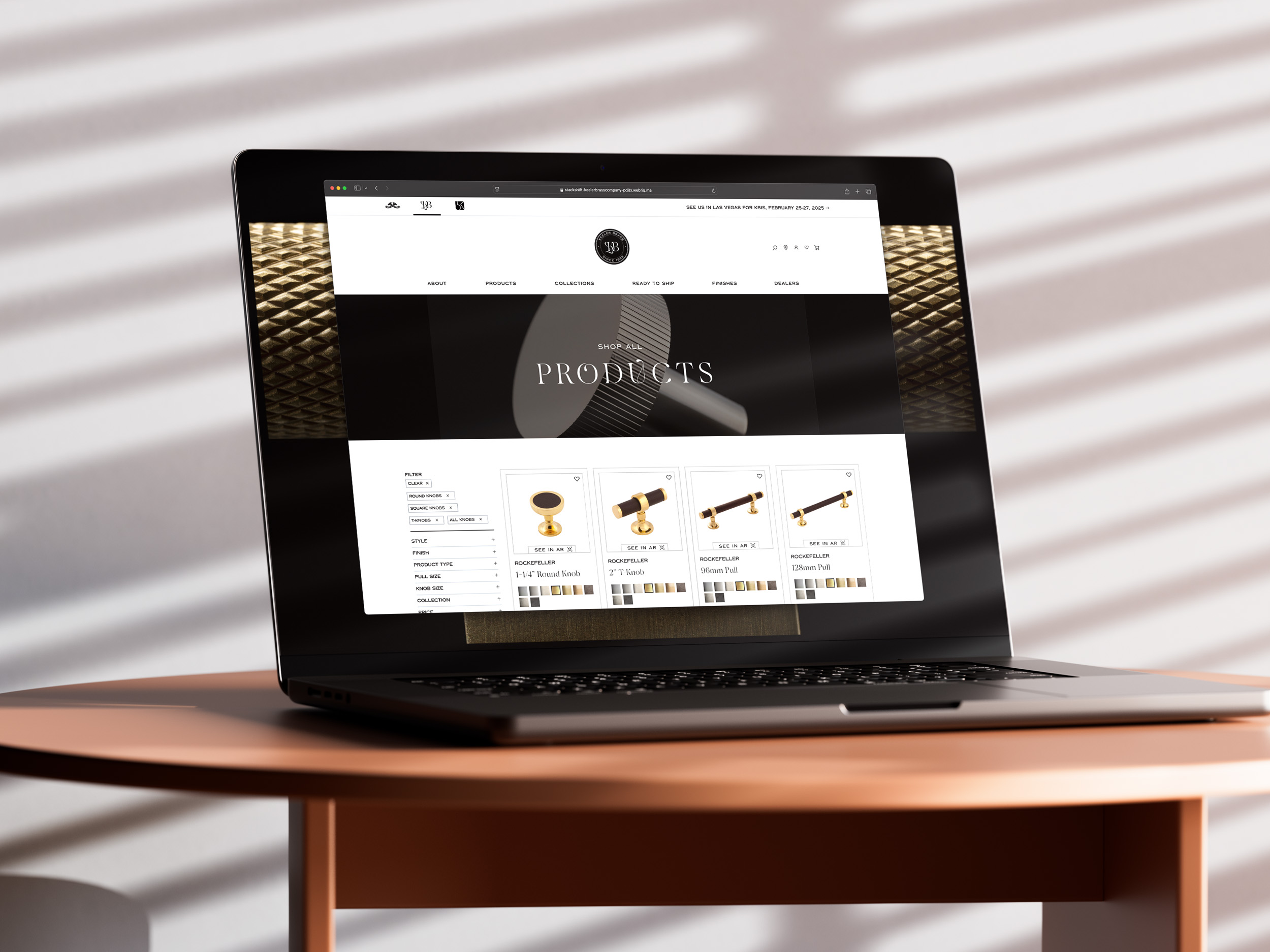
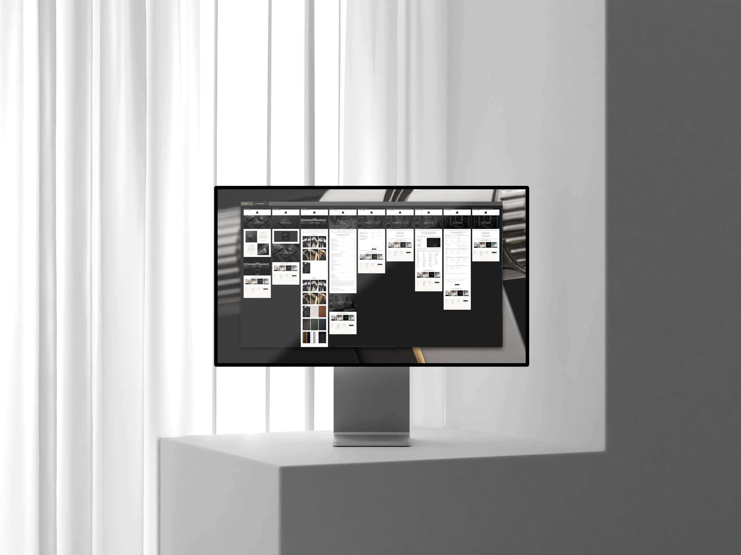
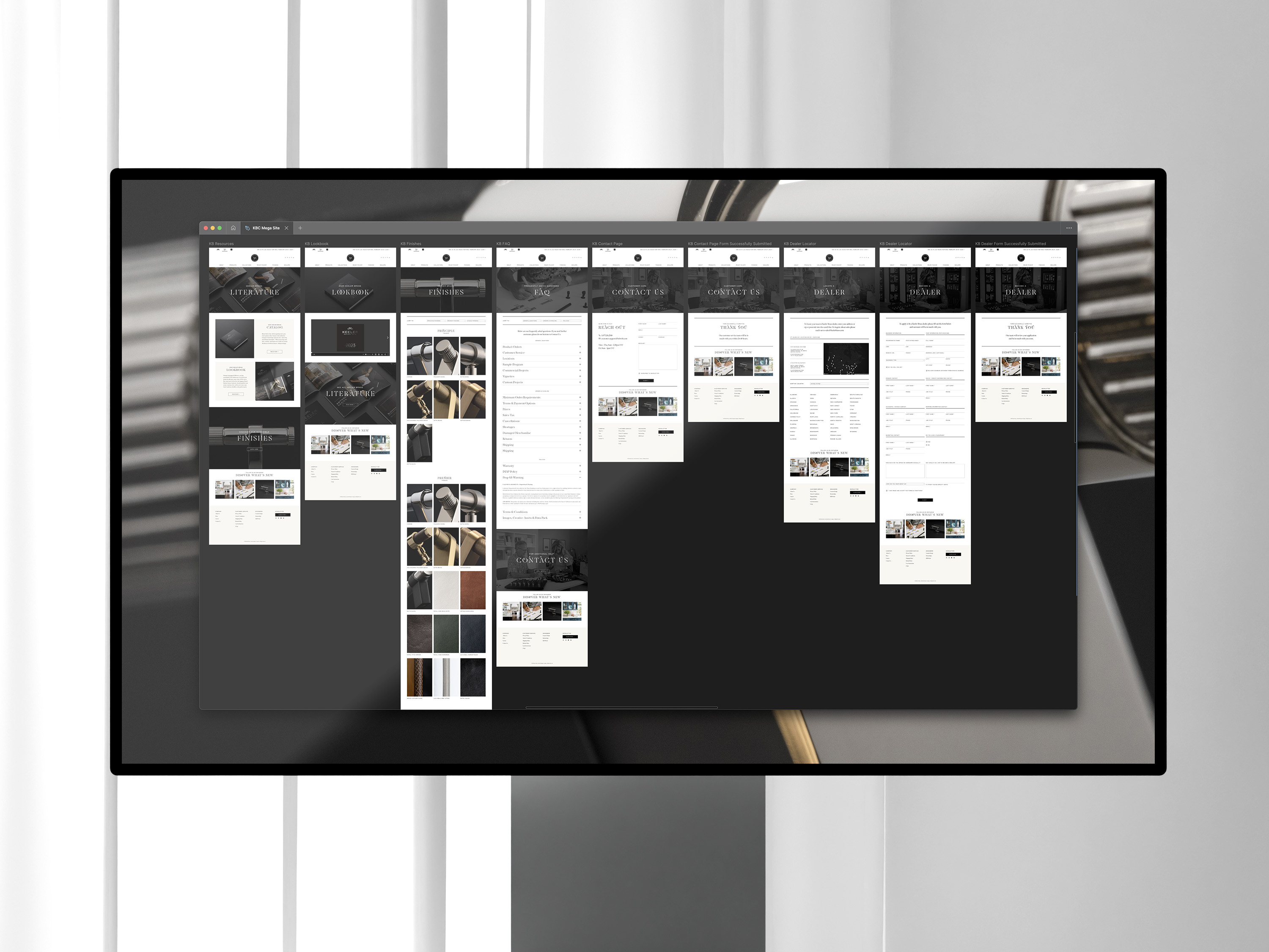
As part of a major website overhaul, Keeler Brass Company, Keeler Brass, and Belwith Keeler merged into a unified mega-site with shared navigation, while Hickory Hardware received its own dedicated revamp alongside Amazon A+ and Wayfair WayMore content updates.
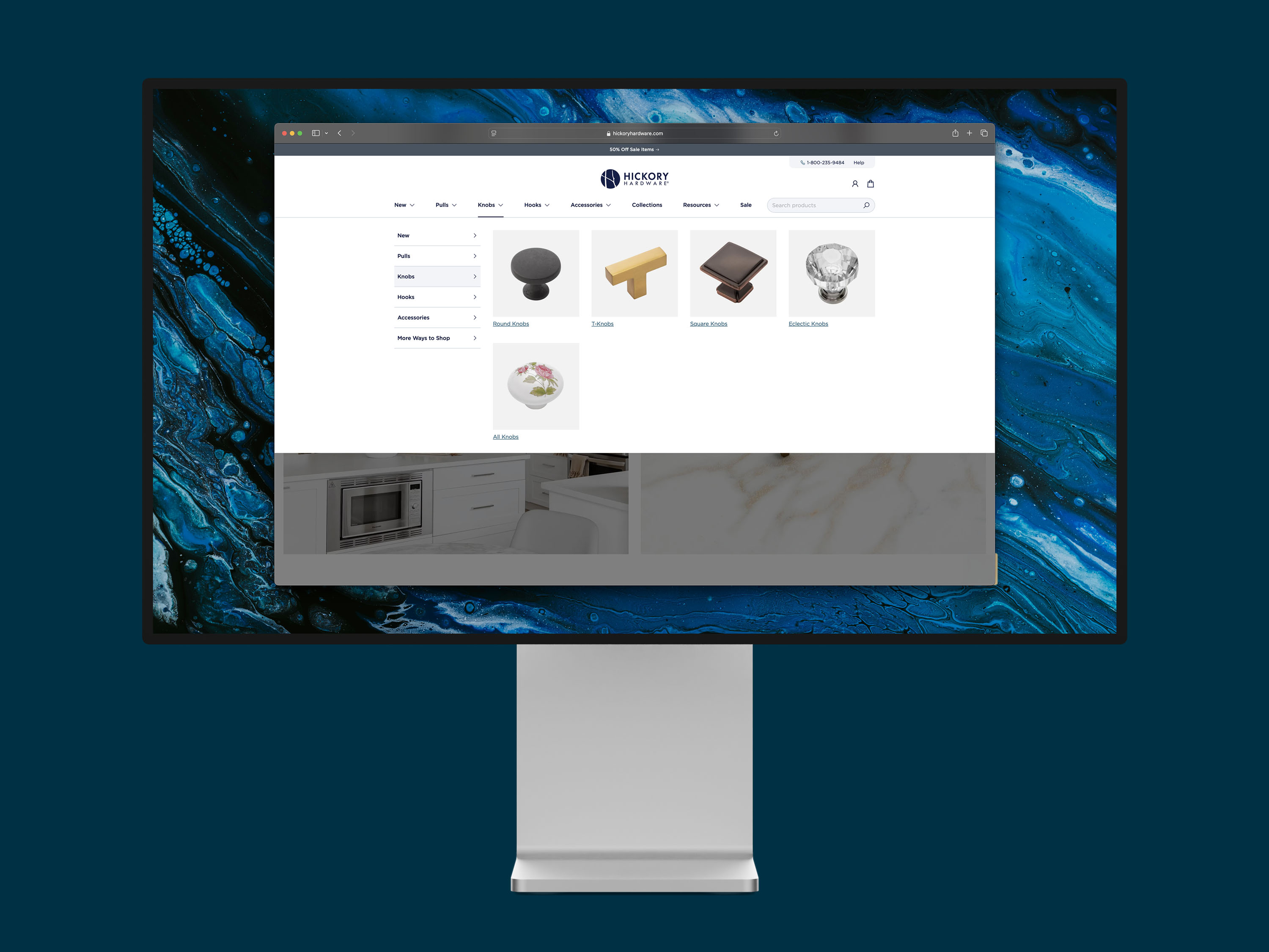
Drawing on user research and insights into different market segments, I tailored the navigation to meet the needs of both homeowners and professional designers.
For Keeler Brass, the luxury arm, the navigation was text-based and minimalist, with manageable lists of collections. To aid unfamiliar users, hover states revealed style categories like Contemporary, Traditional, or Industrial, offering clarity and context.
In contrast, Hickory Hardware's navigation emphasized visuals to educate buyers as they shopped. Icons illustrated categories such as "T-Knobs," "Cup Pulls," and "Lip Pulls," bridging the knowledge gap for less experienced customers while showcasing the brand's extensive product range. This user-focused approach ensured a more intuitive and engaging shopping experience across all brands.
