Portfolio
Lookbooks & Catalogs
- 2018 - 2024
- Design
- Copywriting
- Photography
Challenge
A customer's first interaction with your brand could be through various channels: the website, an Instagram post, a Times Square ad, or an in-person experience. In the decorative hardware industry, print dominated until the late 2010s and even early 2020s, until the pandemic prompted a shift.
Approach
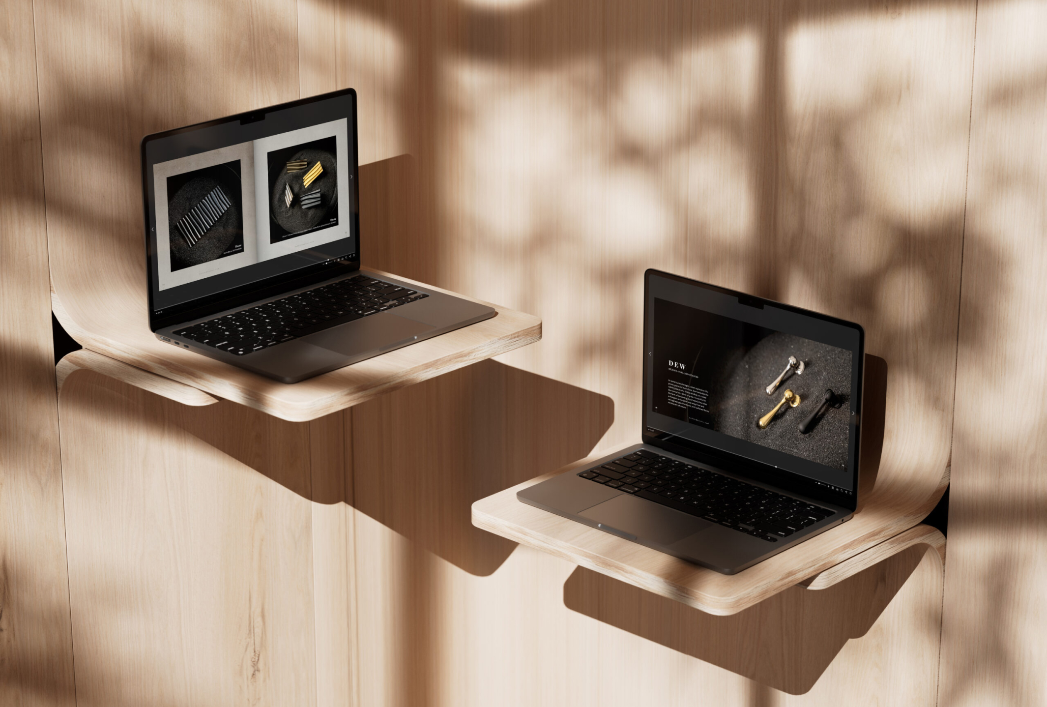
In an industry still rooted in traditional practices, I have worked to modernize the digital experience, advocating for a paperless approach while maintaining the same level of care and meticulous design typically reserved for print materials. Below are examples of this work, showcasing the design, photography and copywriting I contributed to our catalogs and lookbooks.
Redesign
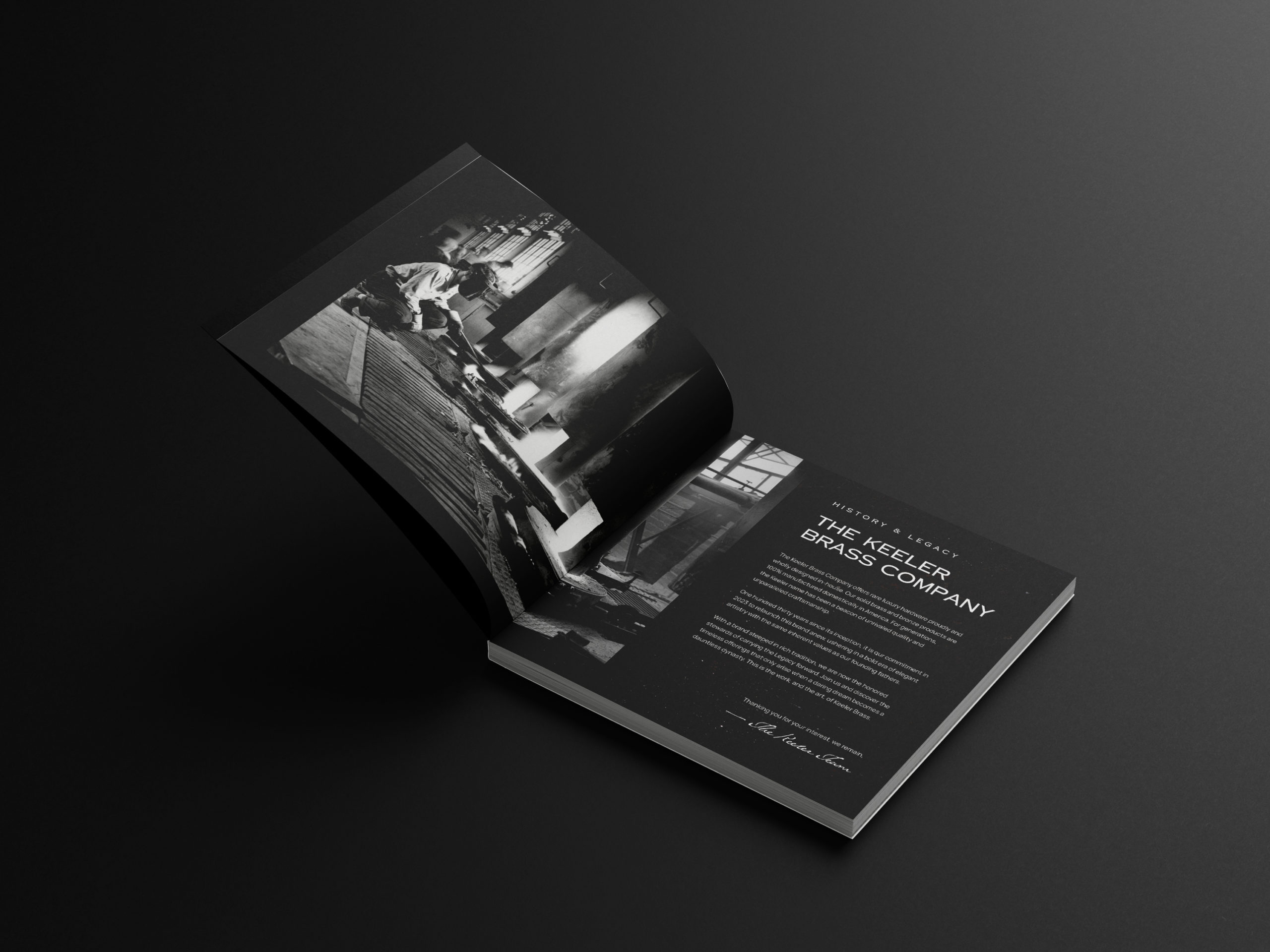
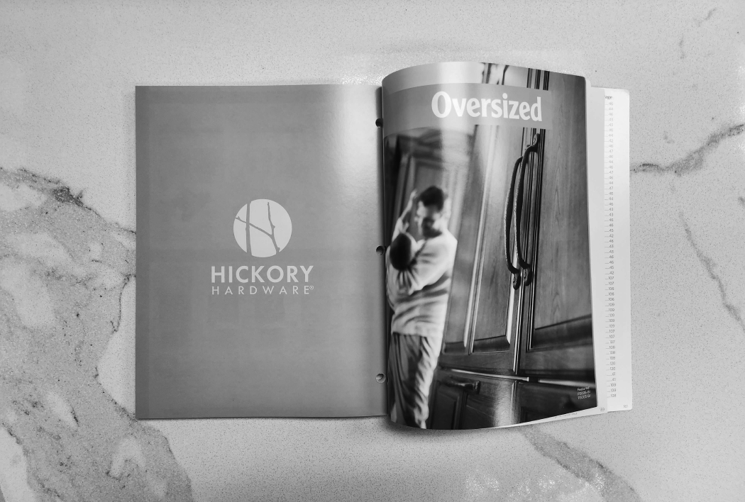
To fully appreciate the evolution of these designs, it's essential to consider their origins. Past print materials lacked cohesive branding, consistency and organization. They were disjointed in terms of layout and templating, failing to reflect a unified brand identity.
My approach was to redesign these materials with a clear objective: to create well-organized, aesthetically pleasing pieces that serve both our customers and internal teams effectively. Every design element was carefully considered to ensure it had a purpose and contributed to a cohesive, impressive presentation.
The result has been overwhelmingly positive. Industry professionals have praised our catalogs, often comparing them to coffee table books—functional tools that are also visually appealing and enjoyable to peruse.
In addition to the redesign, I approached these projects holistically, contributing a great deal to the photography and written storytelling from collection launches to style descriptions of each part.
Progress
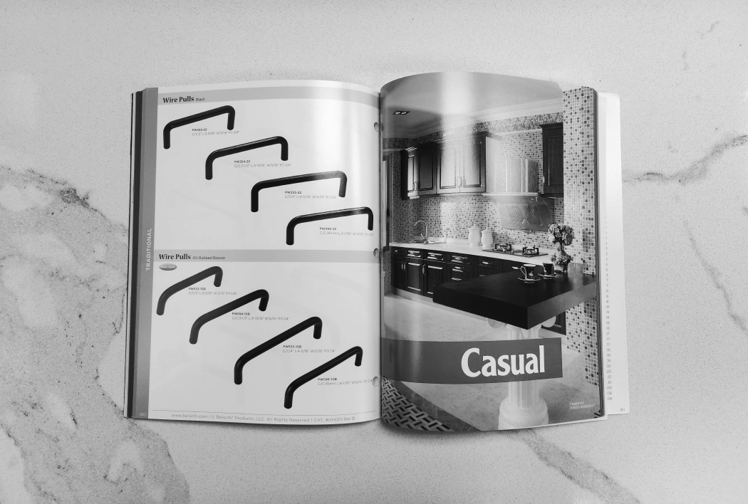
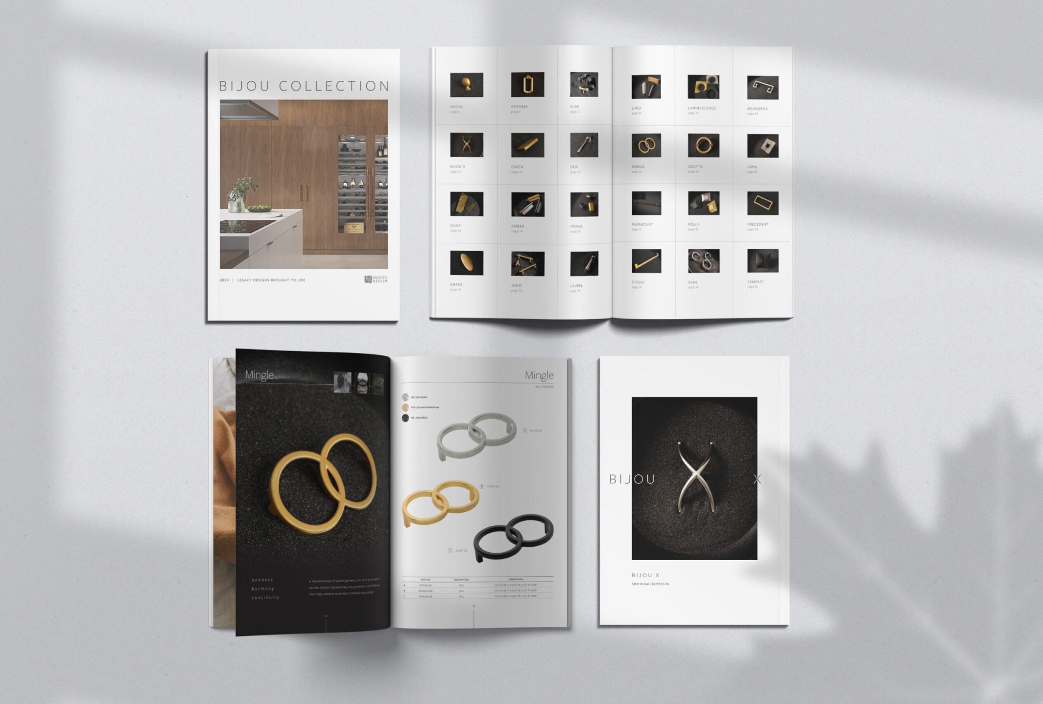
Significant improvements have been made in the layout and presentation of information. My goal was to create a cohesive, consistent template where critical dimensions for each part are displayed prominently beside the product, while additional, less pertinent information is organized in neat columns and tables at the bottom of each page.
This redesign enhances the catalogs' scan-ability and usability. Rather than categorizing collections by style, which can be subjective, I opted for an alphabetical approach, ensuring a more straightforward and efficient user experience.
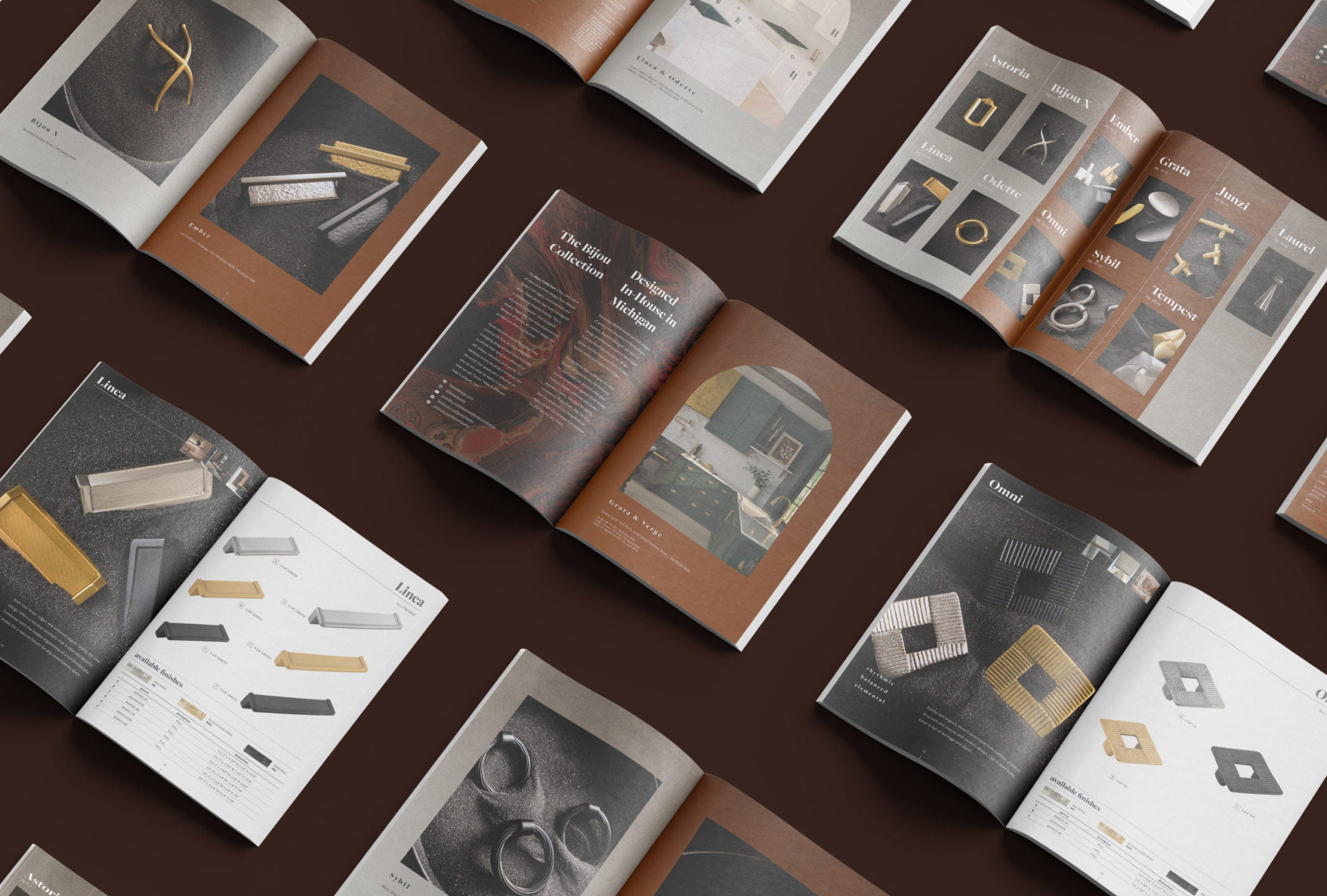
In 2024, we took a significant step by embracing minimalism and reducing color, intentionally diverging from prevailing trends. This shift reflects our commitment to challenging conventional thinking and pushing the industry forward. You can see the marked differences in the style above vs. below.
Writing Samples
As a multidisciplinary designer, my skill set extends to both copywriting and content writing. Below are examples of my work in these areas:
The Bijou Collection is the culmination of years of archival designs from Belwith Keeler’s rich legacy combined with new ideas. These pieces have been reimagined in exceptional, timeless finishes. This is not merely hardware—this is cabinet jewelry.
Rigid lines that once separated the domains of fashion, art, interior design, and architecture have long blurred. Home interiors inspired by fashion have come to the fore, driving trends and energizing designers and customers alike to rethink their space as a reflection of self. Unique, one-a-kind and special.
Our wardrobe is how we project ourselves into the world. Our spaces are a reflection of who we are, what we aspire to be and what we call, “home.” Make it different, make it uniquely “you.”
Aura
ethereal • luminous • intrinsic
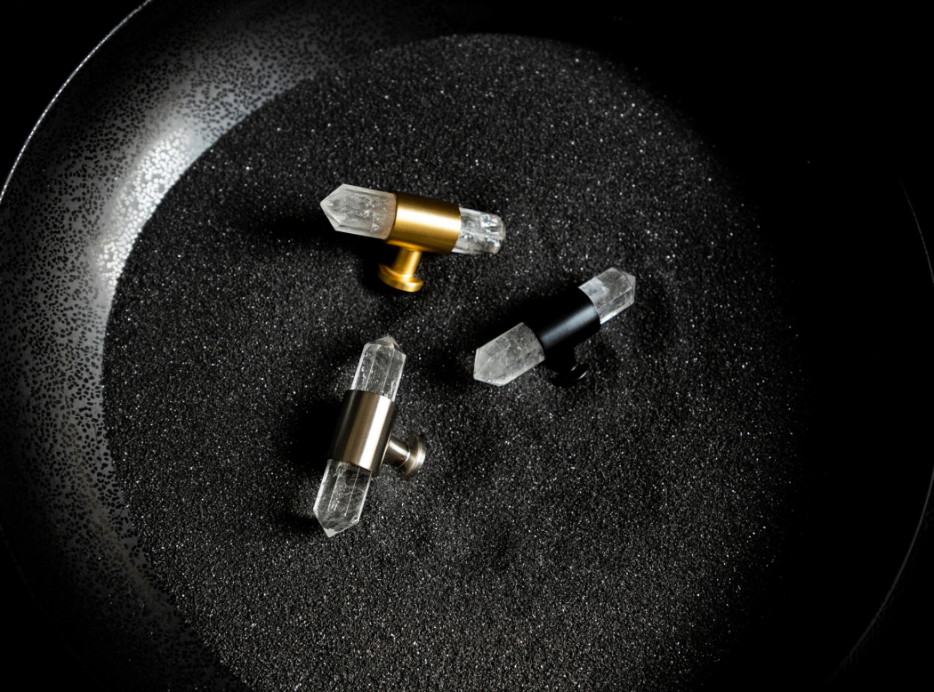
Born of igneous rock and geothermal aquatic environments, authentic crystal quartz gleams in the light. Individual spectral veins and natural bubbles come together to form an abstract pattern unique to every piece, Aura embraces the random formations of nature, while being grounded on a modern base.
Fringe
acute • edgy • minimalistic
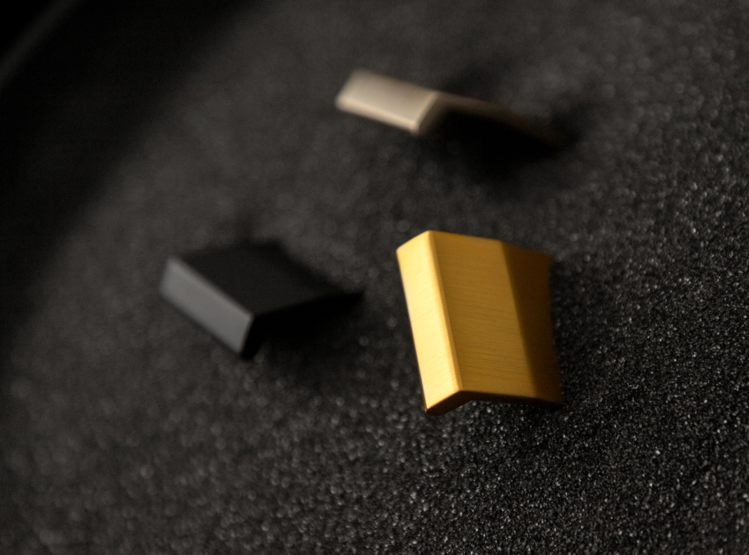
Slick, clean and precise, the Fringe lip pull is a discreet modern design marked with angular features for a sharpened profile. With classic simplicity at its core, Fringe showcases all the hallmarks of practical minimalist design with a contemporary edge.
Dune
moving • expressive • organic
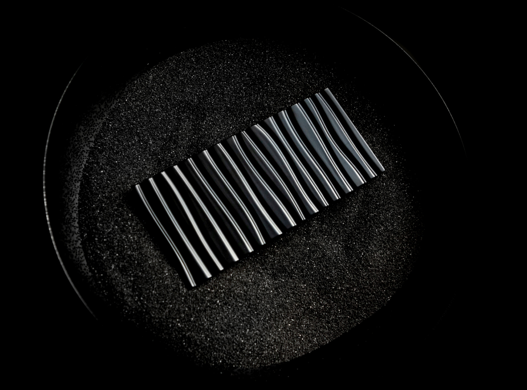
Like a window into the meandering lines of the Sahara Desert, Dune captures a fleeting frame in time as relentless winds carve rippling patterns into the sand. An homage to the forces of nature, Dune combines graceful sweeping curves with a powerful sense of mass and scale.
Imaging
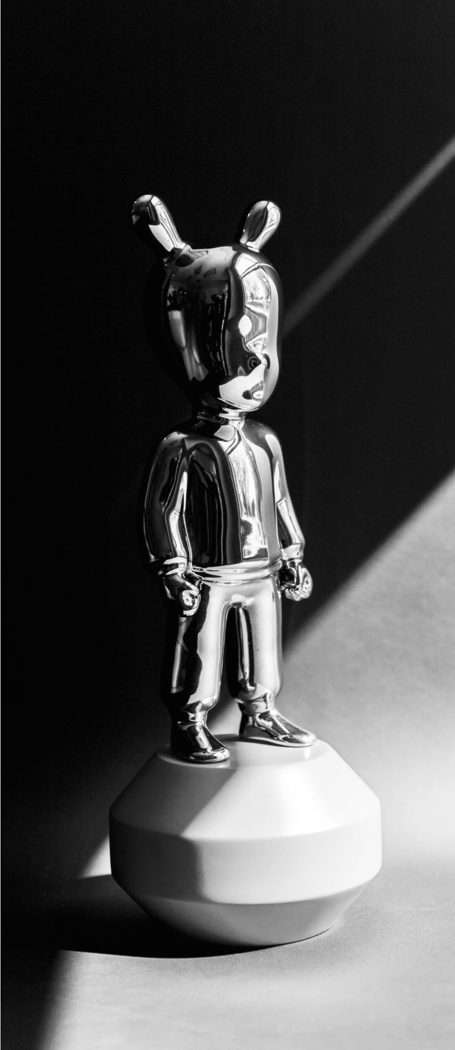
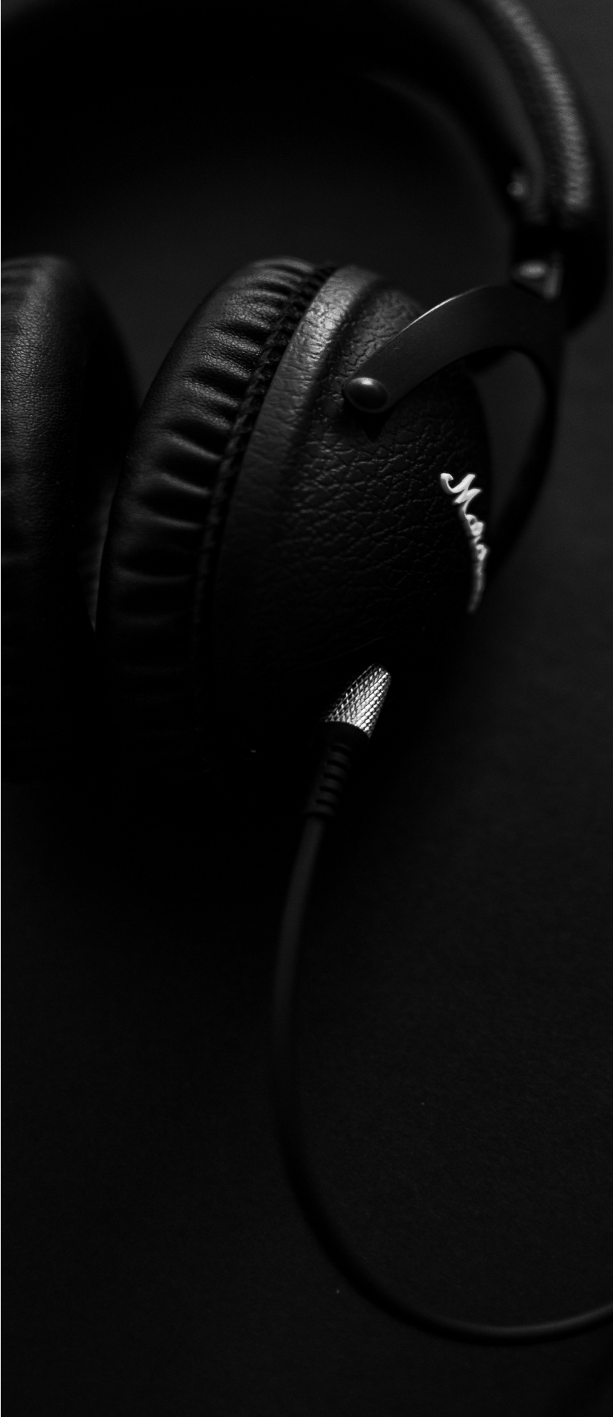
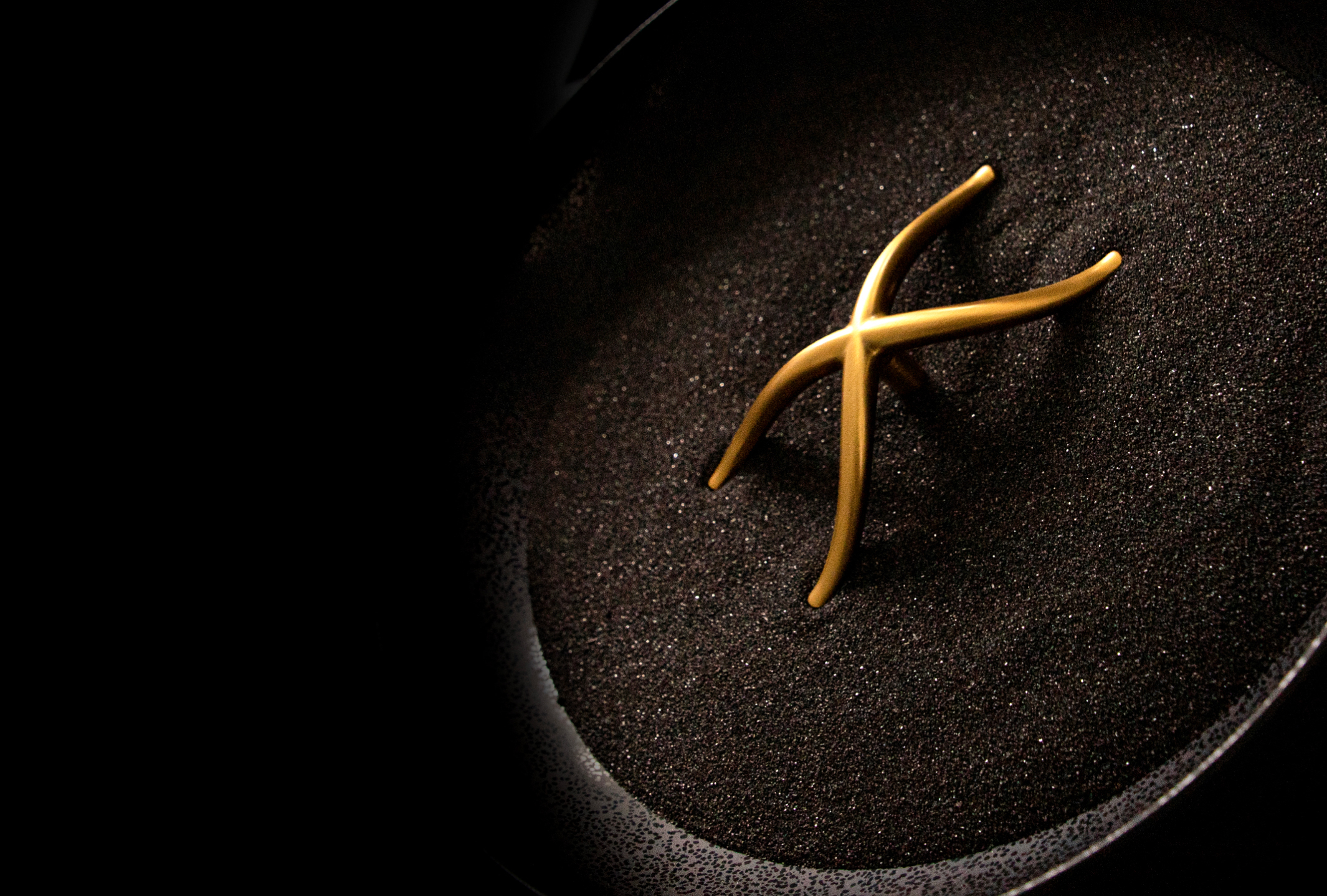
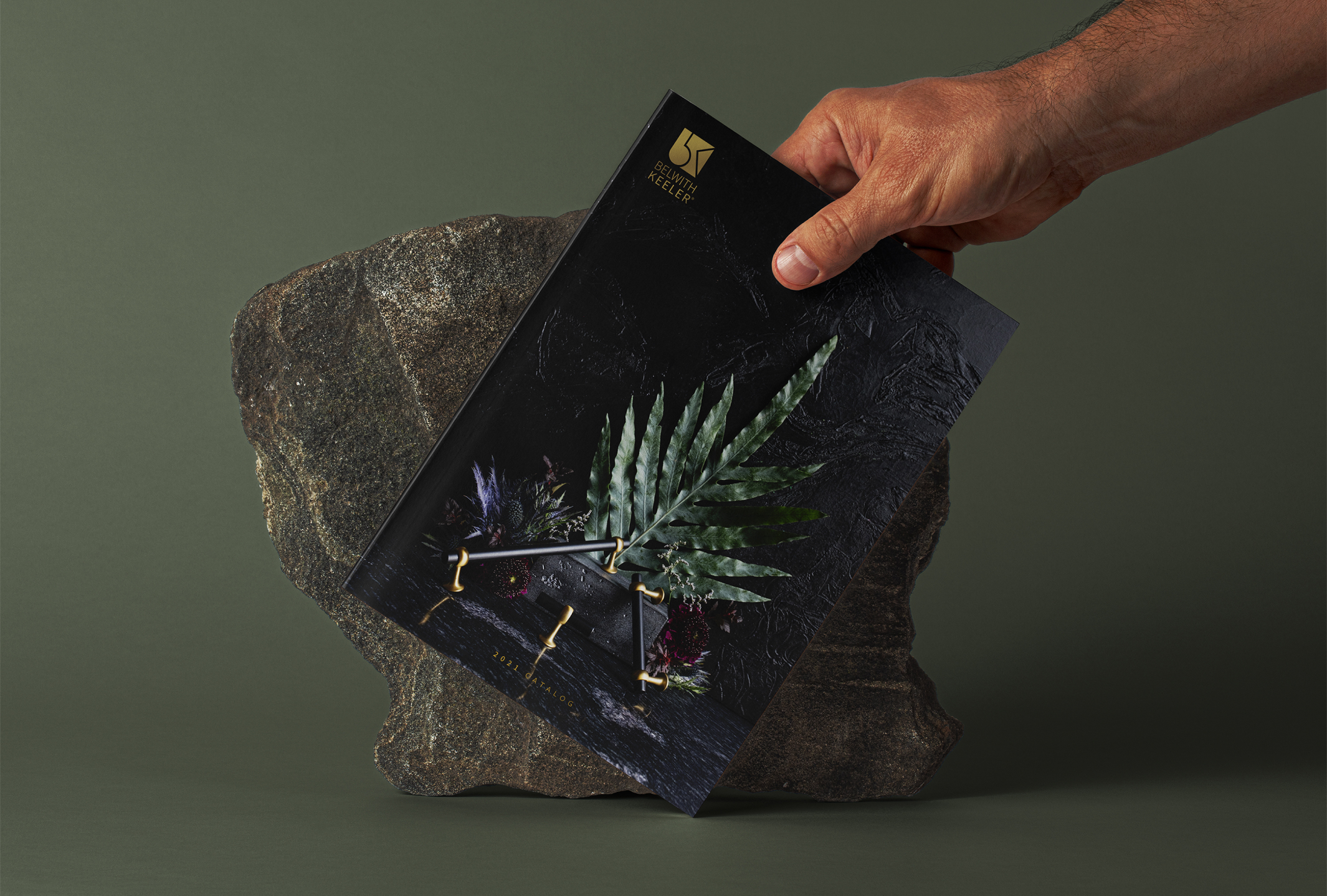
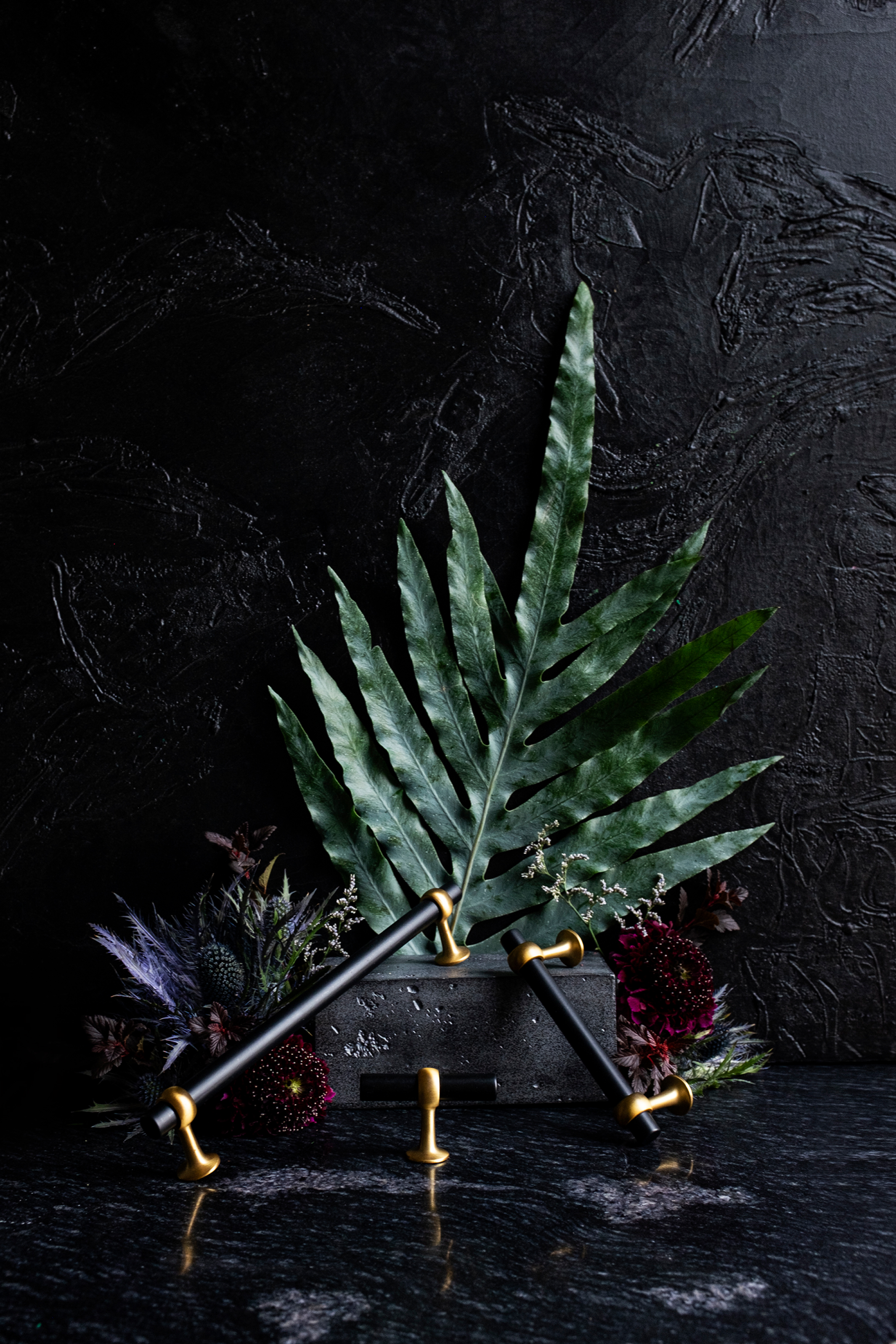
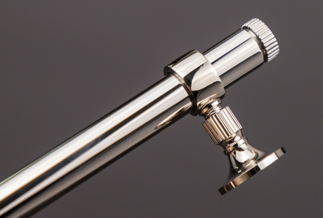
The beauty photography showcased throughout this page represents my efforts to significantly enhance the visual impact of our catalogs, lookbooks and brochures, distinguishing them from competitors’ print materials.
The objective was to capture details of our finishes, such as the metal brushing and to illustrate the depth and dimension of color and texture that are often overlooked and lost in general product photography.
Explore more of my photography work here.

Lookbooks
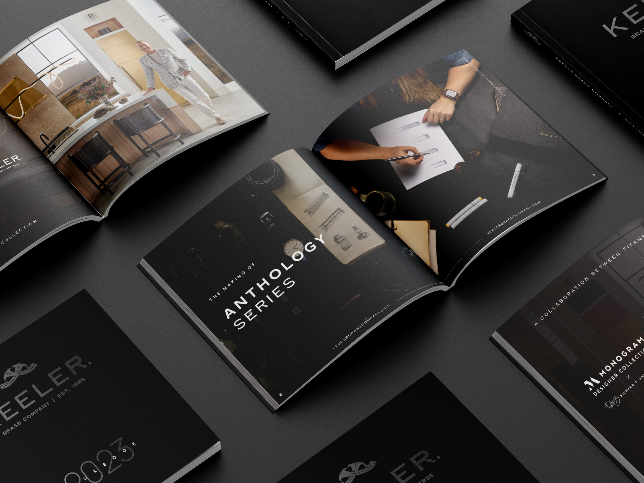
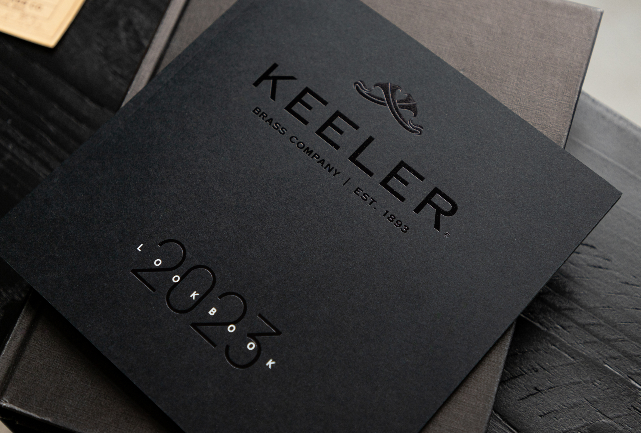
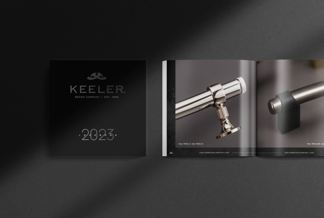
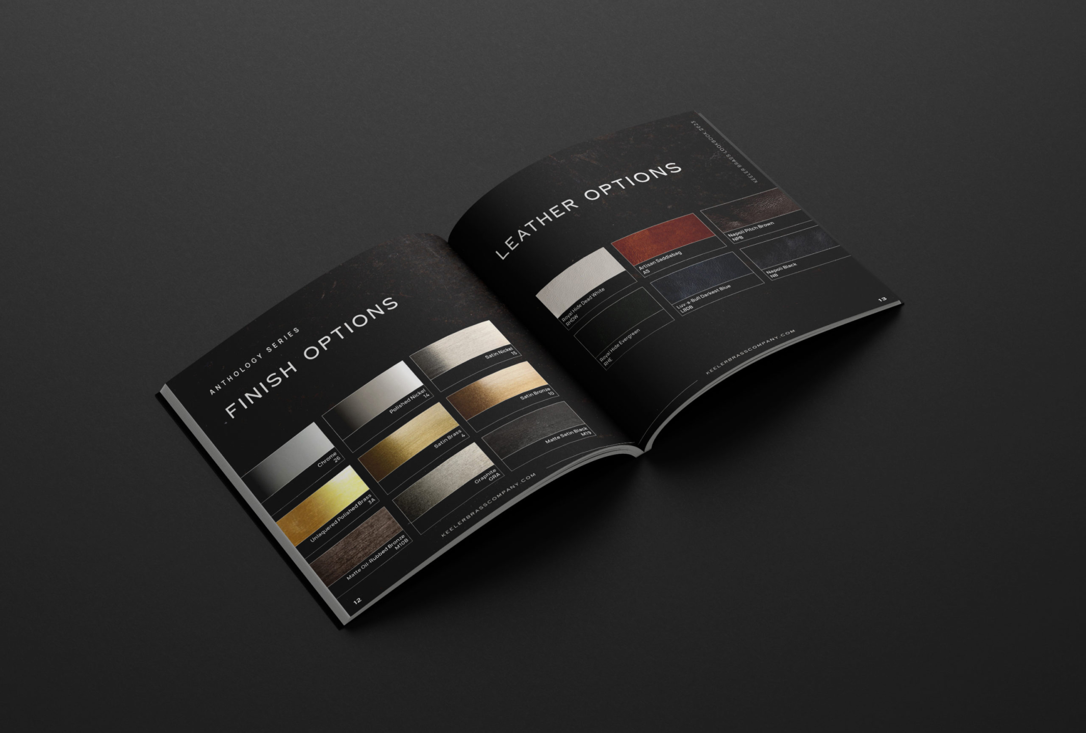
In creative design and art, it’s essential to draw inspiration from sources beyond our immediate industry to avoid tunnel vision. Fashion, known for its lookbooks, served as a valuable resource. This concept was less common in our industry, so we decided to develop our own lookbook for the relaunch of Keeler Brass Company in its 130th year.
Lookbooks emphasize strong imagery and I played a key role in their construction, design and photography. I also sourced the print quality we desired, featuring a black gloss foiled logo on a matte black paper cover, with white foil for the lettering. Additionally, some lookbooks for our other brands were produced with aqueous soft touch coatings, providing a suede-like tactile experience. No detail was too small to overlook.
Beauty Photos
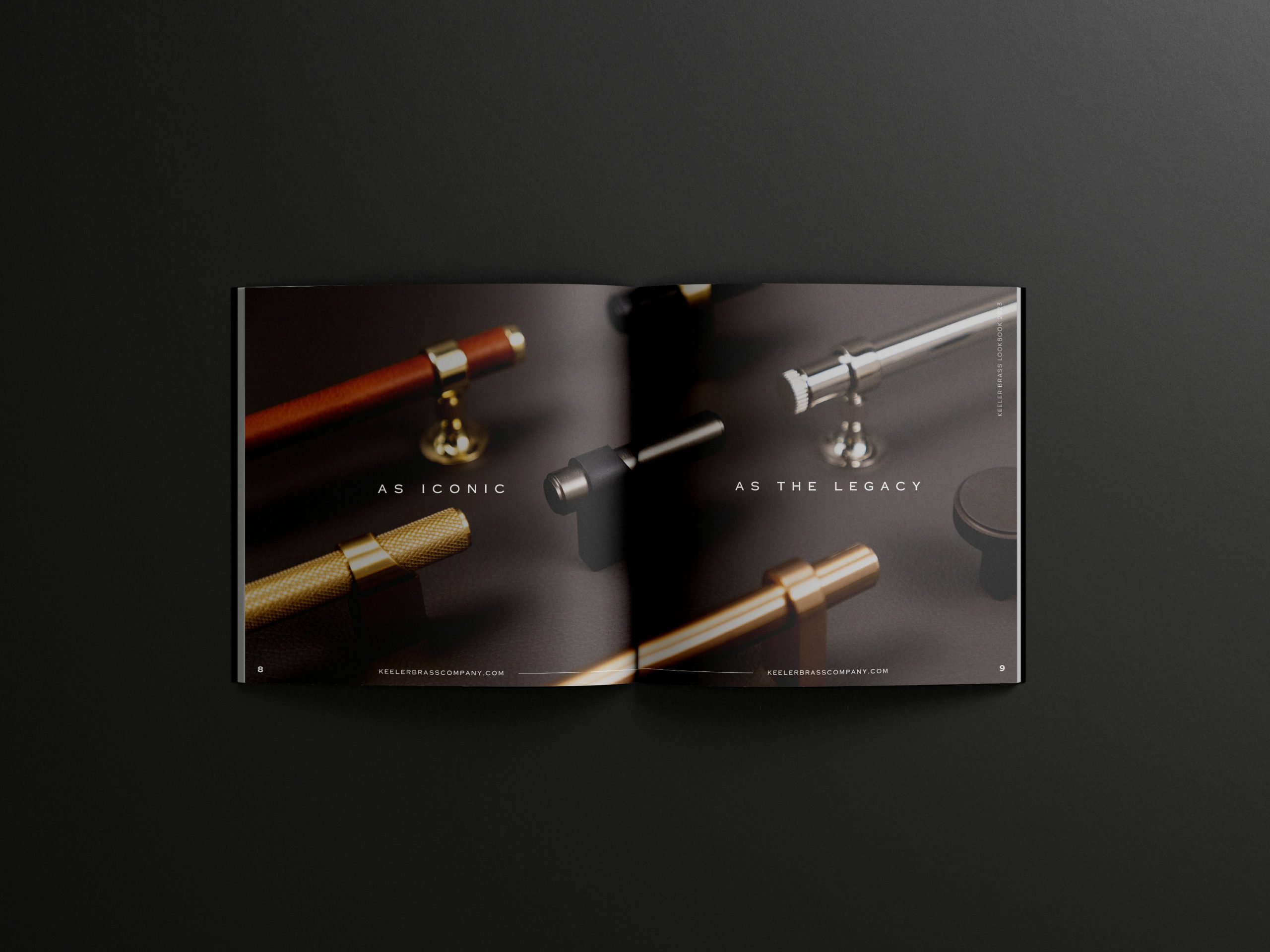
For the launch of the Anthology Series by Keeler Brass Company, capturing the intricate details like coining and knurling in our hardware was crucial.
To achieve these shots, many of which are featured throughout the lookbook, I balanced the camera in one hand while holding the part off-screen with the other to capture the perfect angle.
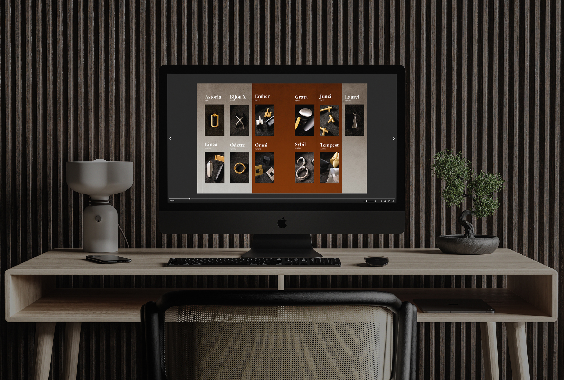
Virtual Catalogs
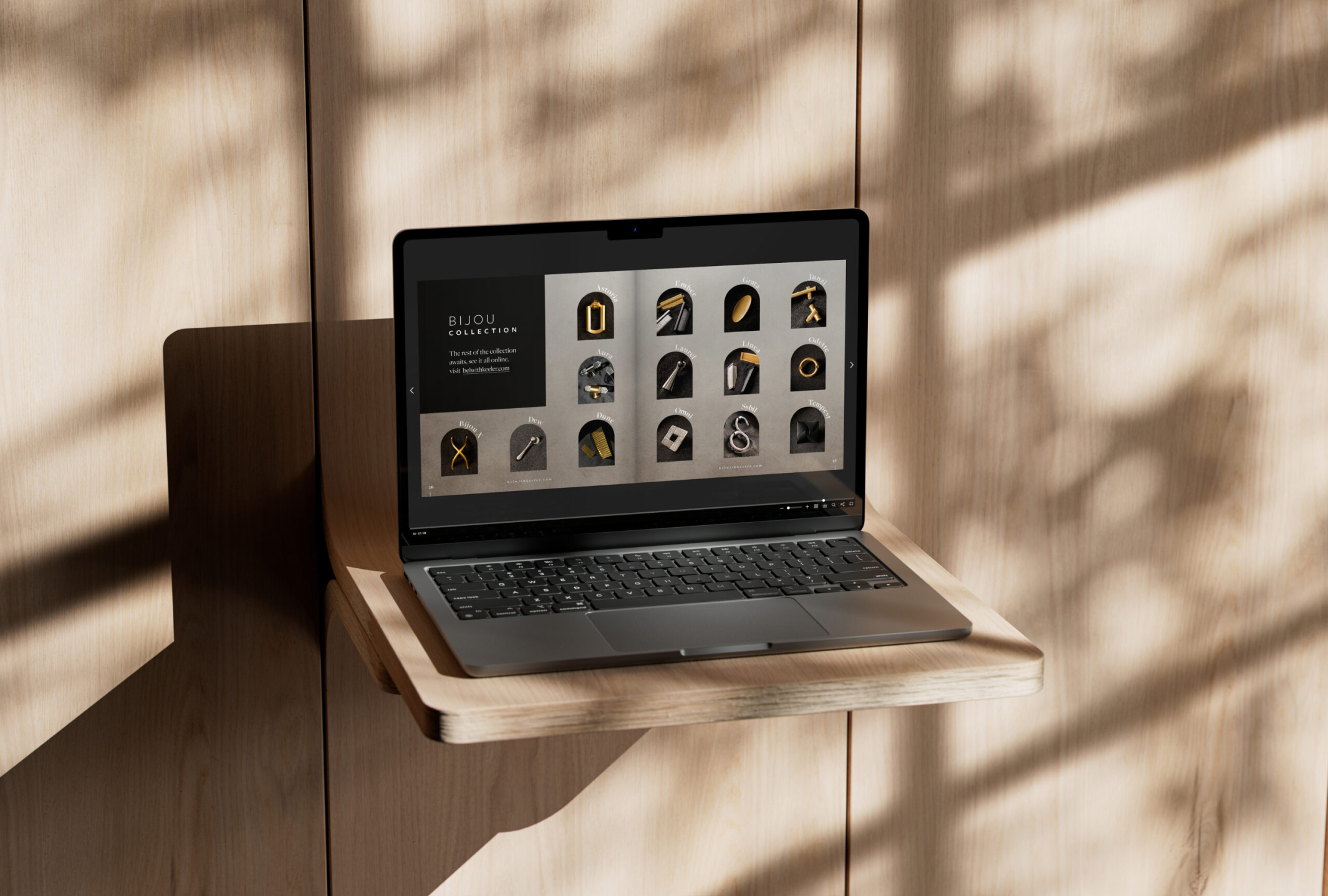
In an industry often mired in outdated practices, our company stands out for driving innovation, particularly through the promotion of paperless catalogs. Since 2022, I have been spearheading the design evolution of our catalogs, constantly refining its style.
