

Portfolio
Drip Over Skill
- 2024 - 2026
- Packaging Design
- Product Design
- Branding
Challenge
Drip Over Skill (DOS) engaged me as a freelance creative partner to support its growing startup sports product brand across multiple creative mediums from digital to print. The scope includes packaging design, e-commerce creative support and the refinement of brand expression across different Amazon product listings. No matter the final deliverable, my goal was to clearly communicate the brand’s ethos and improve visual consistency across an expanding product catalog by building a growing library of reusable brand assets.
Approach
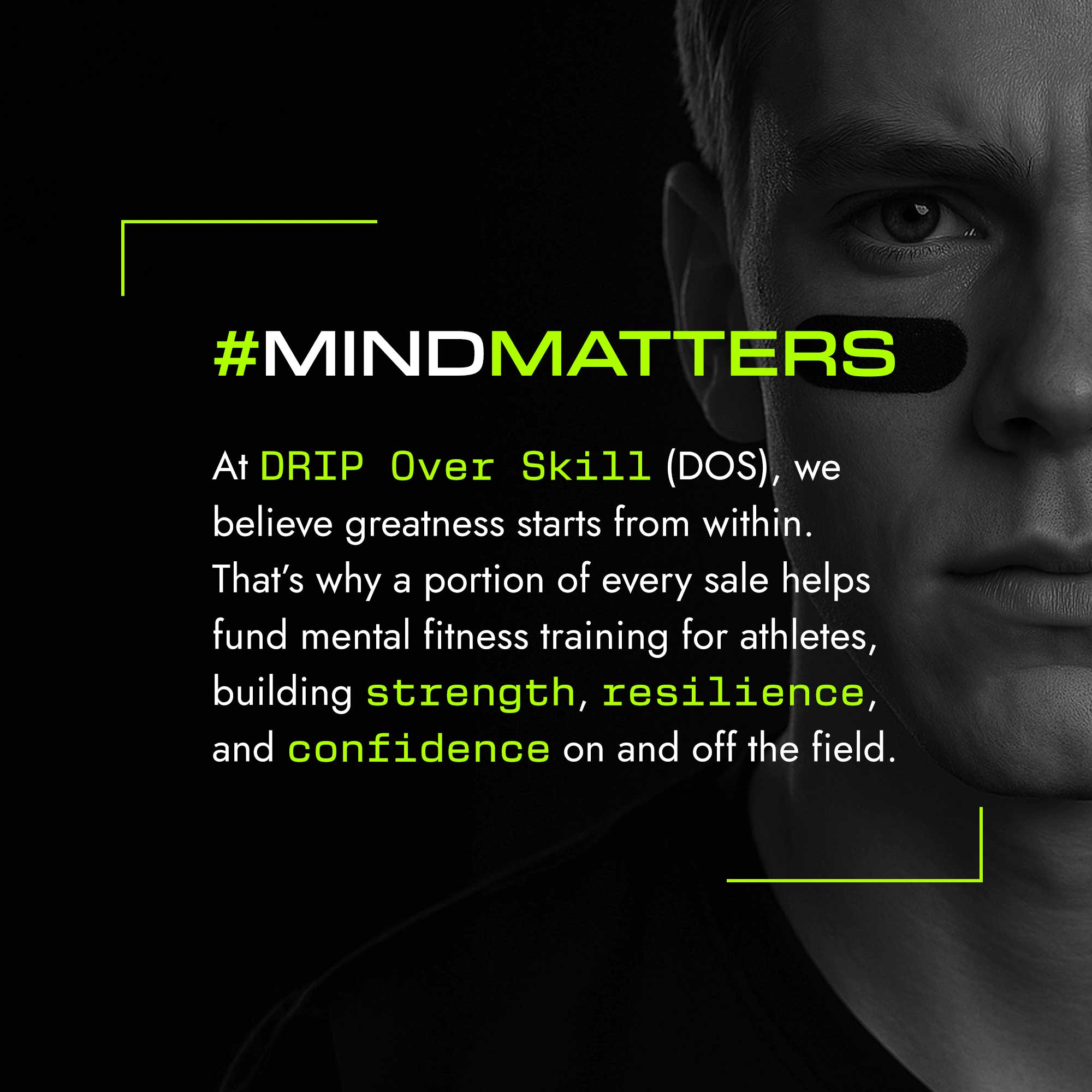
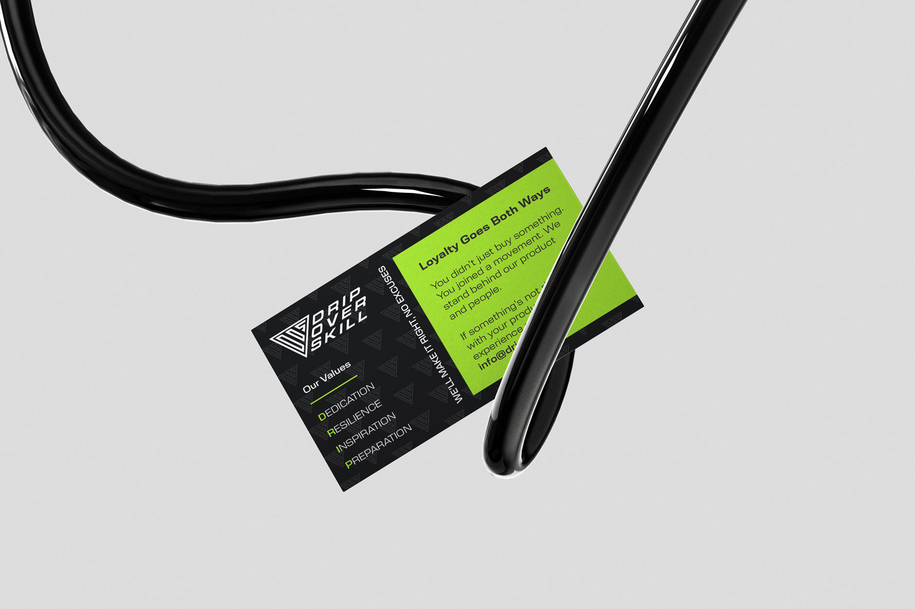
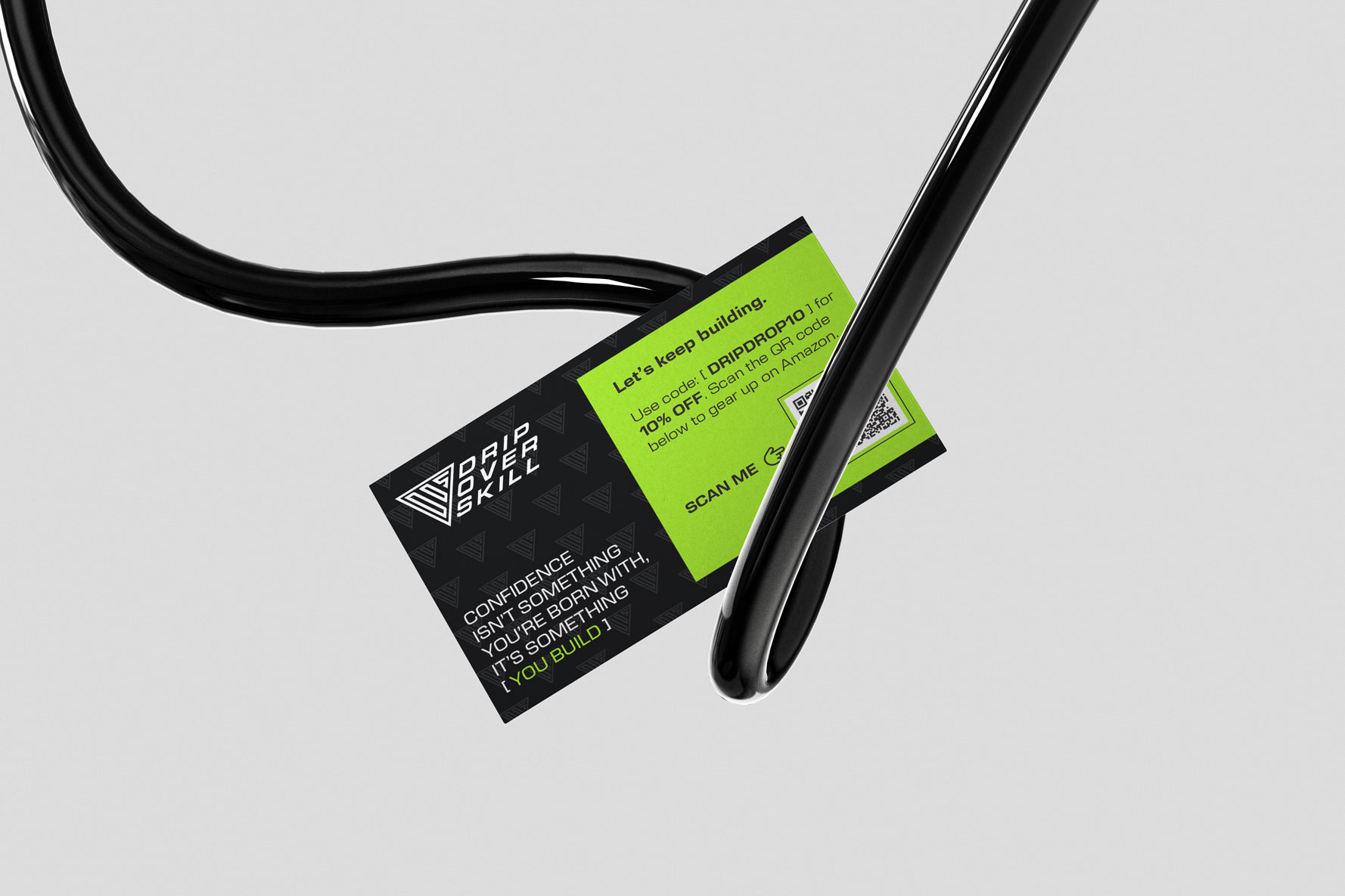
I began by interviewing the founder and key stakeholders to develop a deeper understanding of the brand’s purpose, positioning and values. A central focus of these conversations was DOS’s mission to normalize and raise awareness around mental health within the sports industry, framing mental fitness as inseparable from physical performance. These insights directly informed the design strategy. I translated the brand’s values into subtle but intentional moments throughout the product experience, embedding messaging within tear-away tabs, unboxing interactions and hidden typography beneath lids and folds, rewarding engagement while reinforcing DOS’s message in a thoughtful, memorable way.
Developing the Model
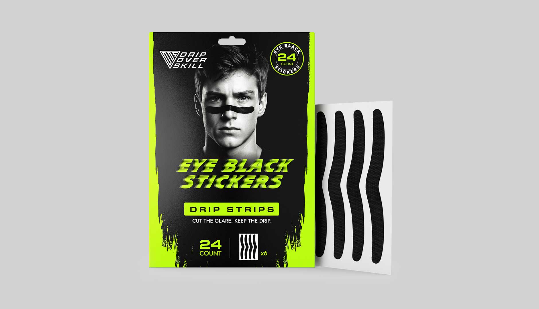
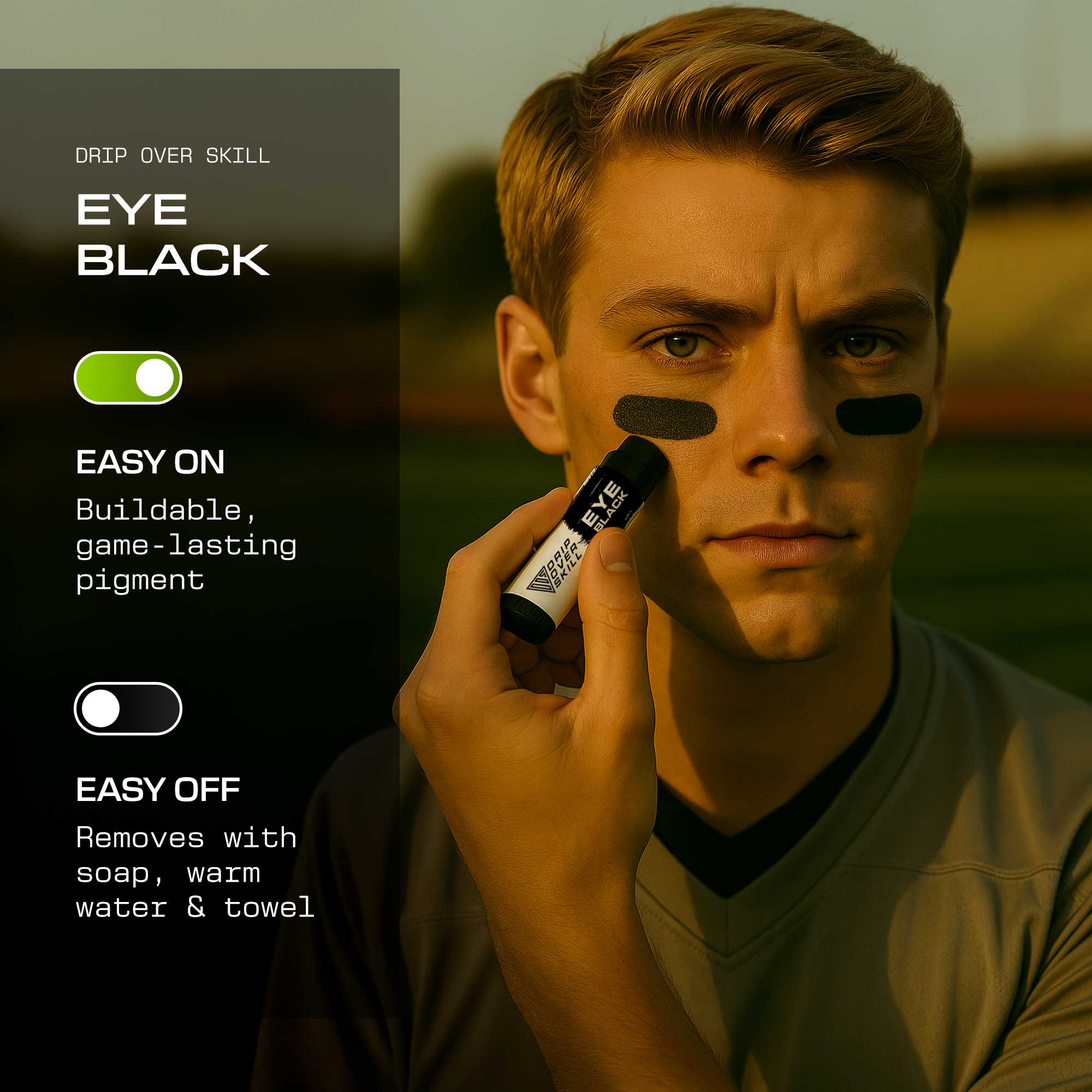
One of the brand’s most immediate gaps was high-quality product photography. Working within tight budget and timeline constraints, I developed a small set of male model archetypes to serve as consistent visual representatives for the brand, beginning with the DOS Drip Strips, an adhesive eye black product that differs from traditional balm-based applications.
A key challenge was maintaining visual continuity as these models appeared across different environments and product variations. To solve this, I combined custom-trained AI models with hands-on post-production, leveraging my design and retouching expertise to ensure accurate and realistic placement, scale and facial contouring of the eye black strips. This hybrid approach allowed the brand to achieve a cohesive, scalable visual system without the overhead of traditional photo shoots.


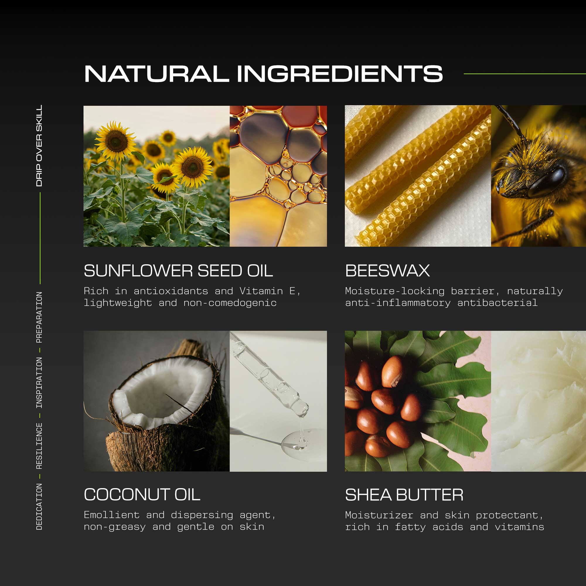
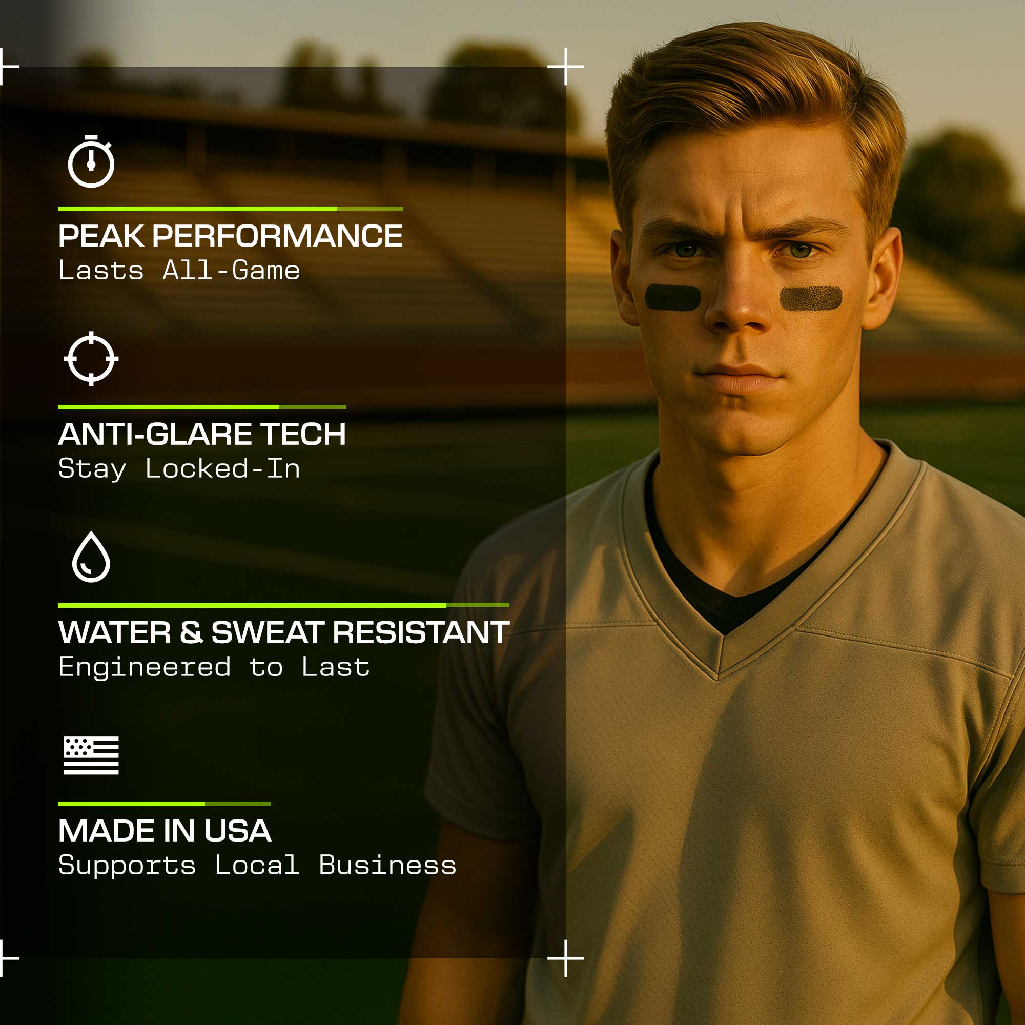
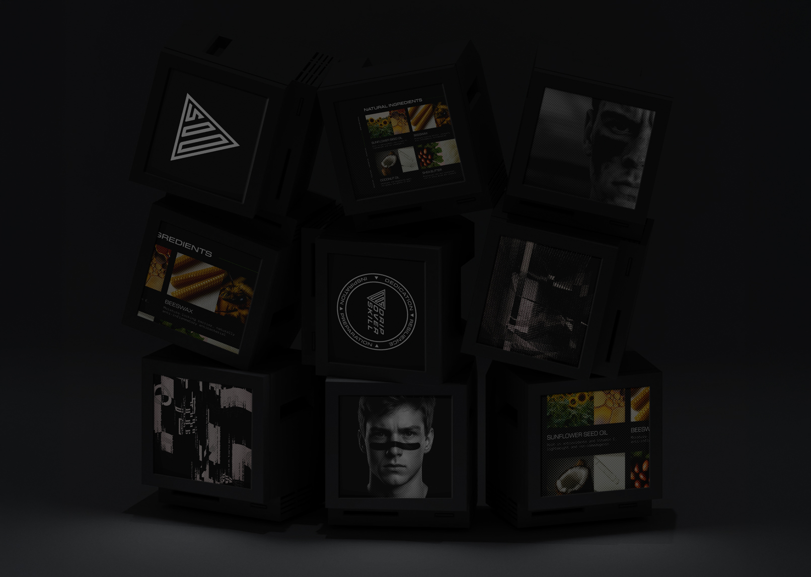
Amazon A+ Images
Optimizing product performance on Amazon requires a highly intentional approach to visual storytelling. Every element from image sizing, hierarchy and sequencing within the carousel to composition and clarity all directly impacts discoverability, comprehension and conversion. I learned a lot of Amazon tricks during this journey, both through observation and experimentation, and a founder who's deeply invested in passing the learned knowledge forward.
I collaborated closely with key stakeholders to ensure secondary imagery complemented the primary product image while reinforcing the brand narrative and clearly articulating product differentiation.
Anything But the Cookie-Cutter
Rather than relying on conventional Amazon templates or mimicking what every other product line in this space was doing, I approached A+ content with an elevated design sensibility, balancing strong visual impact with concise, consumer-focused information to create secondary imagery that stood out while remaining conversion-driven.
I helped strengthen DOS’s visual identity throughout by establishing a more cohesive design system, introducing vibrant and consistent typography and design elements that help reinforce the brand's design signature.
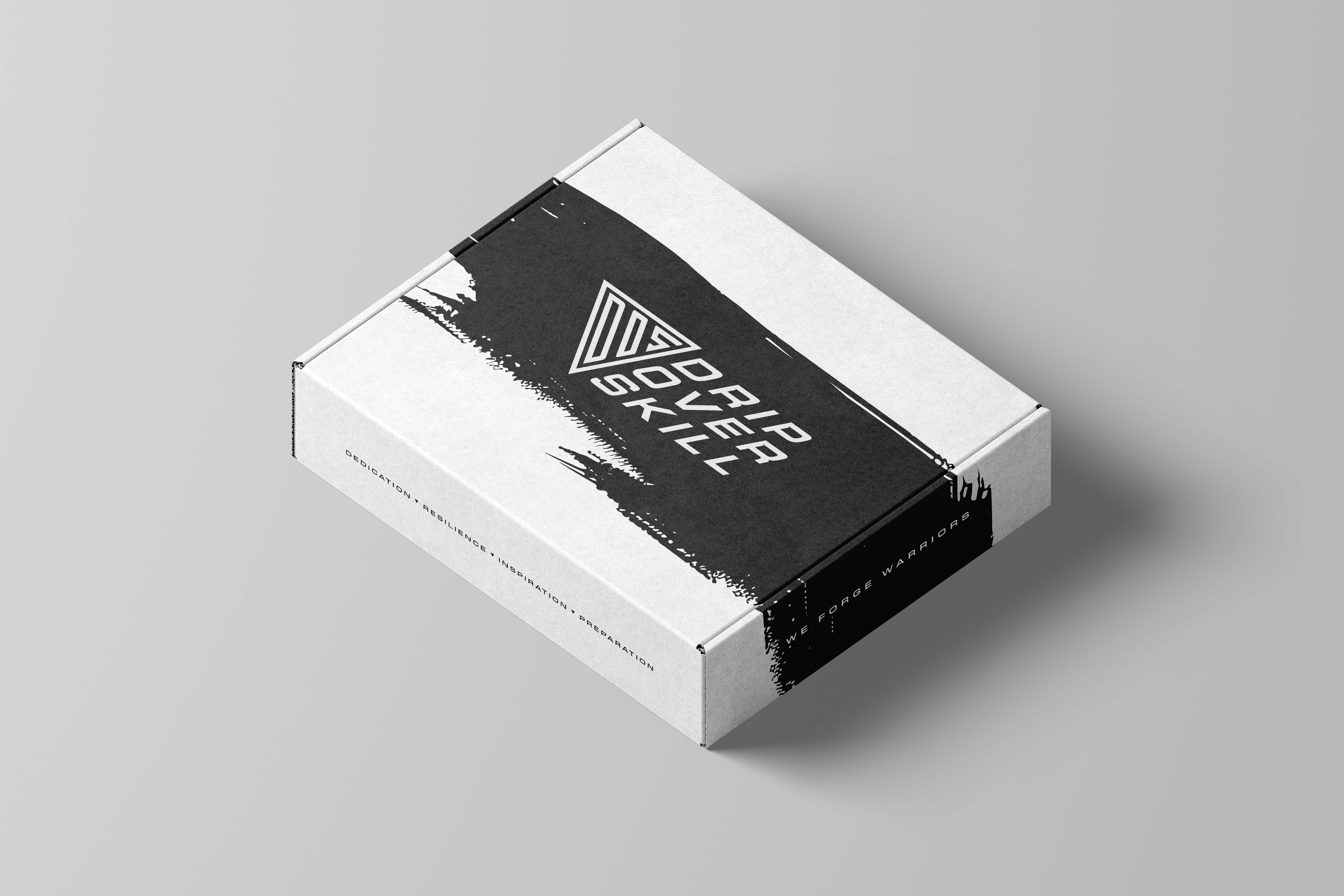
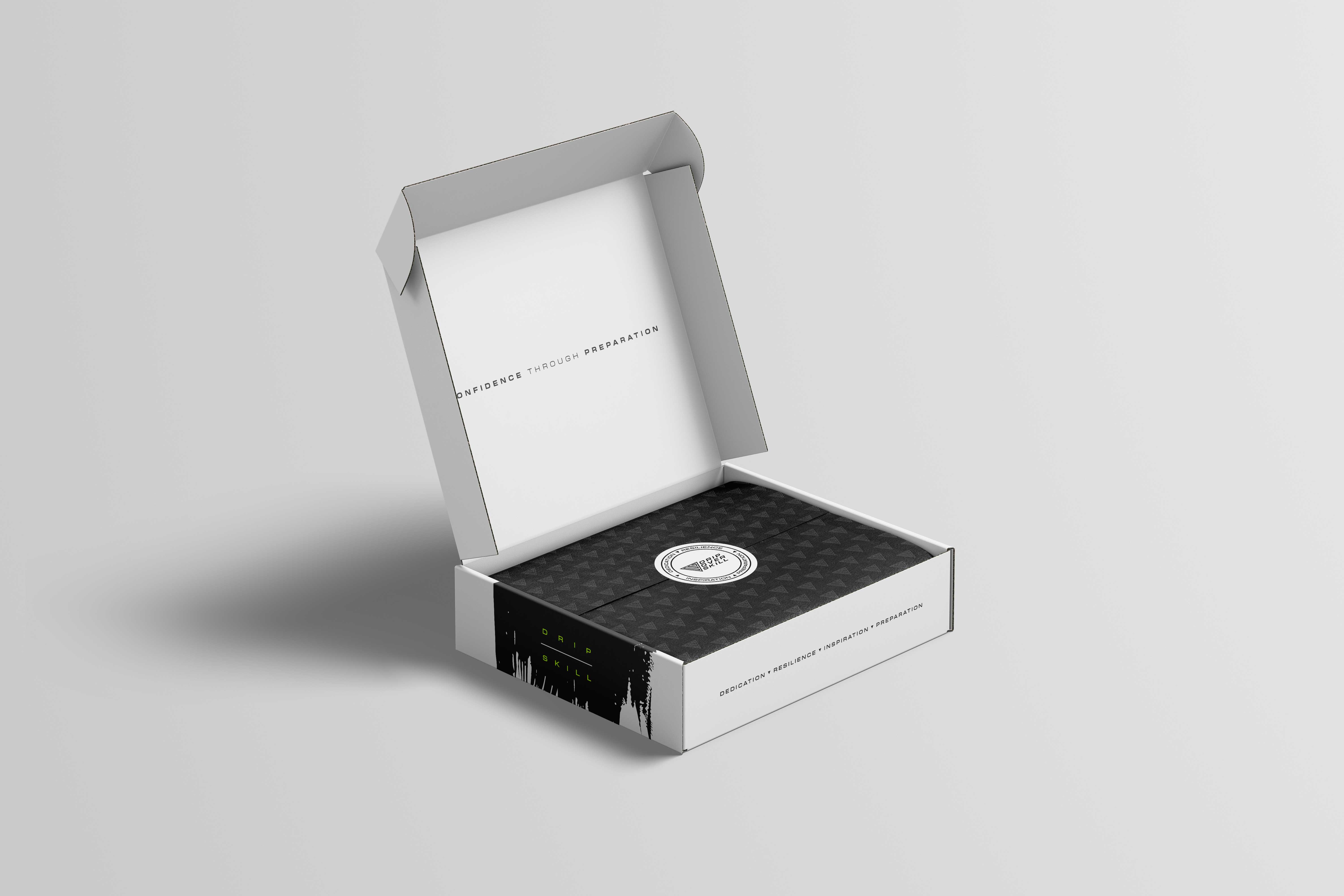
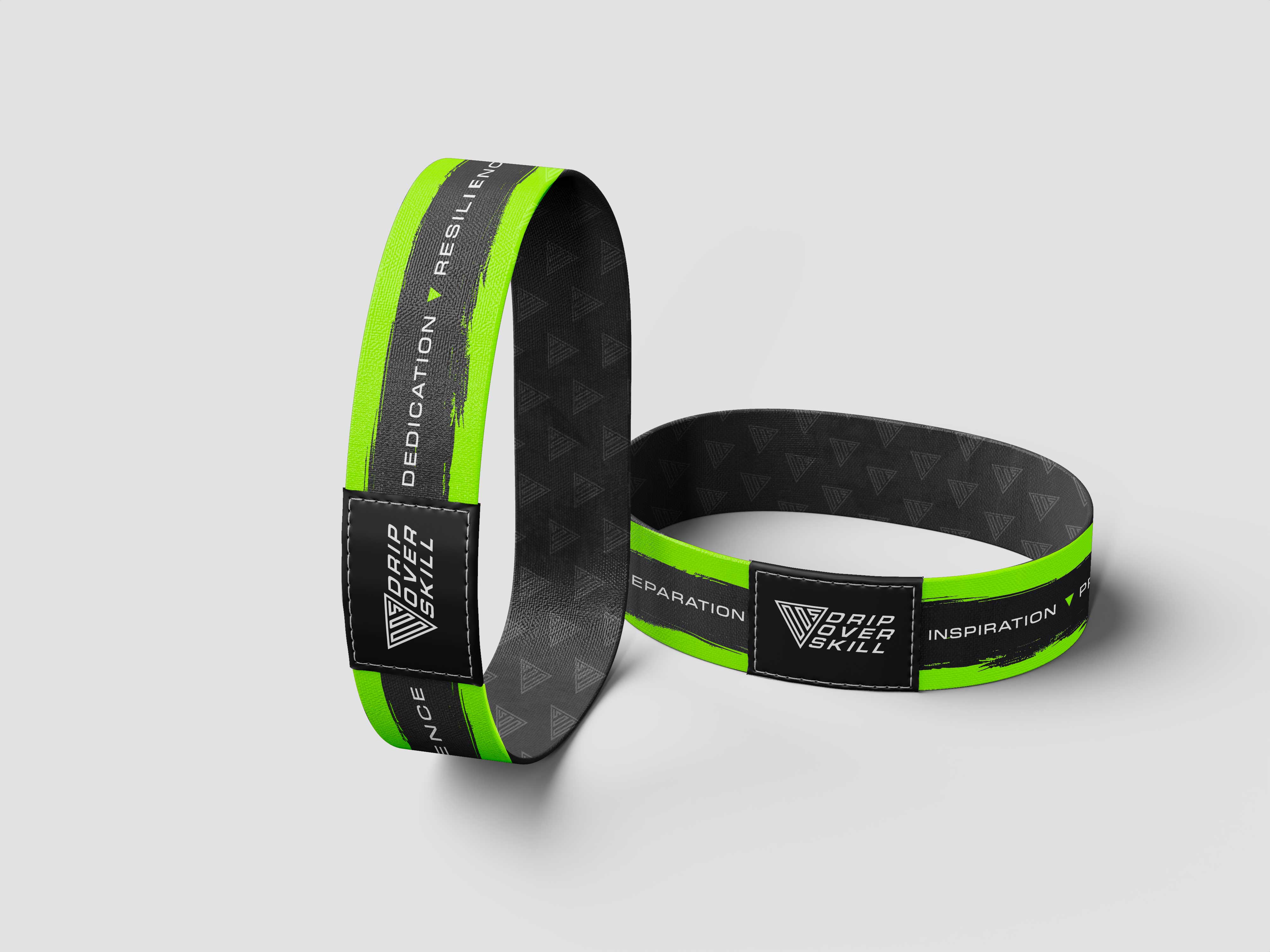
Brand Ambassador Influencer Boxes
One of the key initiatives early in 2025 was the development of branded influencer boxes designed to create a premium, shareable unboxing experience. Working within pre-established manufacturer dieline constraints, I designed a seamless wrap-around streak graphic inspired by the brand’s flagship eye black product.
Every surface was treated as an opportunity to reinforce the brand, integrating DOS values and taglines throughout the exterior and inner flaps of the box. To extend the experience further, I proposed and designed custom branded tissue paper featuring a seamless DOS logomark pattern, along with a badge-style logo for the sealing sticker. The sticker incorporated the brand’s DRIP values: Dedication, Resilience, Inspiration and Preparation; all encircling the core DOS mark to create a consistent unboxing experience.
Introducing Lime Green & a New Typographic System
When I initially joined the project, DOS operated within a largely black-and-white palette, with a heavy emphasis on white. I identified an opportunity to introduce a high-impact accent color to improve shelf visibility, particularly in big-box retail environments where products must compete aggressively for the buyer's gaze.
Lime green was introduced as a strategic addition rooted in sports culture and performance signaling. While the color was gaining momentum across advertising, fashion and streetwear throughout 2025, its value went beyond trend relevance. Lime green conveys energy, strength, and intensity, qualities that aligned naturally with DOS’s performance-driven mindset and the founder’s optimistic, forward-looking vision. With this in mind, I began evolving the flagship product’s packaging to feel more dynamic.
I introduced a new primary typeface, New Science, to strengthen the brand’s typographic foundation. Prior to this, DOS relied solely on Jost, which lacked the range and authority needed to support a growing product ecosystem. Jost is a good font, it functions, it just lacked the pizazz needed to spice things up visually. New Science offered a cohesive yet highly flexible system, with extended, monospace, and serif variants that could work across packaging, e-commerce and apparel.
Inspired by precision, technology and performance, New Science’s structured, square letterforms reinforced DOS’s positioning in mental and physical fitness. Together, the expanded color palette and refined typography helped elevate the brand from a minimal startup aesthetic to a more confident and lively visual system.
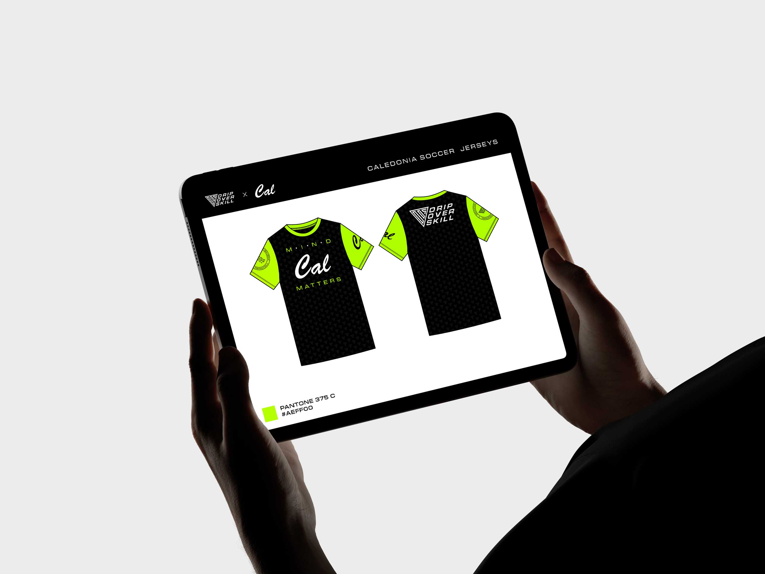
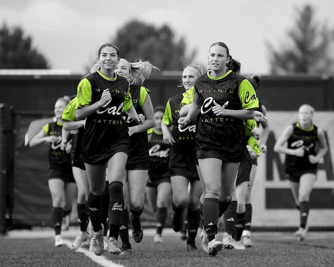
Cal Soccer Jerseys
The introduction of lime green extended naturally into the design of the DOS-sponsored pre-workout jerseys for the Caledonia Girls’ Soccer team. I designed multiple jersey concepts that prominently featured the DOS logo co-branded with the Cal identity, ensuring clear visibility and balanced brand equity for both partners.
Ongoing Project Support
I continue to collaborate with DOS on ongoing creative initiatives. The work presented here represents a curated selection from a broader body of work, with additional projects currently in development and slated for future launch.

01
About
An area describing what this site is all about, who I am and how I came to be.


02
Portfolio
The most important aspect of the site, a select catalog of works spanning over a decade.

03
Blog
An amalgam of my creative explorations, activities, musings and discoveries.


04
Music
Music is one of the most vital ingredients to my creativity and inspiration. Visit this page to listen to some tunes.


05
Contact
I am always looking to connect with other talented individuals. Reach out for collabs,freelance, or other opportunities.